Yearly Archives: 2018

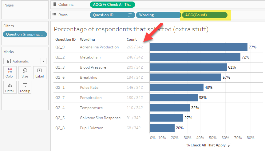
A Bar Chart and a Pie Chart Living in Harmony

By |2021-03-14T16:42:43+00:00December 2nd, 2018|Business Visualizations, General Discussions, Makeovers|

And a great way to visualize Pareto analysis December 2, 2018 Special thanks to Lindsey Poulter, Andy Cotgreave, Jeffrey Shaffer, Cole Nussbaumer Knaflic, Robert Kosara, Adam Crahen, and Joey Cherdarchuk. Overview While at this year’s Tapestry conference (by far my favorite conference) I had the good fortune to literally bump into Joey Cherdarchuk from [...]

Chart Chat Live – Round 1

By |2022-03-23T20:40:46+00:00November 28th, 2018|Business Visualizations, Chart Chat, Videos|

November 28, 2018 Thank you to everyone that joined our first Chart Chat Live webinar. https://youtu.be/Z3wLmRvy4YQ In addition to the recording above, you can also download Steve’s slides here and download Jeff’s slides here. Recap After brief introductions, Steve discussed color and the use of BANs. Steve discussed “Lonely [...]

How to visualize check-all-that-apply questions using Tableau

By |2020-02-16T22:56:33+00:00September 12th, 2018|Visualizing Survey Data|

September 12, 2018 Overview I’ve recently seen some questionable approaches to visualizing check-all-that-apply questions (CATA questions) in Tableau. I’m concerned because many of these approaches won’t work if either you filter the data to only show some options, or if some of your survey participants skip the CATA questions. It’s the latter reason that [...]

Showing uncertainty in survey results

By |2021-11-15T15:52:10+00:00August 20th, 2018|Business Visualizations, Visualizing Survey Data|

Visual representation of error bars using Tableau August 20, 2018 Much thanks to Ben Jones whose book Communicating with Tableau provides the blueprint for the calculations I use, Jeffrey Shaffer for providing feedback on my prototypes and sharing research papers from Sönning, Cleveland, and McGill, and Daniel Zvinca for his thoughtful and always invaluable [...]

Is this better than a Jitterplot? Could be

By |2020-02-16T23:25:08+00:00July 22nd, 2018|Business Visualizations, General Discussions, Visualizing Survey Data|

July 22, 2018 Overview After writing my blog post about why I still love the Jitterplot, I got some thoughtful feedback from Adam McCann, Jeffrey Shaffer, and the always provocative Daniel Zvinca. Dan had written a wonderful article suggesting a Stingray plot as an alternative, and Jeff and Adam’s comments encouraged me to revisit [...]

Rethinking the divergent stacked bar chart — placing the stronger views in the center

By |2020-02-17T02:20:59+00:00April 1st, 2018|Business Visualizations, Visualizing Survey Data|

April 2, 2018 Overview Followers of the Data Revelations blog and website know that my “go to” visualization for Likert scale data is a divergent stacked bar chart. Earlier this year there was some debate about whether this is a better approach than a stacked bar chart. I'm still completely in favor of the divergent approach, [...]

Thank you, Joe; Thank you, Kelly

By |2020-02-17T02:32:44+00:00March 6th, 2018|General Discussions|

As we finish awards and recognition season (Academy, Gartner Magic Quadrant, Zen Master Hall of Fame, Razzi’s, etc.) I want to pause to make sure readers of this blog are aware of the contributions of two extraordinary data visualization practitioners who have not been very visible in the Tableau community for the past year [...]

Title