Chart Chat Live — Round 29
Amanda Makulec interviews Steve, Jeff, and Andy as they reflect on The Big Book of Dashboards, five years later. https://youtu.be/kVh7I6gFB_c


Amanda Makulec interviews Steve, Jeff, and Andy as they reflect on The Big Book of Dashboards, five years later. https://youtu.be/kVh7I6gFB_c
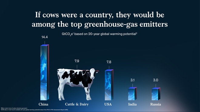
So many wonderful things from 2021. In this post I share my favorite chart, channel, chat, and tool. My favorite chart: If cows were a country I love this McKinsey gem from Jason Forrest, Gabrielle Merite, and Gergo Varga. I know, it violates so-called best practices. The bars are 3D (they look like smoke-filled containers) [...]
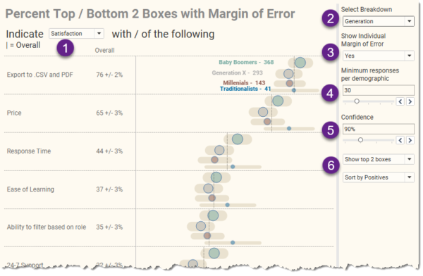
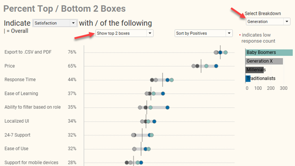
A big “thank you” to Daniel Zvinca, Chris Lay, Anna Foard, Jeffrey Shaffer, and Joe Cohen for their feedback and encouragement. Overview I published a blog post earlier this year on how I recommend showing results for Likert-scale questions broken down by different demographics. I had become fond of how organizations like Pew Research does [...]
And some other thoughts on conditional formatting. Overview A few weeks ago my friend, Yamil Medina, asked me to attend a weekly livestream he hosts with his colleague at Data Meaning, Aaron Simmons. The livestream is called 3@3: A Mystery Chart Show and I enjoyed it so much I decide to hangout the following week. [...]
Understanding Index Charts and Log Scales https://youtu.be/Kzee9HyX6bU Index Charts are a great way to compare events that don't happen at the same time; for example, how are sales this quarter vs. last quarter, vs. a year ago this quarter? There are lots of business cases for this type of chart. What about log scales? [...]
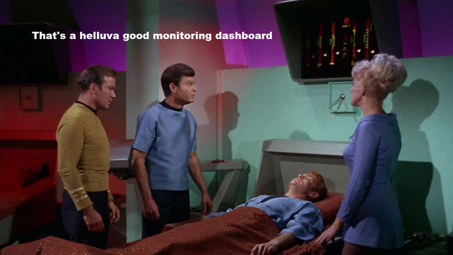
Data Viz and Star Trek I chatted recently with Andy Cotgreave about the original Star Trek series and how impressed I was with Dr. McCoy’s sickbay monitor. I think this is an AMAZING KPI monitoring dashboard and a lot of organizations could benefit from something like this. (Hey, Nick Desbarats… this is similar to your [...]
Overview September 6, 2021 update: A big thanks to Chris Lay and Daniel Zvinca who chimed in on a variety of issues, the most important of which is that the margin of error is very large with a low response count. I've added an option to hide marks where the number of responses is fewer [...]
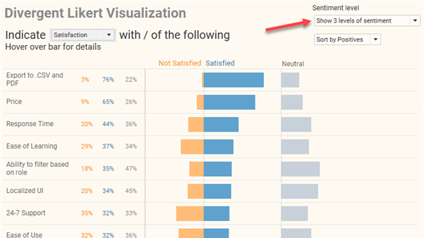
Note: A big thank you to Daniel Zvinca who wrote a wonderful article advocating the “inside-out” approach that I recommend here. Overview My preferred way to visualize Likert-scale data in Tableau is a little cumbersome to create and I suspect some audiences won’t find it intuitive. But it’s worth taking the effort to build, and [...]
Overview There are times when an attendee at one of my workshops will share a chart or dashboard that is extremely complicated, to the point where I have a lot of trouble parsing it. I point out that I am a “professional chart looker-atter” and that if I am having trouble understanding the dashboard, I [...]

January 18, 2021 Some thoughts about critique in data visualization. Background For the past 18 months I’ve been working on a new book (more on this in a moment). Last September, I asked some colleagues to review selected chapters. I asked everybody to review the preface, which included this passage: My friend Jonathan Schwabish provided [...]

