Overview
Note: I based my Tableau Conference 2015 presentation on this blog post. You can download a PDF of the presentation and the Tableau packaged workbook. Click here to see a video of the presentation.
Earlier this year one of my clients was updating a collection of survey data dashboards and they wanted to revisit the way they presented demographic data. They thought that the collection of bar charts comprising the demographics dashboard was boring and wanted to replace them with something that was a bit more visually arresting. In particular they wanted to take something that looked like this this…

Figure 1 — a “boring” collection of bar charts.
… and replace it with something that looks like this:

Figure 2 — A “flashy” demographics dashboard
When asked why they wanted something “flashier” they indicated a desire to draw the viewer into the dashboard and they thought a dashboard with more than just bar charts would do the trick.
I wondered “why stop there?” Why not add pictures of kittens and puppies?
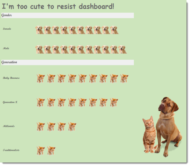
Figure 2a — the Too Cute dashboard.
The real issue here is that the underlying data just isn’t interesting and adding sexy visual elements will do nothing to make the data more interesting. There’s only one way I know to make this kind of data “interesting”.
Make it personal.
Tapestry and Chad Skelton
I recently attended the 2015 Tapestry Conference where Chad Skelton of the Vancouver Sun presented a great session making the case that people are ravenous for data about themselves.
I was particularly taken with an interactive dashboard Chad created that allows Canadians to see how much older / younger they were than other Canadians.
I decided I would look at United States census data and build a similar dashboard.
US Census Data without Personalization
Here’s a histogram showing the relationship between age and US population.

Figure 3 — A histogram showing the relationship between age and US population.
I have to admit this doesn’t do much for me although I do find the long downward slope from around the age of 50 somewhat interesting (but I am a bit of a data geek).
Contrast this general purpose graphic with the personalized dashboard shown below.
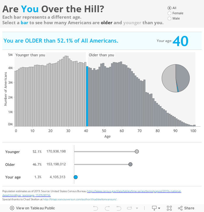
Did you try it? Are you over 38 years old? If “yes,” were you a bit depressed?
I certainly was.
While I don’t mean to depress anyone I do want to underscore how much more interesting the data is when the data is about YOU.
Make the Demographics Dashboard Interesting – Make it Personal
With the goal of personalization in mind let’s see how we can make the dashboard in Figure 1 more interesting.
Let’s start by gathering some information about the person viewing the dashboard; that is, let’s present some parameters from which the viewer can apply personalized settings:

Figure 4 — Get your user to tell you something about himself / herself.
Now we can take these parameter settings and highlight them in the dashboard.

Figure 5 — A “personalized” demographic dashboard.
We can then go one step further and invite the viewer to select the colored bars to see exactly how many people that took the survey have the same demographic background as the person interacting with the dashboard.

Figure 6 — There are 65 people who fall into the same demographic pool as the person viewing the dashboard.
Conclusion
I’ve become a big advocate for adding personalization to dashboards and a number of my clients have started to adopt the approach. I’ve seen some very good results at Bersin by Deloitte where Bersin is leveraging their proprietary survey data by allowing individual organizations to benchmark their numbers against similar organizations.
Note: A few months ago Joe Mako sent me a link to a Stephen Few blog post. In researching this topic I revisited the post and see that Chad Skelton was in fact featured in Few’s essay . It seems that Skelton did not just “happen” upon the idea of personalization but was grappling, like so many of us, with ways to entice people to engage with visualizations.
For the record, I think personalized bar charts beat packed bubbles any day of the week.