January 14, 2020
Overview
Going back to 2013 I’ve had a “wish list” that Tableau has either addressed (navigation buttons, collapsible / expandable containers) or is about to address (dynamic parameters and server-side animation).
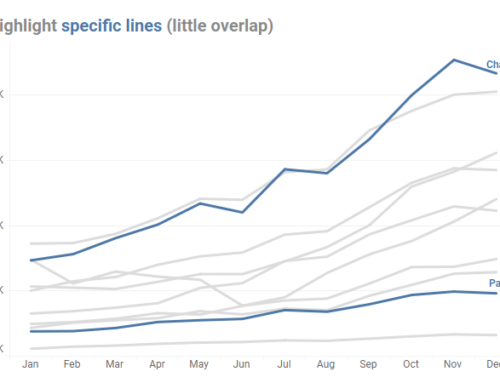
One feature request that still remains unmet is being able to change the width of individual columns on a worksheet. This is something that’s very easy to do in Excel but if you want to have charts with different widths in Tableau you need to stitch together one or more sheets on a dashboard, as shown below.
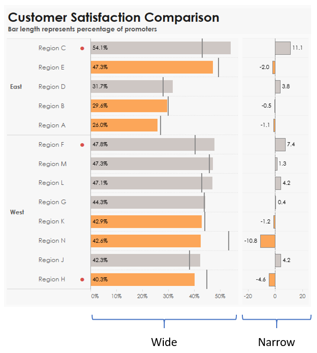
Figure 1 — Stitching together two worksheets on a dashboard.
The visualization here contains two worksheets. The first (Wide) has the header visible. The second (Narrow) hides the header and is sorted using the same calculation as the Wide worksheet.
So, this is definitely a pain to get the alignment and row heights correct, but it does work.
Except… what happens when you have a lot of rows and scroll bars appear in each sheet?
Small dashboard, lots of rows
Several people have come up with some ways to address this, including this approach from Weston Palmer and this really slick “scroll bar as a visualization” approach from Luke Stanke and from Linday Betzendahl.
All of these approaches work by limiting the number of rows you can see in the dashboard at any one time. I find the UI of Weston’s to be a little unintuitive and Luke’s and Lindsay’s to be a little confusing if I try to drag the scroll “button” rather than click. I also can’t use the scroll wheel on my house mouse with any of these approaches. That said, I encourage you to look at these as it may be exactly what you’re looking for and because there are a couple of shortcomings with my approach that I’ll discuss later.
Alternative approach — Make a BAD dashboard
One way to avoid the individual scroll bars is to make a “BAD” (a Big-Ass Dashboard). Here the dashboard is so tall that you never see individual scroll bars. Instead, there is a single scroll bar all the way to the right.
Before I get into how to build this, try clicking the image below to see the Tableau dashboard and try changing the filter settings to add and remove rows. Note that all three sheets always stay in sync as they are all set to sort based on SUM([Sales]).
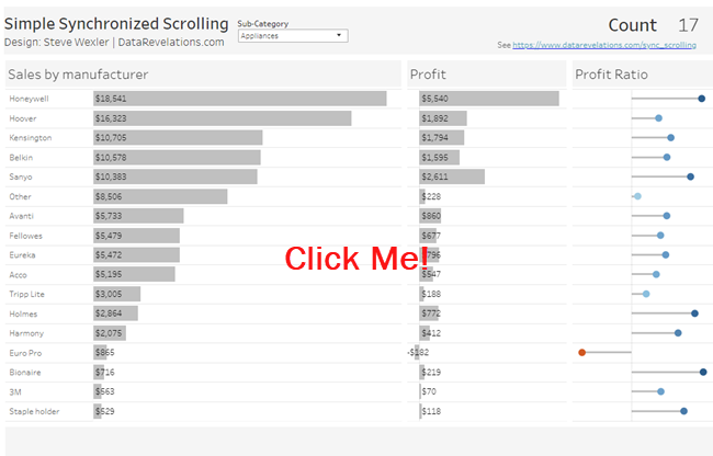
Figure 2 — Click to try the interactive dashboard.
Understanding the Layout
The biggest trick in marrying the three worksheets is making sure the row height stays consistent whether there are many rows of data or just a few rows of data.
The dashboard needs to be taller than it needs to be. Okay, that sounds like a Yogi Berraism, but you just need it to be taller so that it can accommodate more rows than you will ever need to display. This ensures that there will be a single scroll bar along the right side of the screen so you do not have to worry about the individual sheets having scroll bars.
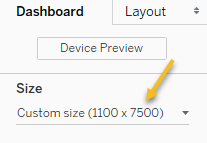
Figure 3 — Specify a dashboard that is taller than you will need it to be (in this case 7,500 pixels).
Within this dashboard we have a floating vertical container which in turn contains a horizontal container and a blank.
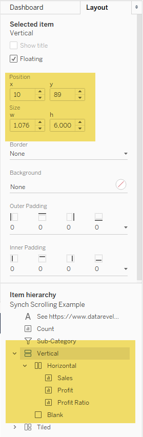
Figure 4 — Specifications for the layout container.
Here’s how the components fit together.
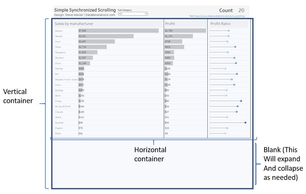
Figure 5 — Elements of the Layout container.
While the three sheets within the horizontal layout container are set to “fit entire view” within the dashboard itself, if you inspect each sheet individually you will see that they are set so that the fit is Standard and the row height for each has been manually set.
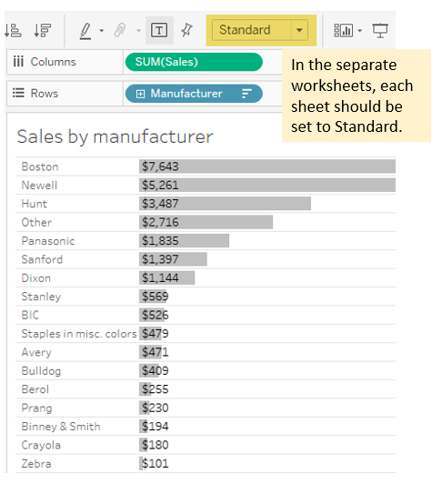
Figure 6 — When inspecting the individual sheets, the fit should be set to Standard. On the dashboard the fit should be set to Entire View.
The blank at the bottom will expand and contract as needed so that you don’t have very tall rows if your filter reduces the number of rows. This is the key thing! Instead of the rows expanding and collapsing they stay the same height. It’s the blank that expands and collapses.
Conclusion
There are two shortcomings to my approach. The first is that as you scroll down you can’t see column headings. The second is that the maximum height for a Tableau dashboard is 10,000 pixels so this technique will work for up to around 500 rows.
And what about all the blank space if you scroll down? I suspect people won’t scroll once they see there’s no data (except for folks that want to download the workbook). That said, you can always add a “footer” to the container above the blank, like this:
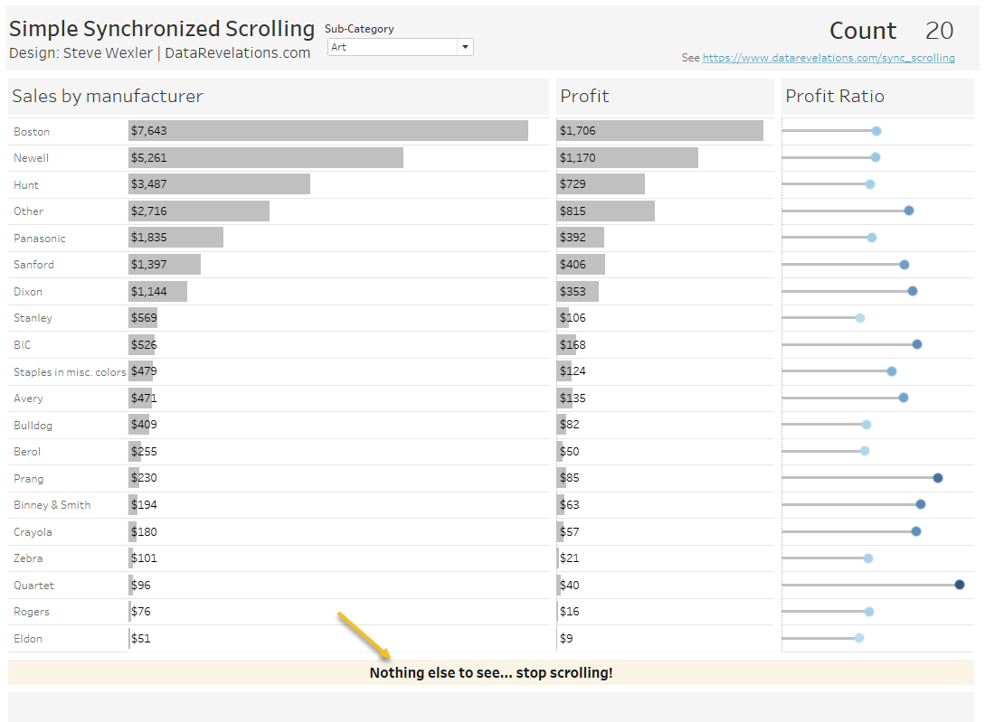
Figure 7 — It’s easy to create a footer that shows where the data ends.
I’ve used this technique in a production dashboard that has as few as two rows and as many as 120 and my stakeholders have found the scrolling easy and intuitive.
My hope is that at some point Tableau expands its worksheet formatting capabilities so it is easy to independently set the width of columns. Until then, here is a technique I hope you find useful.
Thank you, Ken Flerlage, Kevin Flerlage, Chantilly Jaggernauth, and Luke Stanke for your feedback.