And a great way to visualize Pareto analysis

December 2, 2018
Special thanks to Lindsey Poulter, Andy Cotgreave, Jeffrey Shaffer, Cole Nussbaumer Knaflic, Robert Kosara, Adam Crahen, and Joey Cherdarchuk.
Overview
While at this year’s Tapestry conference (by far my favorite conference) I had the good fortune to literally bump into Joey Cherdarchuk from Darkhorse Analytics. Holy crap! Joey is responsible for this brilliant and charming redesign of a pie chart. I encourage you to step through “Salvaging the Pie” now.
Delighted to have met the author of one of my favorite presentations, and aware that Tapestry was looking to fill some mini-presentation slots for the second day of the event, I excitedly shared Joey and his work with Cole Nussbaumer Knaflic, Robert Kosara, and Adam Crahen. As is the case whenever opinionated data visualization enthusiasts gather, a discussion transpired whether the “sleight of hand” magic was a fair makeover as Robert, Cole, and Adam pointed out that a bar chart allows for accurate comparisons among different members of a category but a pie chart, when done right (which is rare) is supposed to show a part-to-whole relationship. You’re not supposed to use a pie chart to compare slices.
In any case, this discussion got me thinking…
Where a Pie Chart Works
Please note the singular; “pie chart”, not “pie charts.”
There are some cases where a pie chart works well, particularly in tandem with a bar chart. Consider Jeffrey Shaffer’s pie chart makeover from The Big Book of Dashboards.
Here’s the original monstrosity.

Figure 1 — A “screaming cat” of a pie chart.
And here’s Jeff’s makeover.

Figure 2 — Jeff Shaffer combining a simplified pie with a bar chart a clear story that expresses to views, comparison and part-to-whole.
We’ve got the best of both worlds here. We can make an accurate comparison of all 17 categories and we can see how big the largest slice is compared with the whole.
But what if someone wants to look at something besides the top category, or what if they want to look at two or three categories combined?
Why not just highlight more slices? The problem is the pie charts are only easy to understand if the slice or slices start at 0%, 90%, 180% or 270%, with starting at 0% and moving counterclockwise being “best practice.”
Consider the three pies below that Andy Cotgreave created based on Stephen Kosslyn’s work from Graph Design for the Mind and Eye (Oxford Press, 2006.) What percentage of each circle is shaded blue?

Figure 3 — Three pies. Guessing the percentage of the blue segment is easy in the first example but difficult in the other two.
Most people get the first example without having to think hard. It’s 90-degrees / 25%.
Now look at the second pie chart. This one is harder because we’re not starting at 0%. It’s still a 90-degree / 25% slice but it’s much harder to guess the size.
Change the degrees / percentage to some random value and most people are lost. They just can’t accurately guess that percentage at all.
So, how can we create something so that whatever we select becomes a slice whose size we can easily interpret?
Time for some interactivity and Tableau set actions.
Bars, Pie Slices, and Set Actions
Here’s a version of the Pig Meat Preferences visualization with nothing selected.

Figure 4 — Pig Meat Preferences with nothing selected
Let’s see what happen when we select Bacon.

Figure 5 — Dashboard with first item selected. Notice that the selection is reflected in the pie as well.
Now let’s see what happens when we select “Ham” and “Other.”

Figure 6 — Dashboard with two items selected. Notice that the red slice in the pie reflects what has been selected.
We’re using Tableau Set Actions to color the slice red by what is in the set (whatever is selected, in this case “Ham” and “Other”) and gray by what is not in the set (Bacon and Ribs.) The pie is “sorted” so that the items in the set start at 0 degrees and move counterclockwise.
Pareto Analysis
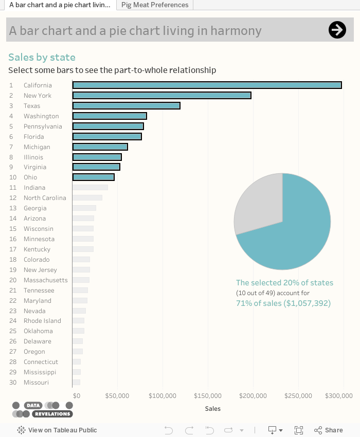
We can also apply this technique to Pareto analysis. Consider the example below where we see the sales from 49 different states in the US. There’s a total of 49 states and the top states dominate.

Figure 7 — Sales by state. No pie chart, yet.
Will the 80/20 rule apply here? That is, will 20% of the states (around 10) be responsible for 80% of the sales?

Figure 8 — The top 10 states contribute to 71% of the sales.
Not quite, but pretty close. The top ten states contribute to just under 3/4 of the sales and the pie chart makes it easy to see that we’re not quite at 75%. Incidentally, you can select any combination of bars and see the part-to-the-whole represented in the pie, as shown here.

Figure 9 — You can see the part-to-whole relationship for any selection.
Conclusion
Pie charts can, when used in conjunction with bar charts, provide a part-to-whole perspective that the bar charts by themselves cannot.
Want to learn more about Tableau set actions? This post from Bethany Lyons contains many examples, including specific instructions on how to use set actions create a part-to-whole views.
You can experiment with both examples below.