Some thoughts on functionality, beauty, crown molding, and lollipop charts
Overview
I’ve been writing a book about business dashboards with Jeffrey Shaffer and Andy Cotgreave and we’ve conducted screen-sharing sessions with dozens of people and reviewed scores of dashboards. We had a particularly enjoyable jam session with Tableau Zen Master Mark Jackson last week. When we asked him why he had done something in particular he replied with a comment that has been haunting me (in a good way) ever since:
“I look at this dashboard first thing every morning. I want to look at something beautiful.”
This really resonated with me. Mark was not tasked with making a public-facing dashboard that had to compete with USA Today infographics. He just wanted to make something that was both functional and beautiful. It made me think of waking up in a lovely room with crown molding. You don’t need crown molding, but as long as it isn’t blocking sunlight or clashing with the decor it’s certainly delightful to have crown molding.
This got me thinking about a topic I come back to often — how to make visualizations that are both functional and beautiful.
Unfortunately, this isn’t so easy and often leads to people sacrificing clarity for the sake of coolitude (see “Balancing Accuracy, Engagement, and Tone” and “It’s Your Data, not the Viz, That’s Boring” for some more thoughts on the matter). I did, however, want to share a case study that had a delightful outcome and that employed a chart type that combines the accuracy of a bar chart with a bit of the “oooh” from packed bubbles and “ahhh” from donut charts.
Marist Poll and Views of the 2016 Presidential Election
Marist Poll is one of my clients and they are tasked with providing nationwide survey results to The Wall Street Journal and NBC News. In November 2015 they conducted a poll asking people to describe in one word the tone of the 2016 presidential election. Here were the results.

Figure 1 — Marist Poll results in tabular form
Attempt One — Word Cloud
The results from the poll are very compelling but the results as depicted in the text table don’t exactly pop.
The client tried a word cloud as shown below.
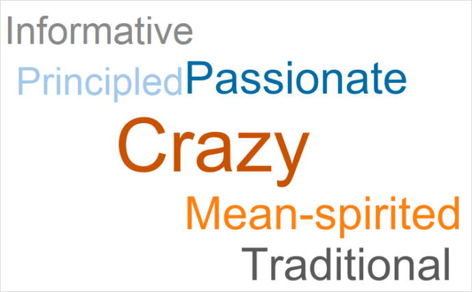
Figure 2 — Marist Poll results using a word cloud
I’ll admit that the graphic “pops” but it’s hard to make sense of the six terms let alone discern that the results for “Crazy” were almost three times greater than the next most popular term.
Attempt Two — Packed Bubbles
People love circles and this chart certainly looks “cool” but what does it tell other than that the “Crazy” circle is larger than the other circles?

Figure 3 — Marist Poll results using packed bubbles
Why not use a simple bar chart?
Attempt Three — A Simple Bar Chart
Here are the same results rendered using the chart type Tableau’s “Show Me” suggests you use when working with this type of data.

Figure 4 — Marist Poll results using a bar chart
This is a big improvement over the word cloud and packed bubbles with respect to clarity — you can easily sort the responses and see how much larger “Crazy” is than the other responses.
But the chart is a bit sterile. What can we do to make the “Crazy” pop out without distorting the information?
Attempt Four — A Colored Bar Chart
The major takeaway from the poll is that 40% of the respondents characterized the election as “Crazy.” We can make that easier to glean by making that bar a bold color and all the other bars muted, as shown here.

Figure 5 — Marist Poll results using a bar chart with one bar colored differently
I’ll confess that this does the trick for me, but the client wanted to pursue some other options so we looked into a lollipop chart.
Attempt Five — Lollipop Chart
The lollipop chart is not native to Tableau; it’s simply a dual axis chart that superimposes a circle chart on top of a bar chart that has very thin bars.

Figure 6 — Marist Poll results using a lollipop chart
This strikes me as an excellent compromise between the analytical integrity of the bar chart and the “ooh… circles” appeal of the packed bubbles. I have no qualms about using this chart type.
But there’s still something if we want the chart to have some impact.
Final Attempt — Adding a Compelling Title
A concise, descriptive title can make a huge difference in garnering attention and making a chart more memorable. In the example below the client added some graphic design artistry to the typography to make the title compelling.
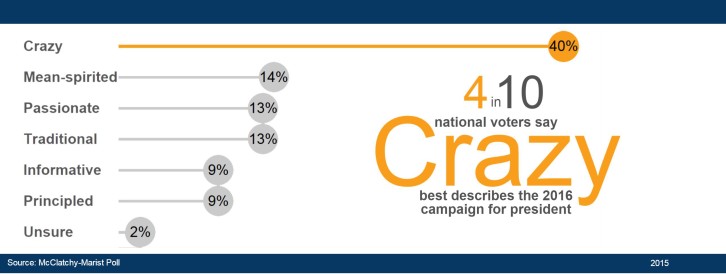
Figure 7 — Marist Poll results using a lollipop chart with compelling headline. I love this.
Conclusion
My bass-playing friends will probably agree that “groove” is more important than “chops.” That is, being able to play “in the pocket” with a rock-steady beat is more important than being able to play a great solo with a flurry of notes all over the neck.
But it sure is great to be able to do both.
The same goes for data visualization. Functionality needs to come first, then beauty.
But it sure is great to have both.
And in many cases, with a little extra effort, you can have both.
So go ahead, try putting some “crown molding” into your data visualizations and delight yourself and your stakeholders.