Overview
There are times when an attendee at one of my workshops will share a chart or dashboard that is extremely complicated, to the point where I have a lot of trouble parsing it. I point out that I am a “professional chart looker-atter” and that if I am having trouble understanding the dashboard, I fear that the intended audience may have trouble as well.
Why I Encourage Everyone to Disagree with Me
I’m quick to point out that I, too, have made charts and dashboards that I had no trouble understanding, but that my audience did. The good news is that often you can make a very minor change, and what was confusing becomes quite clear.
Here’s an example of hands-on exercise where attendees use pens and sticky notes to visualize this data set.
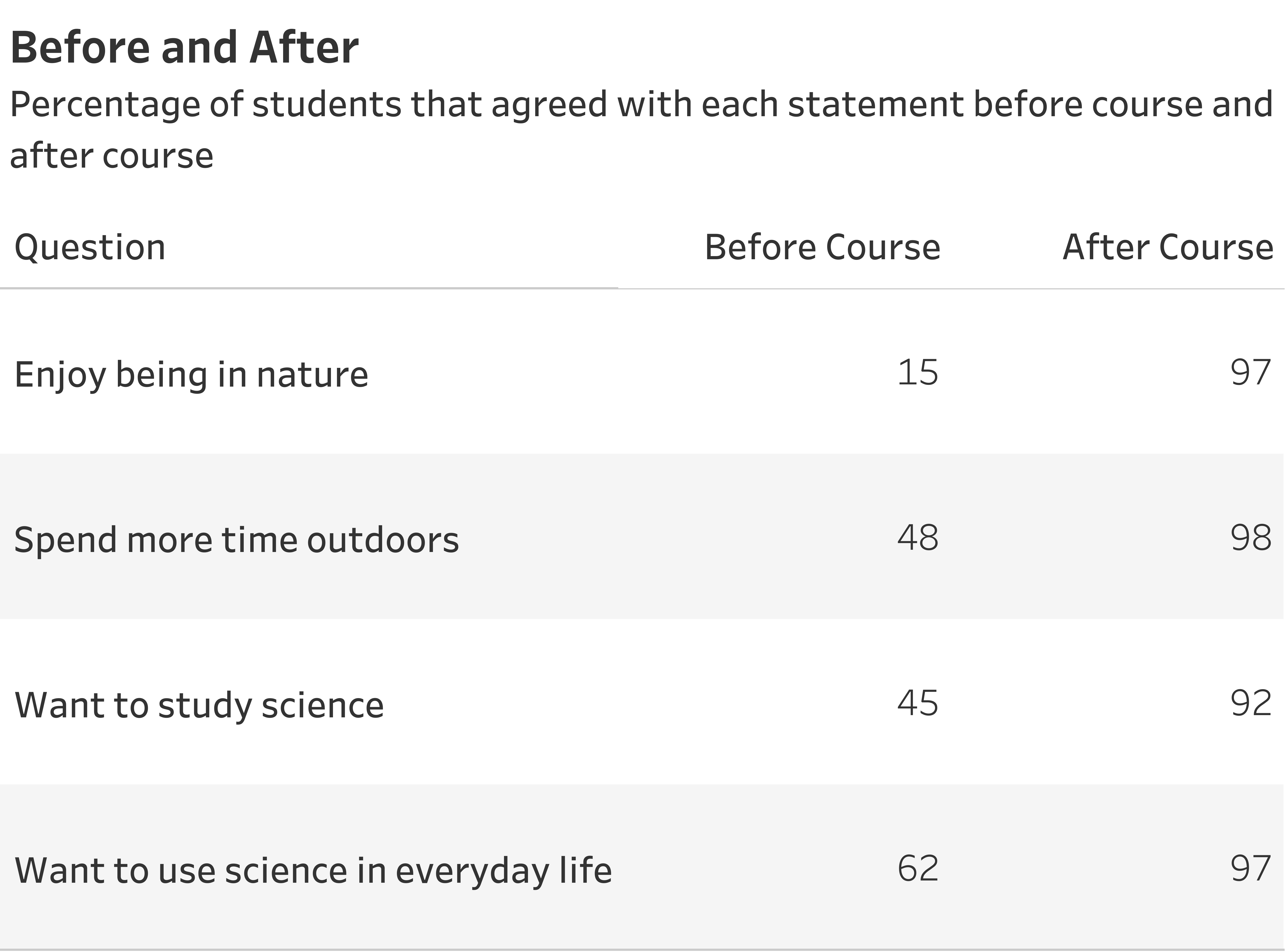
Percent of people surveyed who agreed with the statement before taking a course and after taking a course.
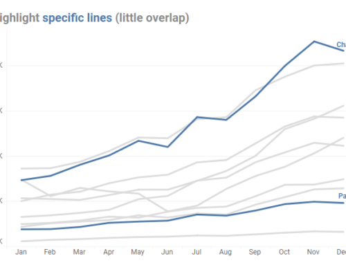
We review everybody’s work and then I show folks some approaches I would take to visualizing this data set. I start with the one below, a connected dot plot (it goes by many names, including a dumbbell chart, a barbell chart, and a gap chart.)
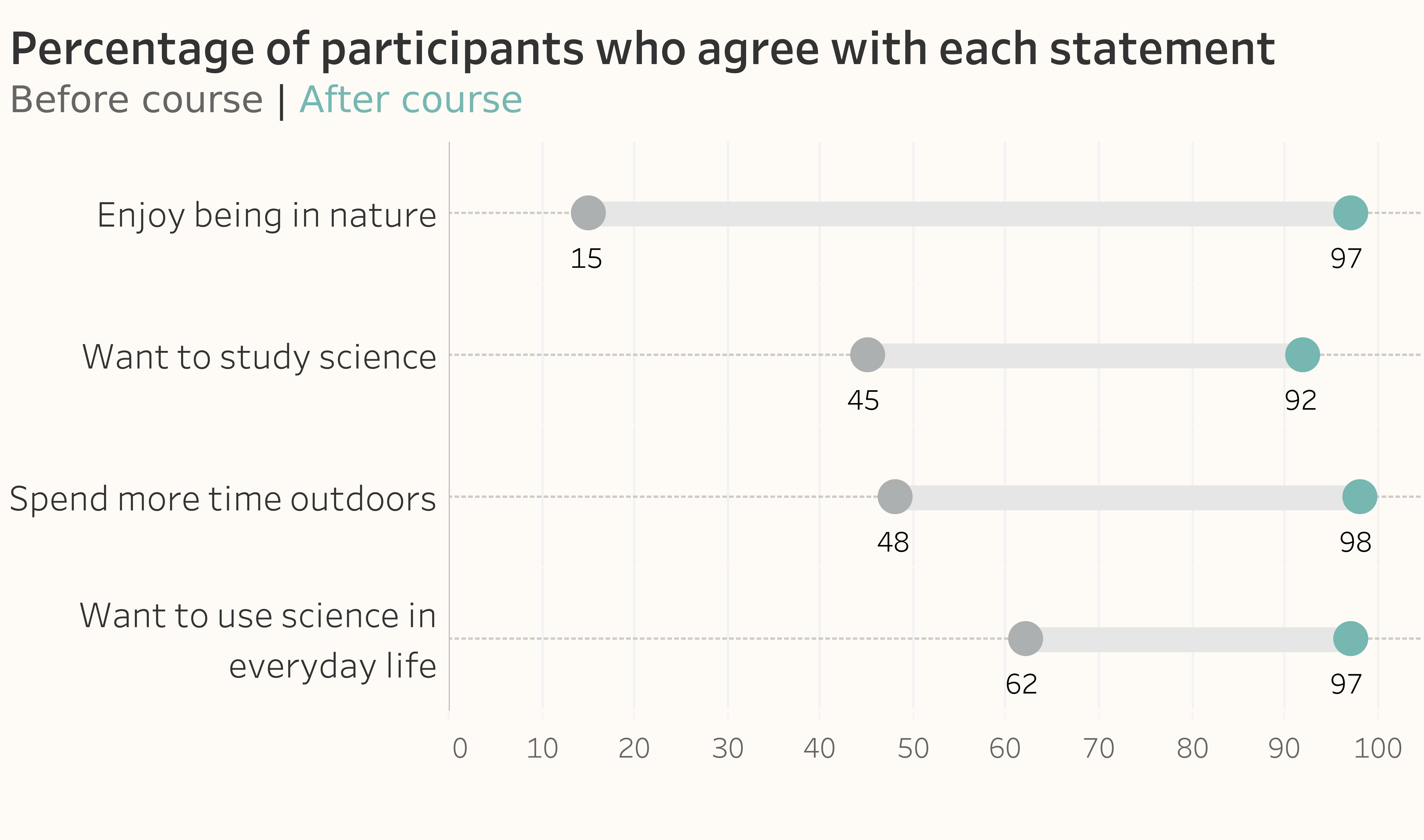
Connected dot plot (also known as a barbell chart, dumbbell chart, gap chart, or Cleveland dot plot).
The image above is my preferred approach, but I make sure to show what I think are viable alternatives, including this one.
A distributed slope area chart.
And because I am the expert with the really cool presentation clicker (and it is a seriously badass clicker), people nod and think, “Oh, I guess that’s good.”
The next day is typically a sequence of masterclasses in which I work with small teams to help them implement the theory of the workshop into their dashboards. On one of those second days, one participant, Ivana Ferrer, said she had a problem with the distributed slope area chart. She found it confusing because she thought she was being asked to compare the area of four trapezoids.
Yikes. She had a point.
I was so comfortable with the distributed slope area chart, so I thought others would be, too. I was not seeing my visualizations through fresh eyes.
I followed up and asked if this simpler distributed slope chart below would be less confusing, and she said it worked well for her (other people in the group agreed).
A distributed slopegraph.
Lesson learned. Just because something may be clear to me doesn’t mean it will be clear to others. Now, at the beginning of all my workshops, I encourage participants to disagree with me as it paves the way for good discussions (and better dashboards.)
I Love / Hate that I Can Understand This
If I were to ask you how you would visualize times series data, you’d probably offer the default of a line chart. It’s pretty ingrained that dinosaurs go to the left and Star Trek goes to the right.
Here’s a typical line chart that shows sales over time.
A line chart showing sales trends over a 12-month period.
One of the great things about bar charts is that you can flip them 90 degrees and still be able to read them. What happens when we flip this line chart 90 degrees?
Timeline flipped 90 degrees.
Yikes! That chart that was so easy to read when it went left to right is very difficult to interpret when it goes from top down.
At least it was difficult for me to interpret. Now I have no problem with it.
Yes, I’ve started to get used to seeing time turned on it’s side. As one of my fellow authors of The Big Book of Dashboards, Andy Cotgreave points out, we can blame my newfound skill on this:

So, why am I not celebrating that I can read the rotated time charts so easily?
Well, who cares if I can understand it? The essential question about any chart or dashboard is whether the intended audience will understand it.
Simple is Good. Simplistic is Not.
I’m not saying that every chart or dashboard you create has to be so simple that it doesn’t require explanation. Sometimes you’ll need to employ a chart that might require some handholding (the Churn dashboard in The Big Book of Dashboards is a great example of this). Yes, you want to make it simple, but not simplistic.
But realize that the more adept the chart creators are at reading charts, the more important it is that they are in touch with, and in tune with, their stakeholders. Better yet, they should be collaborating with them.
If I can leave you with one guiding principle, it is that for your intended audience, you want to provide the greatest degree of understanding with the least amount of effort. I discuss this in depth, along with the need for audience empathy and collaboration in chapters 6 and 8 of The Big Picture: How to Use Data Visualization to Make Better Decisions—Faster. Click here to download a sample or check out the book page on Amazon or Walmart.