Overview
As readers of this blog know, I have my problems with donut charts.
That said, I acknowledge that they can be cool and, under certain circumstances, enormously useful.
On a recent flight I was struck by how much I liked the animated “estimated time to arrival” donut chart that appeared on my personal TV screen. An example of such a chart is shown in Figure 1.

Figure 1 — Donut chart showing progress towards completion of a flight.
I find this image very attractive and very easy to understand — I can see that I’m almost three-quarters of the way to my destination and that there are only 49 minutes left to the flight.
So, given how clear and cool this is, why not use them on a dashboard? And if one is good, why not use lots of them?
It’s the “more than one” situation that may lead to problems.
Trying to make comparisons with donut charts
The flight status chart works because it shows only one thing only: a single item’s progress towards a goal.
Let’s see what happens when we want to compare more than one item.
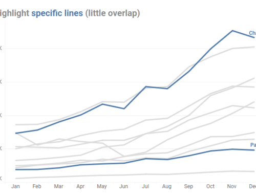
Consider the chart in Figure 2 that shows the placement rates for Fremontia Academy.

Figure 2 — Donut chart showing placement percentage.
A 95% placement percentage is really impressive. Is that better than other institutions? If so, how much better is it?
Figure 3 shows a comparison among three different institutions using three different donut charts.

Figure 3 — Three donut charts displaying placement percentages for three different institutions.
Before digging deeper let’s replace the three separate donuts with a donut-within-a-donut-within-a donut chart (Figure 4.)

Figure 4 — A concentric donut chart (also called a “radial bar chart” or a “pie gauge.”)
“What’s the problem?” you may ask, “these comparisons are easy.”
While you may be able to make the comparisons you are in fact working consierably harder than you need to be.
Really. Let me prove it to you.
Let’s suppose you wanted to compare the heights of three famous buildings: One World Trade Center, The Empire State Building, and The Chrysler Building (Figure 5).

Figure 5 — Comparing the size (in feet) of three large buildings.
Now that’s an easy comparison. With virtually no effort we can see that One World Trade Center (blue) is almost twice as tall as The Chrysler Building (red).
Now let’s see how easy the comparison is with donuts (Figure 6.)

Figure 6 — Three large buildings twisted into semi-circles.
Here are the same buildings rendered using a concentric donut chart (Figure 7).

Figure 7 — Three skyscrapers spooning.
Yikes.
So, with this somewhat contrived but hopefully memorable example we took something that was simple to compare (the silhouettes of buildings) and contorted them into difficult-to-compare semi-circles.
With this in mind, let’s revisit the Placement example we saw in Figure 3.
Here is the same data rendered using a bar chart.

Figure 8 — Placement percentage comparison using a bar chart.
The comparison is much easier with the bars than with the donuts / semi-circles. You can tell with practically no effort that the blue bar is approximately twice as long as the red bar, even without looking at the numbers.
Indeed, that’s a really good test of how clear your visualization is: can you compare magnitude if the numbers are hidden?
Pop quiz — how much larger is the orange segment compared to the red segment?

Figure 9 — Trying to compare the length of donut segments is difficult.
Now try to answer the same question with a “boring” bar chart.

Figure 10 — Comparing the length of bars is easy.
With the circle segments you are squinting and guessing while with the bars you know immediately: the orange bar is twice as large as the red bar.
More downsides for donuts
In addition to comparisons being difficult, how would you handle a situation where you exceeded a goal? For example, how do you show a salesperson beating his / her quota? With a bar chart you can show the bar going beyond the goal line (Figure 11).

Figure 11 — With a bar chart it’s easy to show more than 100% of goal.
How do you show this with a donut chart?
Rhetorical question. You can’t.
Conclusion
If you only have to show progress towards a single goal and don’t need to make a comparison then it’s fine to use a donut chart. If you need anything more complex you should use a bar chart as it will be much easier for you and your users to understand the data.
Special thanks to Eric Kim for creating the building images.