November 3, 2019
Overview
Anyone that follows this blog or visits datarevelations.com to read articles on visualizing survey data know that I spend a lot of time thinking about how to present Likert scale data and what to do with neutral responses.
I remain a stalwart supporter of some type of divergent stacked bar chart, but I now advocate placing the neutral values (the mid-point responses when dealing with odd vs even Likert scales) off to one side.
In this post I’ll present the two views I recommend, then get into the specifics on how to build the two views using Tableau.
Note: For all the examples shown below we use a five-point Likert scale with the following sentiment assignments:
1: Very Negative
2: Negative
3: Neutral
4: Positive
5: Very Positive
Scenario and solutions
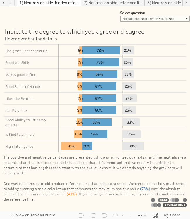
Here’s the results for the question “For the following statements, indicate the degree to which you agree or disagree.”

Figure 1 — Likert scale survey data
If I did not know my audience and did not have an opportunity to show them what I think would be a richer, albeit less intuitive solution, I would go with the approach shown below.

Figure 2 — Simple divergent stacked bar chart with neutrals on the side.
Hovering over a bar provides details, as shown here.

Figure 3 — Hovering over a bar shows details.
If I knew my audience could “handle it” or if I had time to show them the benefits, I would show all levels of sentiment for positive and negative, as shown below.

Figure 4 — Showing four levels of negative and positive sentiment with the stronger responses hugging the baseline.
So, why the funky ordering going from disagree to strongly disagree (oranges), then strongly agree followed by agree (blues)?
Placing the stronger responses along the baseline makes them much easier to compare. Most people want to see overall positive or just compare the strong positives (the darker blues). I can’t imagine wanting to compare just the light blues.
When you compare just dark blues some interesting things pop out. “Can Play Jazz” is ranked sixth overall, but if we just look at Strongly agree…

Figure 5 — Comparing responses for people who strongly agree.
… we see that this item is tied for first along with “Makes good coffee.”
Update: I showed this post to my friend and Likert scale sparring partner, Daniel Zvinca, who suggested another approach that I include in the embedded Tableau workbook. Here I separate the positives, neutrals, and negatives into three separate columns. Note that this view is very easy to render in Tableau.

Figure 5a — Three-column approach.
Building the simpler view
Now that we’ve seen the two divergent approaches, how do we build them in Tableau?
Let’s look under the hood at the simpler version.

Figure 6 — A dual axis chart (1) for the negative and positive values and a second chart (2) for the neutrals.
Here we see a dual axis chart (1) that displays the orange negatives and the blue positives, and a second chart (2) that displays the neutrals. I’ll explain why we use a dual axis chart in a moment.
The field [% Positive] is defined as
SUM(
IF [Value]>=4 then 1
else 0
END)/
SUM([Number of Records])
This translates as “if the response is 4 or 5 make this a 1, add all the 1s, then divide by the number of people who responded.”
The field [% Negative] is defined as
SUM(
IF [Value]<=2 then -1
else 0
END)/
SUM([Number of Records])
This is similar to the field for positives, but only takes and 1s and 2s into account and assigns a negative value (so that the bars will go to the left.)
I’ll leave it to the reader to figure out the [% Neutrals] field.
What’s wrong with this picture?
Have a look at Figure 6 above and look at the length of the Neutral bar for the last item listed (High Intelligence) and compare it with the Positive response for the first item in the list (Has grace under pressure).
Yikes! The 39% bar is longer than the 73% bar!
This is happening because Tableau is trying to do us a favor by dynamically making the axis as wide as it needs to be to accommodate to the largest value, but in this case we need a normalized axis so that the bar length for the neutrals is in sync with the bar length for the positives and negatives.
By the way, this is why we have the dual axis chart as if we had three separate measures on columns we’d have to find a way to make them all have the same axis length.
So, how do we futz with the axis for the neutrals? We could right-click the axis and hard code the value, but what happens if we underestimate?
What we need to do is make the axis the sum of the lowest minimum value (41%) plus the highest maximum value (73%) yielding 114%.
Why not hard code this value? Well, what happens if we apply filtering and the max and min values change?
We need to come up with a calculated field and use that as a hidden reference line that will pad the axis to accommodate said line.
Note: We could place a 100% positive reference line, a 100% negative reference line and a 200% neutral reference line to accommodate the most extreme possibility, but this wastes a lot of space.
Determining the sum of the min plus the sum of the max
Here’s the formula for the field [Windows Min Negative]:
WINDOW_MIN([% Negative])
Here’s the formula for the field [Windows Max Positive]
WINDOW_MAX([% Positive])
Finally, here’s the formula for the field [Neutral Reference Line (Table Calc)]
[Window Max Positive]+ABS([Window Min Negative])
The screen show below shows the reference line we use to pad the axis. Normally it would be hidden.

Figure 7 — The reference line pads the axis so it is the sum of the absolute value of the minimum value plus the maximum value.
Right clicking the reference line shows how it is calculated. Notice that we need to place it on Detail for this to become available in the Reference line dialog box.

Figure 8 — Reference line dialog box.
Are we there yet?
If you only have one set of Likert scale questions in your dashboard you can skip to the bottom of this post and interact with the workbook and / or download it and see how everything is built.
If, however, you give your users the ability to switch among different Likert groups, we may want to make our visualization a bit smarter. Consider the dashboard below where we see how people respond to the question “Indicate how important these things are.”

Figure 9 — Responses to questions that ask about the importance of various features.
Notice that the longest bar is 89%.
Now let’s see what happens if we revert to the previous question.

Figure 10 – Responses to questions indicating agreement with certain statements.
Here the longest bar is 73%, but the length of the bar is in fact the same as other question where the top response was 89%.
Again, Tableau is “doing us a favor” by making the axis just as long as it needs to be to accommodate the largest and smallest bars for whatever set of results we’re viewing.
But we don’t want that here. We want the axis to consider ALL the Likert scale questions and figure out the maximum and minimum values across all of them.
In this case a table calculation won’t suffice, and we’ll need to create a new calculation to add both the max value and the min values, as shown below.

Figure 11 — Padding the axis by looking at the max and min values across all related questions and not just the current question.
Notice that there’s a filter called Qtype and it is set to Likert.
Here’s the Level of Detail (LoD) expression that will determine the maximum positive value.
{FIXED [Qtype]: MAX({ INCLUDE [Question ID]: [% Positive]})}
This is a nested expression. The MAX portion indicates that for all Question IDs, which we indicate with the INCLUDE statement, return the MAX of [% Positive].
The FIXED portion indicates that we don’t just want to look at the current collection of questions determined by the Question Grouping filter, but we want to look across all question that are set to Qtype=Likert.
The LoD expression that determines the minimum reference line using a similar calculation, and the Neutral reference line adds the absolute value of the two values together.
Note: A special thank you to Mina Ozgen whose post on converting table calculations to LoD expressions helped me determine the calculation we would need for this.
How do you show all the levels of sentiment?
As I mentioned earlier, I personally prefer seeing all levels of sentiment with the most concentrated values hugging the baseline. Here’s a look under the hood to see how this is built.

Figure 12 — How the multiple level of sentiment view is built. Notice that for the field [Pos or Neg 4-way], Labels is on color.
This is very similar to what we had before, but there is a single field, [Pos or Neg 4-way], that is responsible for the divergent stacked bar chart. This is defined as
SUM(
IF [Value]>=4 then 1
ELSEIF [Value]<=2 then -1
END)
/SUM({Exclude [Labels]: SUM([Number of Records])})
The translation of this to English is “if the response is a 4 or a 5, count it as 1; if the response is a 1 or a 2, count it as negative 1. Add everything up and divide it by everyone that responded.”
The {Exclude} statement makes sure Tableau doesn’t perform a separate count for each of the five levels of sentiment.
A few important notes
While the 1s and 2s are negative the percentages display as a positive number. If we look at the formatting for [% Negative] we’ll see this custom format.

Figure 13 — Custom number format.
Tableau uses an Excel like syntax where the semi-colon delimits how to format positive numbers, then negative numbers, then zero values (which are not specified in this example.)
When specifying the reference lines to pad the axis in the examples where you show all levels of sentiment, make sure Total is specified.

Figure 14 — Specification for the overall positive reference line.
Conclusion
No matter whether you prefer showing separate or combined degrees of positive and negative sentiment, I think placing the neutrals over the to side makes it easy to see where people are ambivalent about certain survey questions.
Here is an embedded Tableau workbook that contains the different approaches we’ve explored in this article.