Overview
September 6, 2021 update: A big thanks to Chris Lay and Daniel Zvinca who chimed in on a variety of issues, the most important of which is that the margin of error is very large with a low response count. I’ve added an option to hide marks where the number of responses is fewer than 75. The gap chart approach is advocate works great, but it only works if the gaps are big and/or the response count is large enough so that the differences are statistically significant.
As I assert in this post about displaying Likert data, my “go to” approach to any sentiment data is an “inside-out” divergent bar chart with the neutrals in a separate column, as shown here.
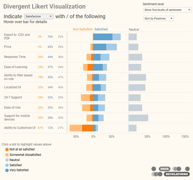
Figure 1 — My “go to” approach to visualizing Likert-scale data.
If you read the very thoughtful comments you’ll see that not everyone buys into this approach. I don’t want to get into a discussion here because whether you like inside-out divergent, default sort-order divergent, or 100% stacked bar, all of them are going to run into problems when you want to show the differences in responses based on demographic breakdown.
Look at what happens if we want to show the current view broken down by Generation.
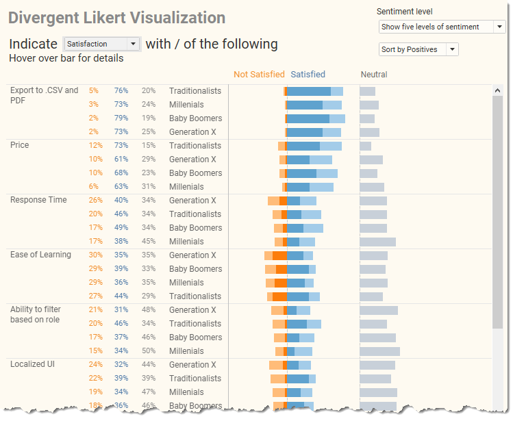
Figure 2 — Divergent Likert-scale data broken down by Generation.
Yikes… that’s a lot to parse.
I experimented with showing the overall results and then allowing people to explore each facet, one at a time, but decided that would place a lot of burden on the audience to find an “aha.”
I think showing Top 2 Boxes and Bottom 2 Boxes would work better.
Top 2 and Bottom 2 Boxes
“Top 2 Boxes” refers to the respondents who selected, well, the top 2 choices (e.g., “satisfied” and “very satisfied”, “agree” and “strongly agree”, etc.). That is, the folks who selected a four or a five on a five-point Likert scale.
“Bottom 2 Boxes” refer to the respondents who selected a one or a two.
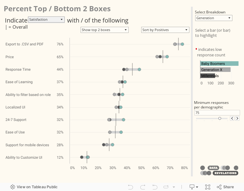
I visualize the top / bottom two boxes using a gap chart (aka, “connected dot plot”, “barbell chart”) as shown here.
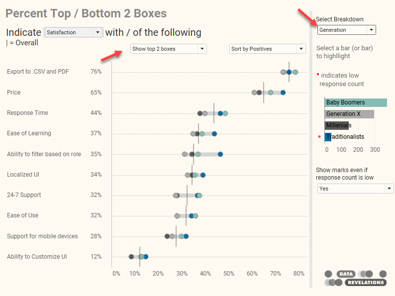
Figure 3 — Top / Bottom 2 Boxes visualizing using a gap chart.
You can show either the Top or Bottom 2 boxes and you can select the demographic.
Note that if your selected demographic contains a lot of elements, the results can get cluttered. In this case it might make sense to highlight where some of the more interesting gaps are. For example, below I highlight the differences between Baby Boomers and Millennials.
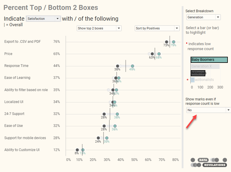
Figure 4 — Highlighting the differences between Baby Boomers and Millennials.
Note that I’m not comparing Traditionalists as the response count is very low and that will make the margin of error very high.
Yes, but what about…
The top one box? The bottom one box?
The top three boxes?
What about just showing the difference among the respondents who are undecided?
These are certainly valid considerations but I’m going to leave it to somebody else to download the workbook and add those options.
In the meantime, the working dashboard is shown below. Feel free to kick the tires and download if you want to see how it’s built.
And do share your thoughts in the comments section.
Final thought: The gap chart is a good choice to show differences among different population segments, which is why and you’ll see Pew Research and The Economist use this chart a lot. That said, it only works if you have an adequate number of responses in the segments you want to compare, and/or when the gaps are large.