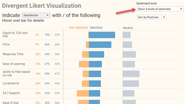
divergent stacked bar

How to visualize Likert scale data broken down by different demographics

By |2021-09-06T16:58:48+00:00September 1st, 2021|Business Visualizations, General Discussions, Visualizing Survey Data|

Overview September 6, 2021 update: A big thanks to Chris Lay and Daniel Zvinca who chimed in on a variety of issues, the most important of which is that the margin of error is very large with a low response count. I've added an option to hide marks where the number of responses is fewer [...]

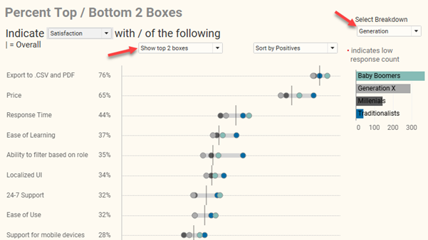
How to visualize Likert scale data in Tableau

By |2021-08-16T16:42:45+00:00August 16th, 2021|Business Visualizations, General Discussions, Visualizing Survey Data|

Note: A big thank you to Daniel Zvinca who wrote a wonderful article advocating the “inside-out” approach that I recommend here. Overview My preferred way to visualize Likert-scale data in Tableau is a little cumbersome to create and I suspect some audiences won’t find it intuitive. But it’s worth taking the effort to build, and [...]

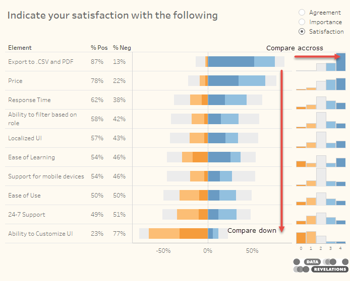
Rethinking the divergent stacked bar chart — placing the stronger views in the center

By |2020-02-17T02:20:59+00:00April 1st, 2018|Business Visualizations, Visualizing Survey Data|

April 2, 2018 Overview Followers of the Data Revelations blog and website know that my “go to” visualization for Likert scale data is a divergent stacked bar chart. Earlier this year there was some debate about whether this is a better approach than a stacked bar chart. I'm still completely in favor of the divergent approach, [...]

There is no perfect chart and there is no perfect dashboard

By |2016-06-22T13:31:54+00:00June 22nd, 2016|Business Visualizations, General Discussions, Makeovers|

Overview My obsession with finding the best way to visualize data will often infiltrate my dreams. In my slumbers I find myself dragging Tableau pills in an ongoing pursuit to come up with the ideal dashboard that shines light on whatever data set has invaded my psyche. But is the pursuit of the perfect dashboard [...]

Title