Visualizing Survey Data
Using Tableau
Using Tableau
On-Demand Course
$299 for one year of access
Interested in enrolling a group of people? Click Here
Overview
I’ve been using Tableau to visualize survey data for more than 15 years and I’ve trained thousands of people in hundreds of organizations how to see and better understand their survey data.
Now you can learn how to visualize survey data using Tableau, too.
At your own pace.
At any time.
I’m delighted to share that I am now offering my Visualizing Survey Data using Tableau course — ON DEMAND!
NEW! I host live “ask me anything about visualizing survey data” sessions once a month. This is included in your registration fee.
$299 for one year of access
Interested in enrolling a group of people? Click Here
Topics we will explore include
$299 for one year of access
Interested in enrolling a group of people? Click Here

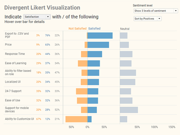
An example of the type of Likert-scale visualizations we will create.
Course length and what you get
The course will take 5 to 8 hours to complete. You get access to three hours of video content (for a year from when you start the course), and a personalized, 111-page instruction guide.
Requirements
A laptop / computer with the following software installed:

Tableau Desktop
2020.2 or later

Tableau Prep
2020.2 or later

Microsoft
Excel

Prerequisites
Participants should have at least intermediate level understanding of Tableau. For example, you should be able to do the following:
What people are saying about the class
A huge thank you to Steve for offering this class. I have struggled with trying to learn Tableau and this class was a godsend. Steve explains things in accessible terms and step-by-step instructions so that I feel like I can really use this software after all.
Given Steve’s in-depth practical experience and discussion of many highly relevant real world examples attendees will come away with a full understanding of all steps required to analyze survey analysis in the most effective and flexible way. This class is a must for anyone who is analyzing survey data.
I’ve been to every Tableau conference since the first, and discovered Steve and his amazing talents early on. Since then, I’ve never missed a presentation. I always learn something useful and innovative about survey analysis. I finally decided to take one of his on-line classes this year, and was really glad I did. It was an opportunity to learn at the foot of a master. Beyond the class itself, Steve was willing to spend time with me personally to walk me through some problems I’d been wrestling with. He has a real desire to teach others what he knows, and is incredibly generous with his time and knowledge.
Your class was an eye-opener on how to better structure our data, leverage calculations/visualizations that are more applicable to our data (% selected, % top rating, etc.), and generally make sense of our data.
About the Instructor

Steve has worked with ADP, Gallup, Johnson & Johnson, Deloitte, ExxonMobil, Convergys, Consumer Reports, The Economist, ConEd, D&B, Marist, Cornell University, Stanford University, Tradeweb, Tiffany, McKinsey & Company, and many other organizations to help them understand and visualize their data. Steve is a five-time Tableau Zen Master, Iron Viz Champion, and on the advisory board to the Data Visualization Society.
His presentations and training classes combine an extraordinary level of product mastery with the real-world experience gained through developing thousands of visualizations for dozens of clients.
Steve has taught thousands of people in both large and small organizations and is known for conducting his seminars with clarity, patience, and humor.
