

Watch as Jeffrey Shaffer, Steve Wexler, Amanda Makulec, and Andy Cotgreave debate the good, the bad, and the “scaredy-cats” of data visualization.
We now have a dedicated Chart Chat website where you can see previous episodes and register for upcoming episodes.
Watch Previous Episodes
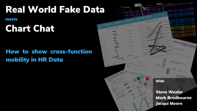
Cross-Function Mobility Recap
Here's a recording and recap of Real World Fake Data meets Chart Chat: Showing cross-function mobility in HR data https://www.youtube.com/live/ZAxzJwyBuOk?feature=share 0:00 Introduction and Agenda 2:06 Backstory / Data 10:45 [...]
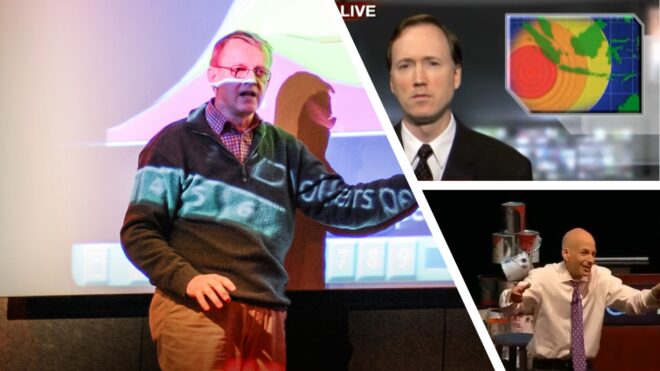
2006—A Banner Year for Presentations Featuring Data Visualization
In chatting with Seth Godin and Jasper Croome during one of last year’s Chart Chat episodes I realized that three of my all-time favorite presentations and videos that feature data visualization were [...]
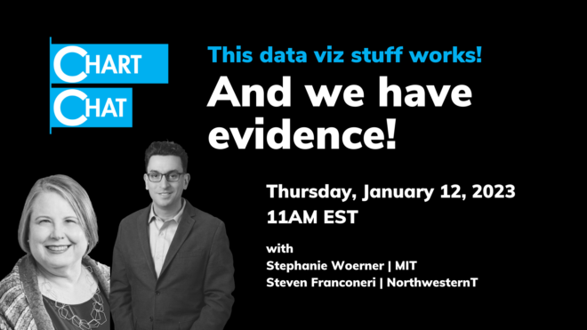
Chart Chat Live — Round 37
The Chart Chat hosts welcome guests Stephanie Woerner from MIT and Steven Franconeri from Northwestern and discuss their research proving that good data viz WORKS. https://www.youtube.com/live/he768qIHbxw [...]
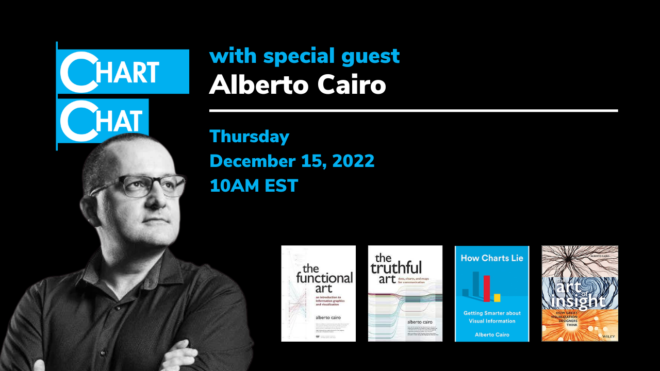
Chart Chat Live — Round 36
The Chart Chat hosts welcome guest Alberto Cairo, author, professor, illustrator and hedonist. The quintet discuss and debate data visualization books and issues around "rules" in data visualization. https://youtu.be/Jxxzzvyhz04 [...]
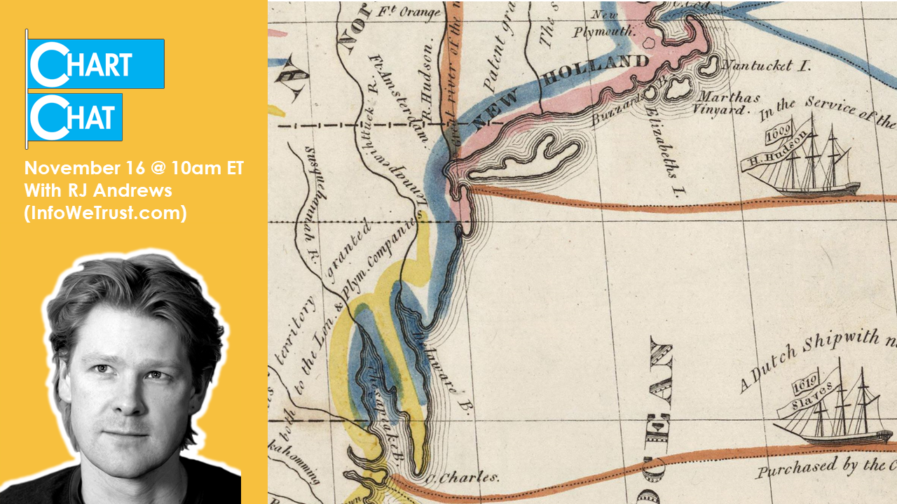
Chart Chat Live — Round 35
The Chart Chat hosts welcome guest RJ Andrews, founder of InfoWeTrust, historical data visualization scholar, modern-day data viz practitioner, and curator of the amazing Visionary Book series. https://youtu.be/_jid3-KaN3E [...]
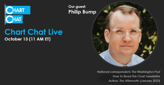
Chart Chat Live — Round 34
The Chart Chat hosts welcome guest Philip Bump, National Correspondent for The Washington Post and creator of the "How to Read This Chart" newsletter. Bump and the hosts each [...]
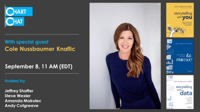
Chart Chat Live — Round 33
The Chart Chat hosts welcome guest Cole Nussbaumer Knaflic who discussed her new book, Storytelling with You. https://youtu.be/2MVJhgQjtVc
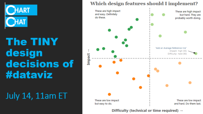
Chart Chat Live — Round 32
The Chart Chat hosts discuss the tiny -- and not so tiny -- design decisions that go into crafting effective data visualizations. https://youtu.be/3qa94Yxt8Ks

Chart Chat Live — Round 31
The Chart Chat hosts speak with guests Seth Godin and Jasper Croome about creating the charts for The Carbon Almanac. https://youtu.be/Kz_EFINGXXY

Chart Chat Live — Round 29
Amanda Makulec interviews Steve, Jeff, and Andy as they reflect on The Big Book of Dashboards, five years later. https://youtu.be/kVh7I6gFB_c
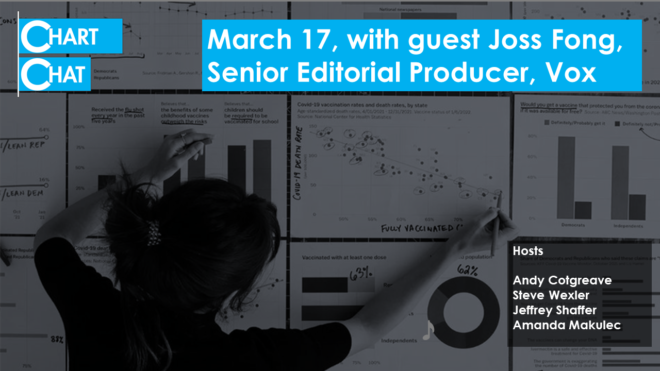
Chart Chat Live — Round 28
A look behind the scenes of the making of Joss Fong's amazing Pandemic Polarization video for Vox.com. https://youtu.be/RhglcxOp9Xo
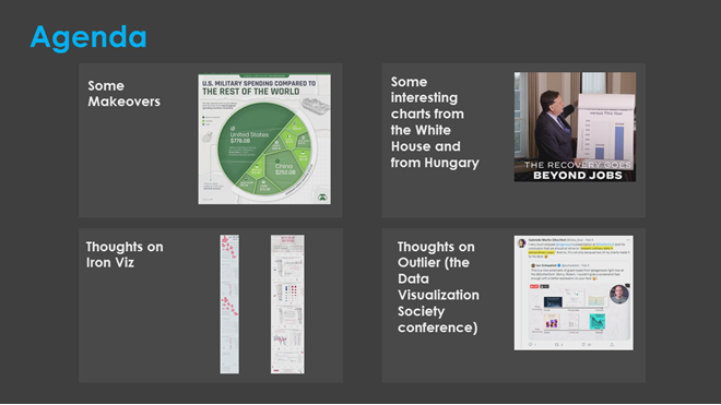
Chart Chat Live — Round 27
Different approaches to making over a Veronoi treemap, some disturbingly similar charts from Viktor Orban and Joe Biden, thouhts on Iron Viz, and reflections on Robert Kosara's 2022 Outlier [...]

