

Watch as Jeffrey Shaffer, Steve Wexler, Amanda Makulec, and Andy Cotgreave debate the good, the bad, and the “scaredy-cats” of data visualization.
We now have a dedicated Chart Chat website where you can see previous episodes and register for upcoming episodes.
Watch Previous Episodes
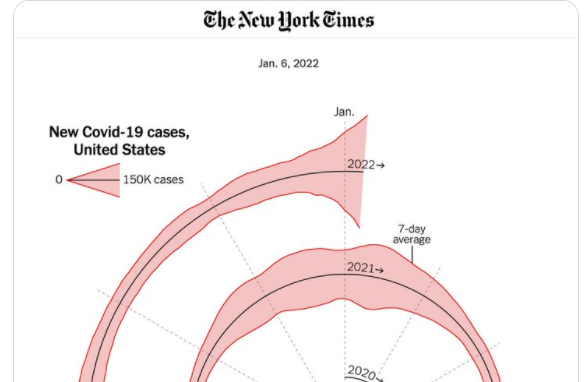
Chart Chat Live — Round 26
A retrospective of some of our favorite visualizations and tools from 2021 and a discussion of the New York Times Covid "Spiral" chart that went viral. https://youtu.be/xchgcYNTs98 [...]

Chart Chat Live — Round 25
Our discussion with James Cheshire and Oliver Uberti. James and Oliver share how they developed some of the striking illustrations for Atlas of the Invisible. https://youtu.be/YwgqWaV5lZw [...]
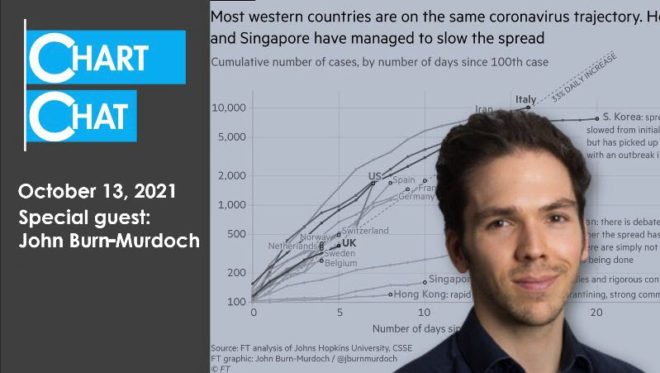
Chart Chat Live — Round 24
Our discussion with John Burn-Murdoch, Chief Data Reporter at The Financial Times. John takes us behind the scenes in the creation and evolution of some of the most influential [...]

Chart Chat Live — Round 23
Our discussion with inventor, data visualization pioneer, and industry icon, Ben Shneiderman. https://youtu.be/nrLutRyr1L4

Chart Chat Live — Round 22
Ros Pearce, data journalist at The Economist, visits Chart Chat. It was a great discussion. https://youtu.be/JPfzinma9QU
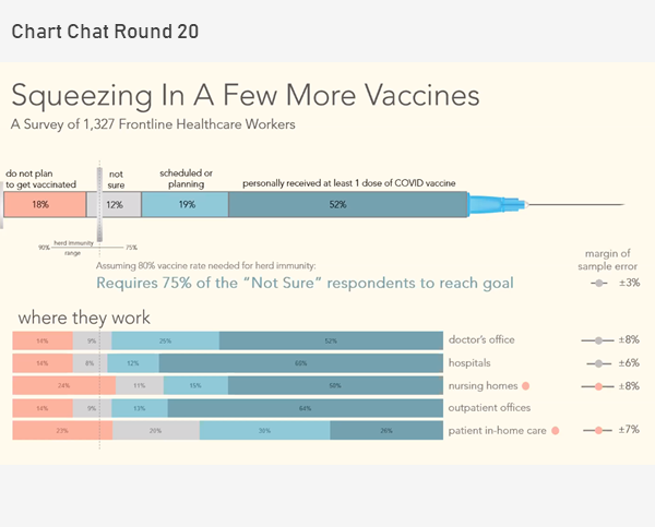
Chart Chat Live — Round 20
Revisit the political divide in the US, take a deep dive into a Washington Post visualization about vaccine intentions among healthcare workers, showcase some stellar social media data visualization [...]
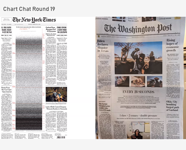
Chart Chat Live — Round 19
We discuss bar-in-bar charts, scaredy-cats and TURDs, great work from the New York Times, how to visualize 500,000 deaths, and the orange/blue debate. https://youtu.be/kco5U5wgDfY
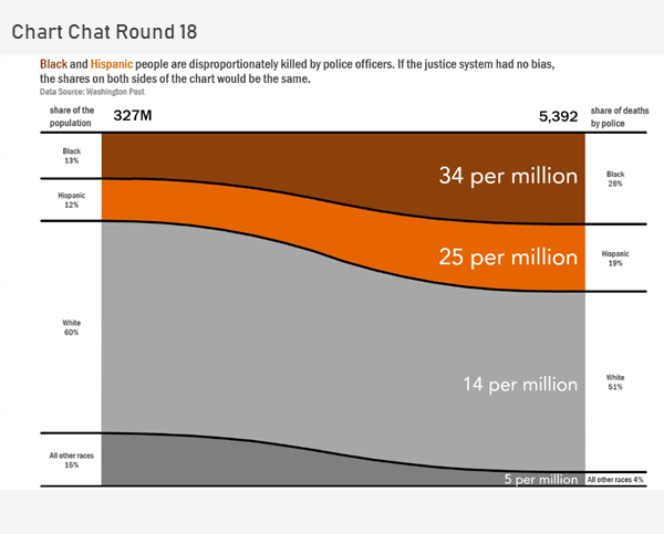
Chart Chat Live — Round 18
In this Chart Chat we reflect on Sankey and proportion charts, unit charts, unemployment charts and presenting complex data. https://youtu.be/IIirXyOcbeQ
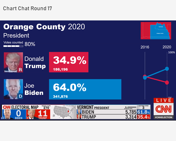
Chart Chat Live — Round 17
In this Chart Chat we reflect on a night of election vizzes, the lack of innovation and clarity (with the exception of the tie gauge, frownometer, and chipped cartogram) and [...]
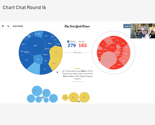
Chart Chat Live — Round 16
In this Chart Chat we discuss election trackers and showing uncertainty. https://youtu.be/STk6n3JJGvE
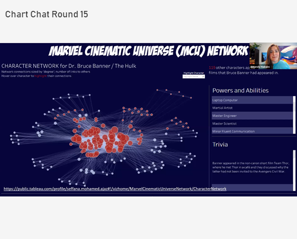
Chart Chat Live — Round 15
In this Chart Chat we discuss waffle and unit charts, Iron Viz, a new approach to visualizing a P&L statement, and contact tracking visualizations. https://youtu.be/-q3ZTmWkQV8 [...]
Chart Chat Live — Round 14
In this Chart Chat we interview Len Kiefer, Deputy Chief Economist at Freddie Mac, explore problems with how the Georgia Department of Health visualizes Covid-19 data, and a discussion [...]

