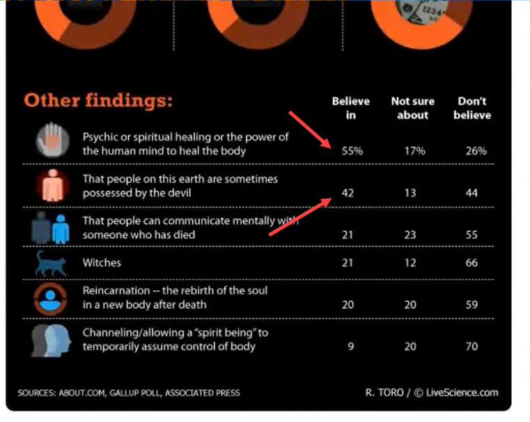
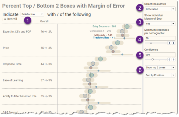
swexler

About Steve Wexler

This author has not yet filled in any details.
So far Steve Wexler has created 193 blog entries.

Chart Chat Live — Round 20

By |2021-04-08T15:11:26+00:00April 8th, 2021|Chart Chat, Videos|

Revisit the political divide in the US, take a deep dive into a Washington Post visualization about vaccine intentions among healthcare workers, showcase some stellar social media data visualization projects, and review Robert Kosara's video on the famous Minard chart. https://youtu.be/kXn3aqGIOXk

Try to Avoid Color Legends

By |2021-04-04T19:04:33+00:00April 4th, 2021|General Discussions, Makeovers|

Let me show you a few techniques that will allow you to ditch color legends and in so doing make it easier for your audience to understand the charts you create. Direct Labeling Lines Here’s a “before” picture of a simple line chart with a color legend. Figure 1 - Line chart with color legend. [...]

Screaming Cats, Scaredy-Cats, and TURDs

By |2021-01-18T15:24:11+00:00January 18th, 2021|Business Visualizations, General Discussions, Makeovers|

January 18, 2021 Some thoughts about critique in data visualization. Background For the past 18 months I’ve been working on a new book (more on this in a moment). Last September, I asked some colleagues to review selected chapters. I asked everybody to review the preface, which included this passage: My friend Jonathan Schwabish provided [...]

WTF? Why doesn’t this survey data stuff work?

By |2022-08-03T21:39:44+00:00December 10th, 2020|Business Visualizations, Visualizing Survey Data|

Overview I’ve written almost ten years’ worth of blog posts on visualizing survey data using Tableau (see https://www.datarevelations.com/visualizing-survey-data/). The good news is that dozens of how-to articles that are currently on my website are relevant and the techniques work. That said, Tableau made a HUGE change in how you can model data with the release [...]

Chart Chat Live — Round 17

By |2021-04-08T15:55:03+00:00November 26th, 2020|Chart Chat, Videos|

In this Chart Chat we reflect on a night of election vizzes, the lack of innovation and clarity (with the exception of the tie gauge, frownometer, and chipped cartogram) and whether we should access all visualizations based on precision (spoiler alert:NO!). https://youtu.be/xa2T-dIA-T0

Title