WTF? Why doesn’t this survey data stuff work?
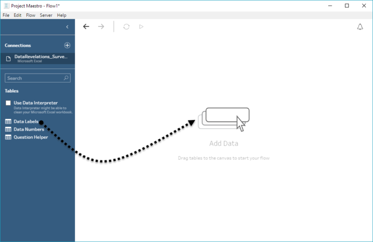
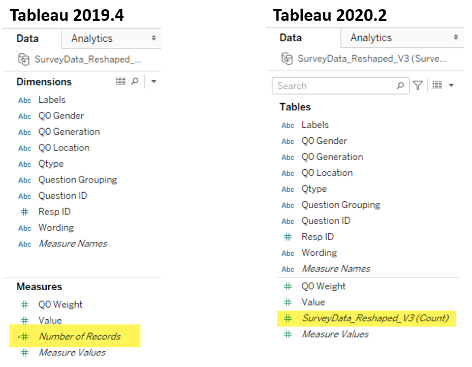
Overview I’ve written almost ten years’ worth of blog posts on visualizing survey data using Tableau (see https://www.datarevelations.com/visualizing-survey-data/). The good news is that dozens of how-to articles that are currently on my website are relevant and the techniques work. That said, Tableau made a HUGE change in how you can model data with the release [...]