
February 20, 2018
Introduction
So, we are a few weeks away from Gartner publishing its “Magic Quadrant” for business intelligence tools. This annual report irks me for two reasons:
- Wall Street analysts pay more attention to the report than I think is warranted; and,
- Practically every vendor finds something to crow about in a press release (and most of these vendors end up paying a significant sum to make the report available to sales prospects).
I also often find myself scratching my head at the results as I question Gartner’s criteria for where and how they place each company on the scatterplot. While I’ve read that a lot of time and consideration goes into the process, I wonder how much weight Gartner gives to the size, strength, and generosity of each products’ user communities because if Gartner were to weigh this heavily I believe Tableau would be an outlier way in the upper right corner.
An example of the Tableau user community doing what it does best (and doing it FAST)
I’ve written previously about how I believe Tableau may have the greatest support community ever, and I was reminded about this last month when I got a Facebook message from my friend and Tableau stalwart, Michael Christiani.
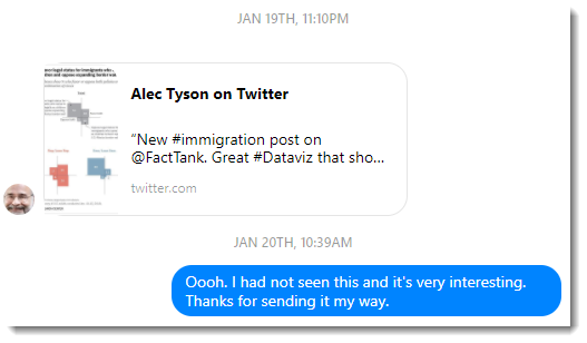
Figure 1 — Michael Christiani hips me to a survey data visualization from Pew Research.
Michael knows that I am a serious survey data / visualization junkie and he thought I would like the article and the visualization.
And he was soooo right! I don’t think I had seen this type of visualization before, but being a big fan of Pew Research (and now of Alec Tyson) I tweet about it.
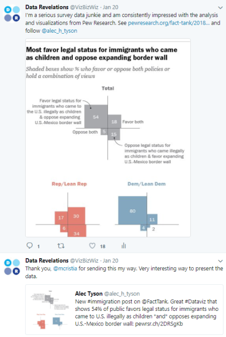
Figure 2 — I tweet about said cool visualization.
Within minutes, global health and data visualization expert Ramon Martinez sees my post and responds with some great insights and a possible approach to building this “I’m-not-sure-what-to-call-it-yet” visualization.
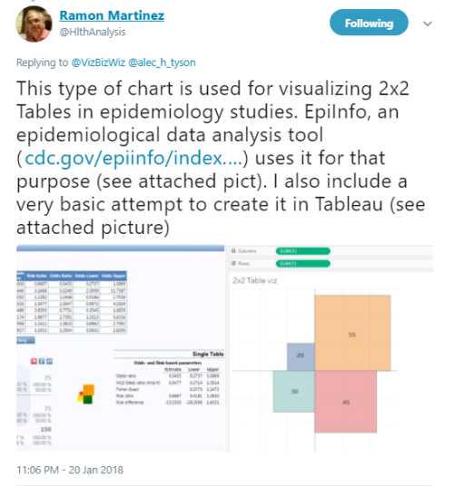
Figure 3 — Ramon Martinez points out this chart is common in epidemiological data and points me to a possible way to build the chart using polygons in Tableau.
A few moments later, wunderkind Tableau Zen Master Rody Zakovich follows up with what he thinks is an easier approach.
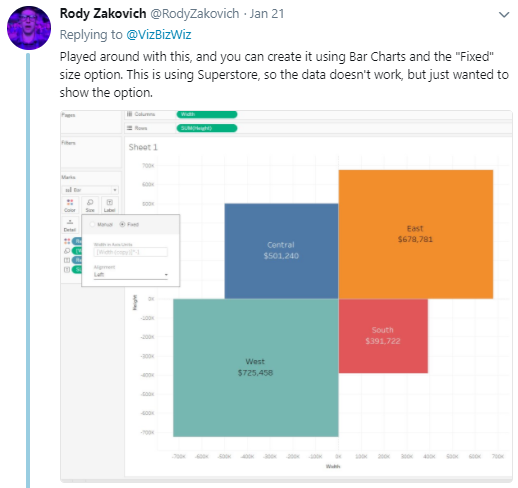
Figure 4 — Rody Zakovich suggests a easier way to build the chart.
And then Rody writes a blog post on how to build it in Tableau!
Shortly thereafter, I apply Rody’s technique to some sample survey data that considers whether people like chocolate, Brussels sprouts, both, or neither.
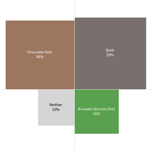
Figure 5 — Applying Rody’s technique to survey data. A blog post on where and how to use this technique is in the works. If you’re chomping / champing at the bit you can see a work in progress here.
We went from “this is cool” to “here’s how you build it in Tableau” in just hours!
This community will do whatever it can to help you succeed
Please realize this is not an isolated incident. Twitter feeds and Tableau’s support forums host thousands of examples of where a flummoxed user is helped and guided by a knowledgeable and generous community, which in turn expands and improves the community. As I’ve written previously, if you are ever not able to figure out what to do, there is a community of people at your beck and call that will help you. The community will NOT allow you to fail.
I’m not just talking about a “hey, how do I create this type of chart” sort of issue. The questions and challenges can be much thornier (e.g., data densification, security, performance, scalability, etc.)
How much value does Gartner put on this combination of mature product and mature — and nurturing — community? I think this type of support is considerably more valuable than having a native donut chart in the product, as donut charts are rarely a good choice (but if you really need to, the community will show you how to make donuts.)
So, just what do you call that type of chart?
I posed the question to my fellow Zen Masters, and now Hall-of-Fame Zen Master Jonathan Drummey did some digging and found the Square four-fold chart and the Proportional area chart.
That said, I rather like Rody’s name (Four-quadrant square chart). Whatever the name, there are some solid use cases for this (especially with survey data) and it’s good to know you can in fact make it…
… because somebody in the community figured out how to do it and shared that expertise!


