
Delight, dismay, and why it’s your responsibility to vet the data
Thank you to Alli Torban, Anna Foard, and Ben Jones for their feedback.
My Delight
A few weeks ago, I saw this terrific interactive graphic in one of my social media feeds. It was part of a recent Makeover Monday challenge.
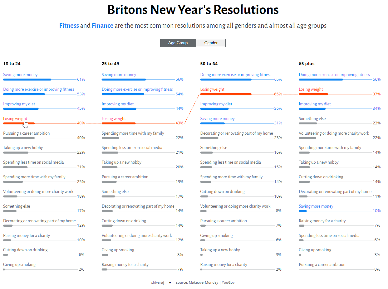
What a great way to show rank and magnitude at the same time, as opposed to a bump chart, which only shows ranking. There are lots of nice touches in this, including the text along the top of the bar, the thin reference lines that show where 100% is, and the right-aligned numbers.
And it got even better. Here’s what happens when you see the same graphic rendered on a phone.
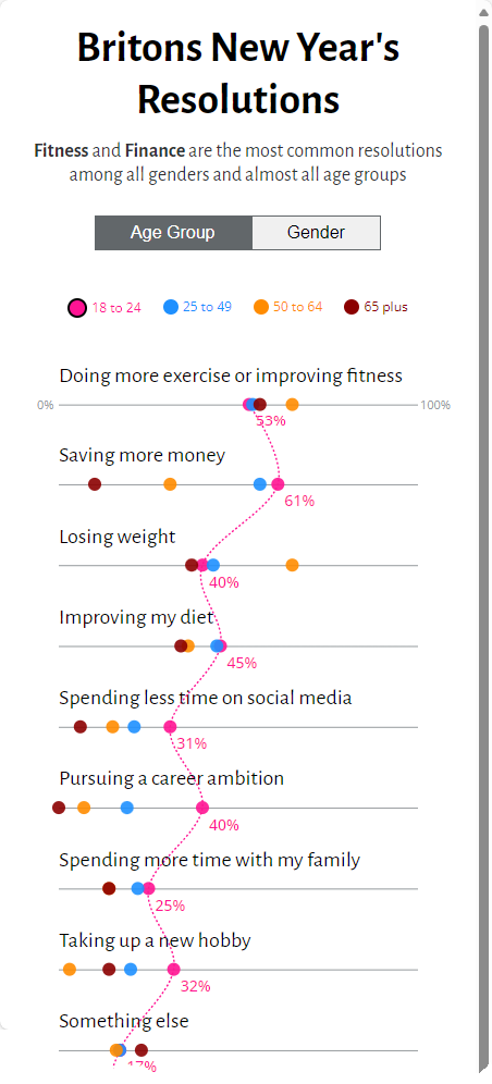
Two great approaches to showing the data. Just who is this shivaraj c practitioner who makes such good stuff?
I saw some other renderings that I liked a great deal, including this connected dot plot from Jhoie Victor, below. Notice the color of the connecting line to highlight where Young exceeds Old (blue) and where Old exceeds Young (orange.)
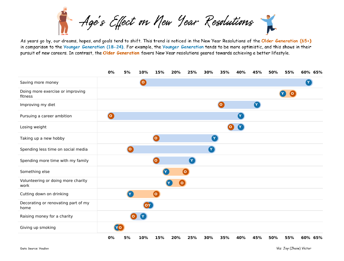
And just look at the huge gaps between older and younger people, especially with respect to saving more money, pursuing a career ambition, taking up a hobby, spending less time on social media, and improving diet.
Those are really large gaps.
Which got me curious about the data.
Which led to my dismay.
My Dismay
Let’s have a look at the Makeover Monday site to see what was available to participants.

We have a link to the data (1), an article that queues up the discussion (2), and the data source (3).
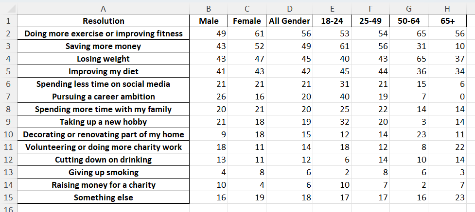
Here’s the data set.
This seems straightforward… but did anybody pause to vet the quality of the data? That is, did anybody stop and think “I’m about to amplify the findings in this data… am I sure the data is correct?”
My guess is that few did, as a visit to the source data would show that the number of respondents who participated in this part of the survey was quite small, which means the findings are going to be fuzzy, at best.
Let’s have a look.
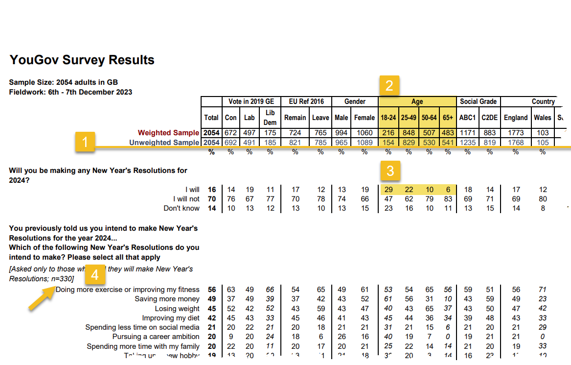
Everything above the line (1) is a response count, and everything below the line is a percentage. The survey sample is robust, with over 2,000 participants (2).
Of these participants we see that 29% of younger people but only 6% of older people will make new year’s resolutions for 2024 (3). THAT is a very interesting finding with a solid response count, but not the focus of the Makeover Monday exercise.
Now here’s where things get dicey. Look at the count of people who in fact plan to make resolutions (4). There are only 330 respondents. How do you get that number? If only six percent of 541 people who are 65 or older plan to make a resolution, that means the total number of respondents in that demographic category is 32. And 29% of the 154 people who are between 18-24 years old planning to make resolutions yields a response count of 45. Do the same multiplication across the other two age groups and you get 330 responses.
Yeah, Yeah, I know 29% of 154 is 44.66. Clearly, they rounded off the percentages.
So, we have 32 respondents who are 65+ and 45 respondents who are between 18 and 24.
When you have a response count this low, the margin of error is extremely high, but in the ten Makeover Monday submissions I reviewed nobody mentioned this.
Let’s Explore Showing Margin of Error
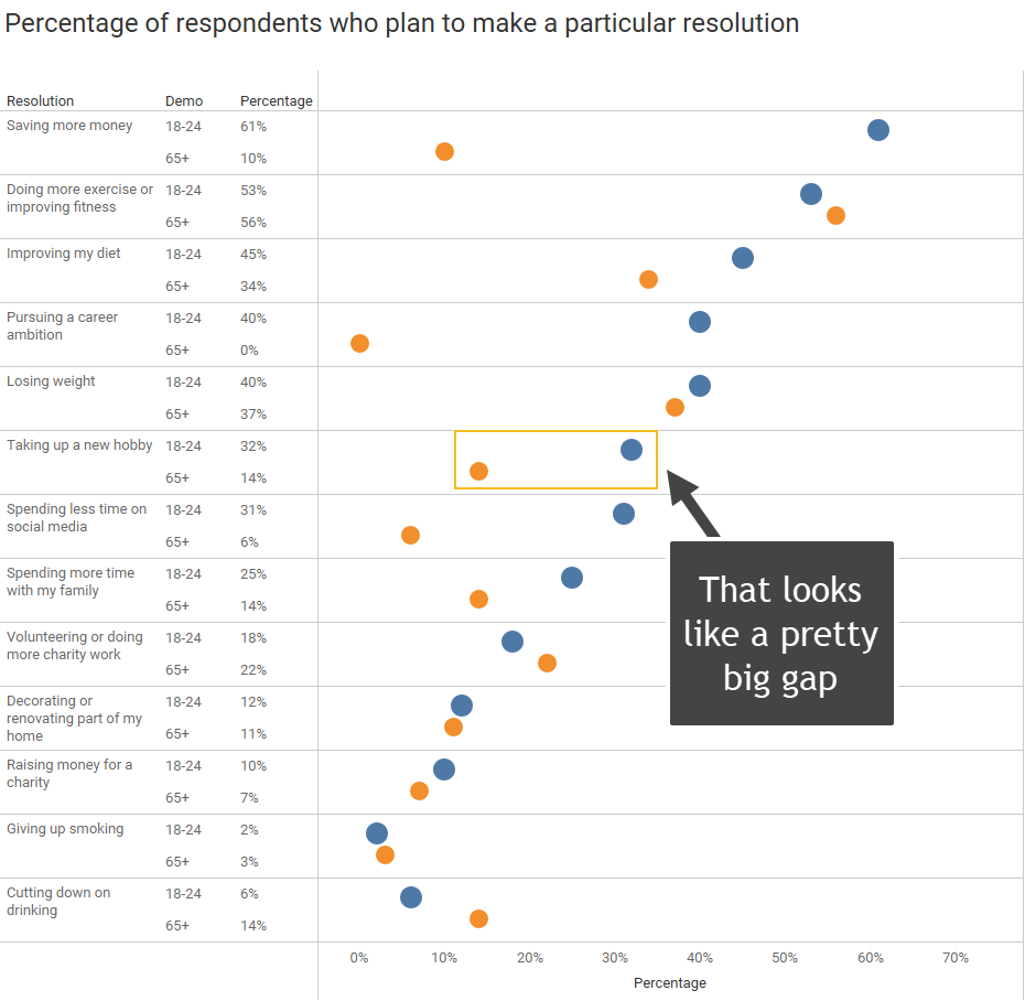
Sure, there’s a very big gap between the first and fourth questions (“saving more money” and “pursuing a career ambitions”) but there also looks to be a big gap for the sixth question, “taking up a new hobby” (32% vs 14%).
But… there’s also a massive margin of error.
Let’s see how to compute the margin of error for the 32% of the respondents aged 18 – 24 who stated they plan to take up a new hobby.
The formula to compute the margin of error is
MoE = z * sqrt(p̂ ⋅* (1-p̂)) / sqrt(n)
Where z is the z-score associated with the level of confidence. A z-score of 1.645, indicating that we want to be within 1.645 standard deviations above or below the population mean, is what we use for a 90% confidence level. If we want a 95% confidence level we would increase the Z-score to 1.96.
The p̂ represents the percentage of respondents who said yes to the question, in our case 32%, and n is the number of respondents (45). Using this formula, we get
MoE = 1.645 * sqrt(0.32 * (1-0.32)) / sqrt(45)
and that yields a margin of error of a little over 11%.
It turns out that the 32% for the younger cohort is 32%… + / – 11 points! This means that if we were to survey a sample of the population repeatedly, we can state with 90% confidence that the true value would be between 21% and 43%.
That’s a very wide range.
Here’s the same data, but with showing the margin of error.
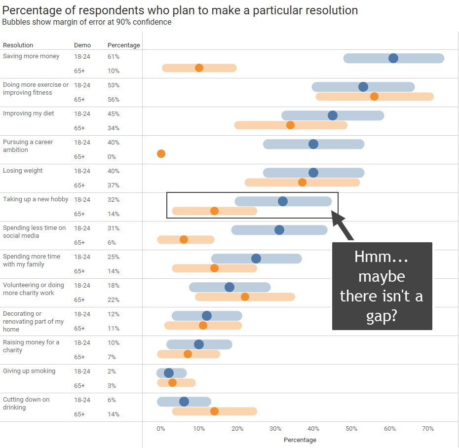
There are only three questions where you can say, with 90% confidence, that there is a gap between older and younger participants (“saving more money”, “pursuing a career ambition”, and “spending less time on social media”). All the other questions have an overlap.
If you are thinking “the range of values is so large… how can anyone report results with authority?” then you have an idea why I’m dismayed.
What should be done, and who should be doing it?
Before going any further, I don’t think disseminating questionable conclusions from this data is going to do any harm, except for maybe denting the reputations of folks who didn’t bother to vet the data and at least display a footnote noting the margin of error.
As for who is responsible for vetting the data, when I first brought this to the attention for the team that’s now running Makeover Monday (Irene Diomi, Chimdi Nwosu, and Harry Beardon), here’s how one of the leaders responded:
“It is on me… I picked the dataset. These are good insights on the data quality, I have to admit I didn’t spend enough time looking at it but it is important to take into account sample size and weights.
I’ll keep this in mind for future datasets.”
I love it when people own up to a mistake, but I don’t think this is just the leaders’ responsibility. I think ALL OF US have a responsibility to interrogate the data thoroughly before publishing visualizations that make assertions.
Realize this was not Real World, Fake Data (one of my favorite data visualization social media projects). With this Makeover Monday challenge, every time a person publishes a visualization asserting the source conclusions, that person is amplifying the idea that “these are facts!”
As I said before, in this case I think there was little harm in asserting questionable differences in New Year’s Resolutions proclivities. Who knows, a larger survey sample may reveal the findings from this survey are spot on.
But there have been cases where people amplified false assertions that may have done some real harm. I encourage folks to read this blog post that I wrote with my friend and colleague, Jeff Shaffer.
I don’t want to come off as “holier than thou” as I have screwed up on countless occasions and I have to actively remind myself that vetting the data is not somebody else’s job. It’s a critical part of my job.
And it’s a critical part of your job, too, so please… do your job well.
Recommended reading
If you don’t already own it, purchase a copy of Ben Jones’ gem of a book Avoiding Data Pitfalls.
Good Calculators has a very good Margin of Error calculator that allows you to input values.
I’ve written several blog posts about how to visualize margin of error in survey data. Here are two that you may find valuable.
Showing uncertainty in survey results – Data Revelations
and
More thoughts on showing Margin of Error in survey data with Tableau – Data Revelations.


