A big “thank you” to Daniel Zvinca, Chris Lay, Anna Foard, Jeffrey Shaffer, and Joe Cohen for their feedback and encouragement.
Overview
I published a blog post earlier this year on how I recommend showing results for Likert-scale questions broken down by different demographics. I had become fond of how organizations like Pew Research does did and decided to share how to do this using Tableau. Here’s what is looks like.
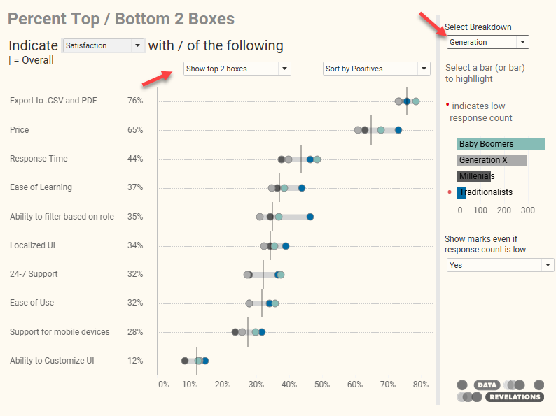
Figure 1 — Using a gap chart to show percent top 2 boxes for Likert-scale data, broken down by different demographics.
Percent Top 2 Boxes just means the people who selected a 4 or a 5 (think satisfied and very satisfied, or important and very important, etc.).
Within hours of posting this article, two friends and colleagues contacted me with invaluable feedback.
The first was Daniel Zvinca who suggested an alternative approach to showing how each of the different demographic components contributed to the overall result.
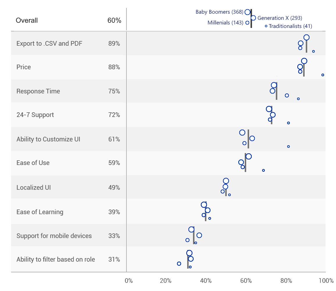
Figure 2 — Dan Zvinca’s first of many iterations showing how each demographic component contributes to the overall result. Note the size legend at the top.
Within minutes of receiving Dan’s suggestion, I heard from Chris Lay who was alarmed that my approach did not consider margin of error, especially since the response count for traditionalists were so low.
Goodness, he was spot on. I had forgotten my own blog post on this very issue.
Going down the rabbit hole
These two comments together led to a lengthy email thread among Dan, Chris, as well as friends and colleagues Anna Foard and Joe Cohen. The question was how to show margin of error and show how each of the different demographic components push and pull from the overall result. Daniel was off to the races with different takes on this. Here are a handful of his experiments.
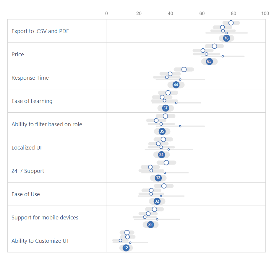
Figure 3 — One of several approaches Daniel shared with me.
Note sure about margin of error works? The “survey result” is the percent of the sample who selected an item, displayed as dots. The “true result” is the percent of the entire population who would select that item. A confidence level of 95% means the true result will be within the calculated Confidence Interval (the error bar range) in 95 out of 100 samples.
This also means that 5% of samples would not return the true result within the error bars.
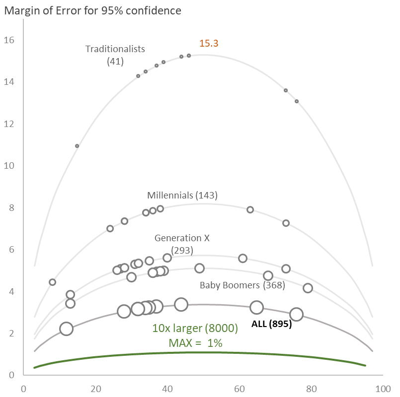
Figure 4 — Showing how the margin of error grows as the sample size decreases as well as how the margin of error is larger at 50% selected than at 90% selected.
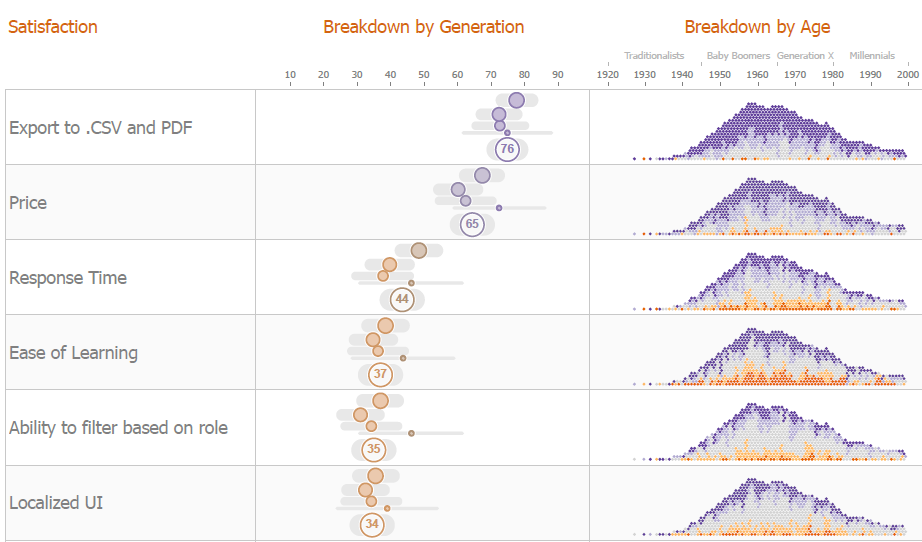
Figure 5 – Another approach showing margin of error for each age group as well as for the overall. We won’t explore the density plot on the right side as it’s beyond the score of this post (although it is very cool and justifies the color choices for the margin-of-error plots).
So, how do you do this in Tableau?
Variable row height
Those of you who follow my blog know that this is not the first time I’ve tried to emulate Daniel’s elegant and informative approaches.
In his margin-of-error examples there was one thing I found particularly appealing and that is the variable height for each row. That is, instead of having a fixed row height, like this…
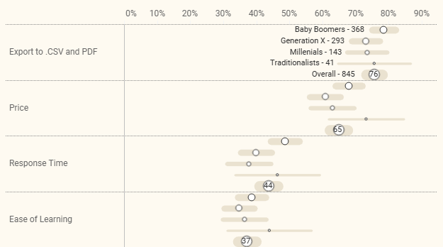
Figure 6 — Each row is the same height even though the circles and error bars are different widths.
… we adjust the row height based on the number of responses per age group, like this.
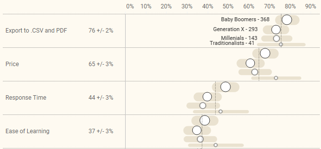
Figure 7 — The height of each row reflects the number of respondents in each age group. The vertical line shows the overall response to the question.
I much prefer the variable row height but to get this without too much fuss in Tableau I had to ditch the totals row. Do note that the vertical line for each question shows the overall response.
Color or monochrome?
Having settled on the variable row approach I experimented with monochrome vs. colored dots and decided to post a poll asking people which they preferred.
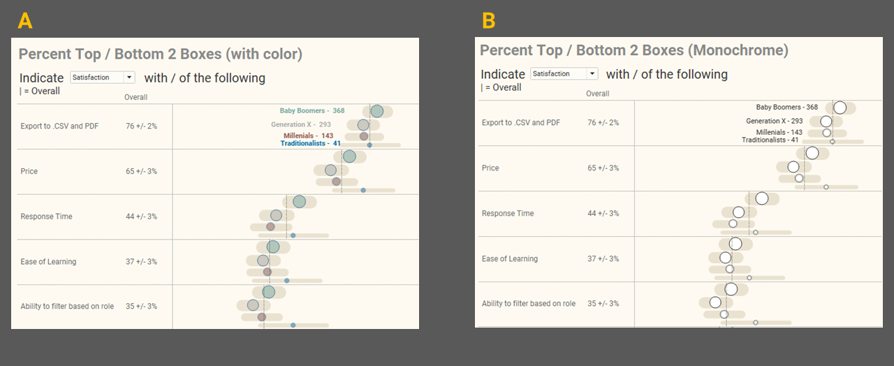
Figure 8 — I asked people which they preferred, A or B.
To my disappointment the 300 respondents I surveyed preferred A by a wide margin, with most people saying the colors helped them more easily determine which age group was which.
So why am I disappointed? I’ve become a little anal compulsive about not having color or size legends in my visualizations and instead display mark labels for just the first row (see this post for my take on how to do this.) It turns out it’s quite a bit harder to have colored dots and monochrome error bars, and have the labels be colored as well, but not have the labels appear too close to the dots. So yes, I’m willing to put up with a little nonsense to get the labeling “just so.” As for showing the totals, this is where I draw the line as it would have meant some futzing to the underlying data.
How it works
At the end of this post I share an embedded dashboard that you can download. Let me walk you through how to use the dashboard and then we’ll look under the hood at how some of the elements work.
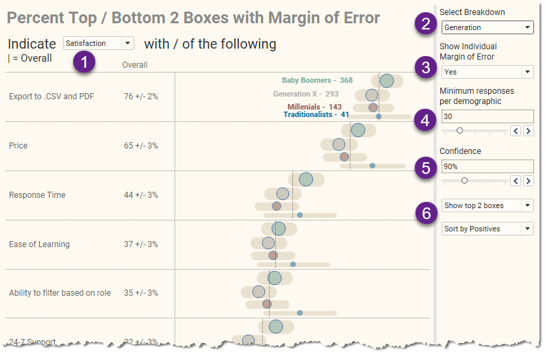
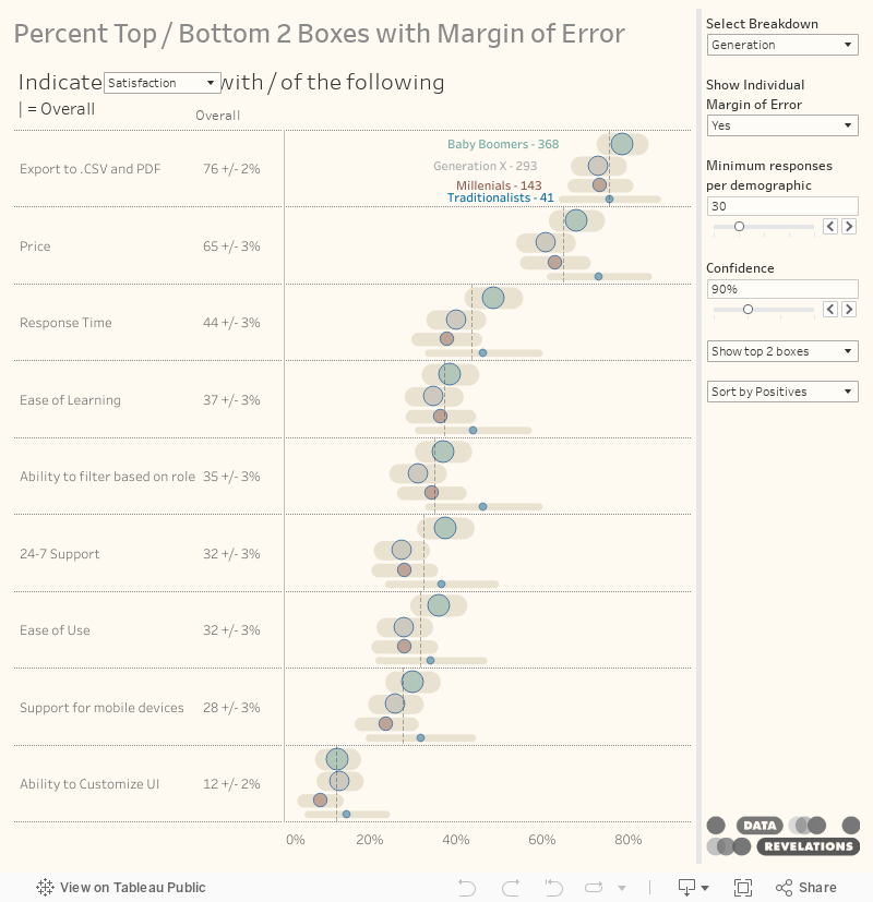
Figure 9 — The Margin of Error dashboard.
Item (1) allows you to switch among several different Likert-scale questions. There are questions about degree to which you agree, importance, and satisfaction (shown here.).
Item (2) allows you to switch among different demographics. Here’s what the results look like when we break things down by Gender.
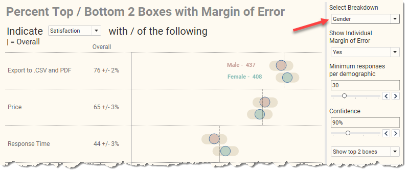
Figure 10 — Percent satisfied or very satisfied, broken down by Gender.
Item (3) allows us to toggle on and off the error bars. This can be very helpful in helping an audience understand the range of possible valid survey results. I strongly encourage you to experiment with the dashboard at the end of the post as the animated error bars can help the uncertainty associated with survey data pop.
Item (4) allows us to specify the threshold for showing results. In this case, if there are fewer than 30 respondents within a segment, we won’t see results for that segment.
Item (5) allows us to specify the degree of confidence. A setting of 90% indicates that the true value (what you would get from the entire population and not just sample) will appear within the margin of error range in nine out of ten samples. Our hope is that what we’re looking at now is NOT that one-out-of-ten case where the true value is outside the error bars. Increasing the confidence to 95% or 99% will make the error range wider but increases the likelihood that the true value is present in 95 out of 100 samples, to 99 out of 100 samples.
Item (6) allow us to toggle between showing the Top 2 or Bottom 2 boxes and control the sort order. I’m not sure if I should have separated these into two choices or had a single choice that forced the sort order. In any case, it’s possible to apply settings that result in a cluttered display, as shown here.
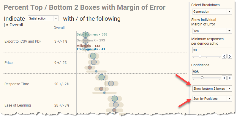
Figure 11 — Showing the bottom 2 boxes (the respondents who specified a 1 or a 2) and sorting most positive to least positive yields a cluttered display. And no, I’m not going to fix it.
Looking under the hood
Here’s how the visualization is built in Tableau.
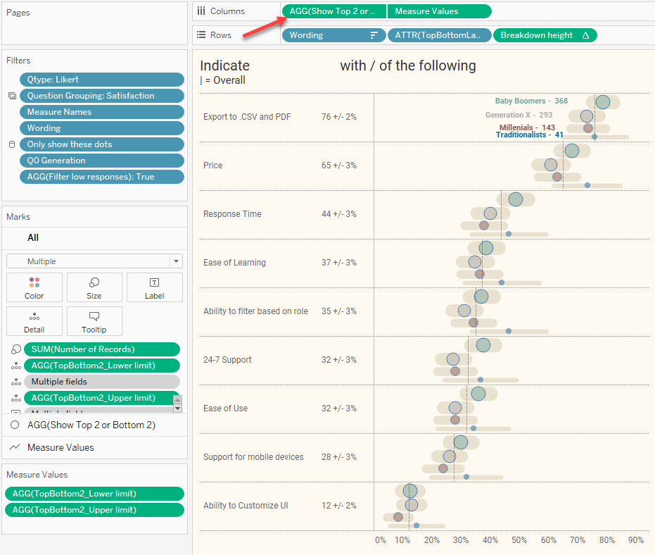
Figure 12 — A dual axis chart displays the dots and the error bars.
Notice that we have a dual axis chart (arrow at top). The first pill is responsible for the dots and the second pill displays the error bars. Let’s remove the dual axis and separate these into two charts.
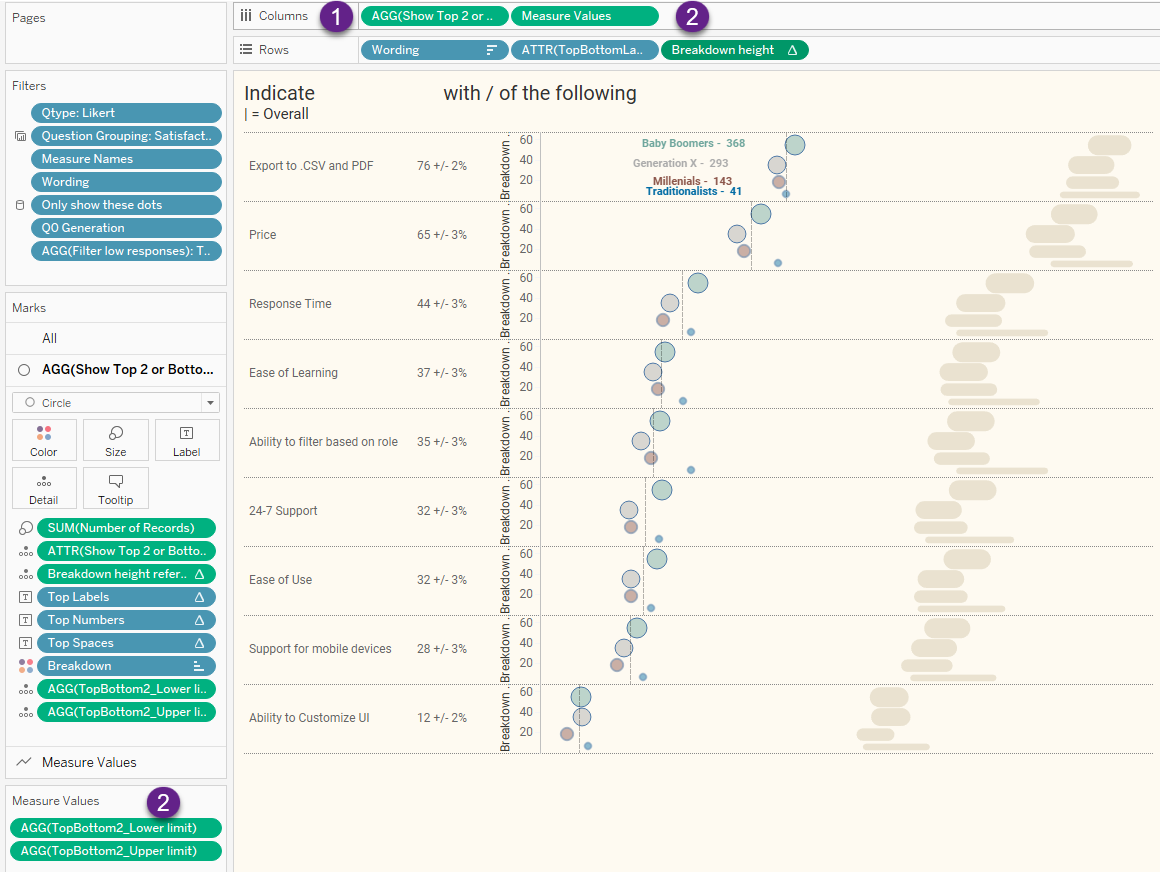
Figure 13 — Breaking the visualization into two separate charts.
The error bars (2) come from placing Measure Values on Columns. This is a line chart that connects the smallest possible value with the highest possible value. I won’t get into how these are computed here as you can read this blog post that gets into the specifics.
The dots come from the field [Show Top 2 or Bottom 2] which is defined as follows:
IF [Top or Bottom]=1 then [% Top 2 Boxes]

ELSE [% Bottom 2 Boxes]

END
Sorry for the extra level of confusion here, but every time I present a class where I show how to compute Top 2 boxes somebody asks me about Bottom 2 boxes. In any case, if the user indicates that he/she want to see the Top 2 Boxes using the parameter [Top or Bottom] we’ll use [% Top 2 Boxes]. This, in turn, is defined as follows:
SUM(IF [Value]>=4 then 1 else 0 END) / SUM([Number of Records])
This translates as “add up everyone who selected a 4 or a 5 and divide by everyone who answered this question.”
Stacking the dots nicely
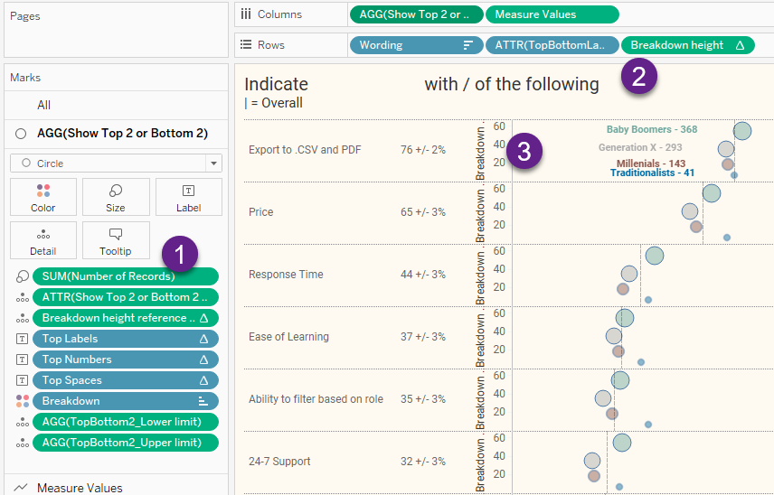
Figure 14 — Focusing on getting the dots to stack nicely
The size of the dots is controlled by Item (1), SUM([Number of Records]). Actually, it’s the area of the circles, not the height of the circle, but we will need to determine the height of the circle.
To get the dots to stack based on the height of each circle we need to figure out the diameter of each circle, or at least recognize that the area relates to the radius of the circle, squared, times Pi. It turns out the only critical thing is using the square root of the [Number of Records] to stack the dots proportionately by their height, and that’s what we do with Item (2), the field [Breakdown height]. This is defined as follows:
RUNNING_SUM(SQRT(SUM([Number of Records])))
The first (smallest) dot starts at zero and moves up the square root of the number of records for that first dot (the square root of 41). The second starts where the first one ended and moves up the square root of the number of records for that dot (the square root of 143).
The value axis (normally hidden) shows the overall running sum (Item 3).
Yes, it’s somewhat convoluted.
But I think it’s worth the effort.
Some Tableau mishegoss
As I said before, I may go a little overboard in trying to avoid a color / size legend that sits over to one side. In this case I wanted to directly label the first row. This is easy if you label the monochromatic error bars, but I wanted the labels to be the same color as the dots, so I had to label the dots themselves.
And that meant I needed to add some extra spaces to that the labels would not obscure the dots.
Let’s look at what’s driving the labels.
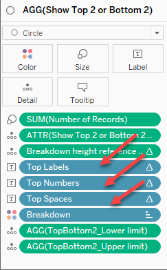
Figure 15 — Three different fields contribute to what is on mark labels.
If we click the Labels button and then ellipsis button, we see this Edit Label dialog box.
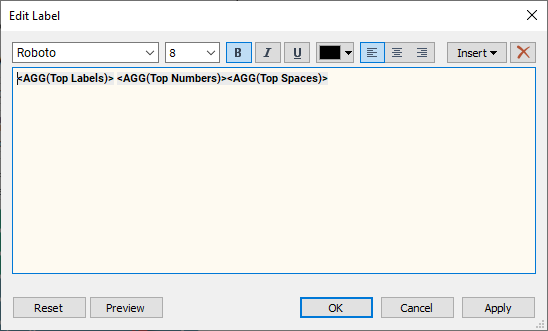
Figure 16 — Three fields contribute to the mark label for the first row of dots.
Let’s look at how [Top Labels] is defined.
IF FIRST()=0 THEN

  IF LEN(ATTR([Breakdown])) >1 THEN ATTR([Breakdown])+" -"

  ELSE "Overall - " END

END
This translates as “if we are in the first… row? Column? Cell? Whatever… if we are breaking down some demographic, display the elements of the demographic; otherwise, display the word ‘overall’.”
I’ve become very fond of this first row trick, so much so that I’ve written a separate blog about the technique. The crucial thing is to make sure that Compute Using is set to [Breakdown] so that only marks for the first question (row) are displayed.
Now, what about those extra spaces so there’s some buffer between the labels and the dots? Here’s how [Top Spaces] is defined.
IF FIRST()=0 THEN "⠀⠀⠀⠀⠀" END
Those spaces between the quotes… they are not just any run-of-the-mill spaces; those are special Braille Unicode 2800 spaces that Tableau won’t trim when it concatenates all the fields.
There’s one more bit of mishegoss.
Notice that there is a field called [Breakdown height reference line] on level of detail. I use this to create a hidden reference line that under some circumstances adds some padding. Here’s what happens if we breakdown by gender and don’t have this reference line.
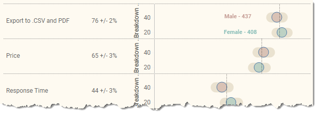
Figure 17 — Spacing between two elements without the reference line to add padding.
And here’s the layout when we have the hidden reference line.
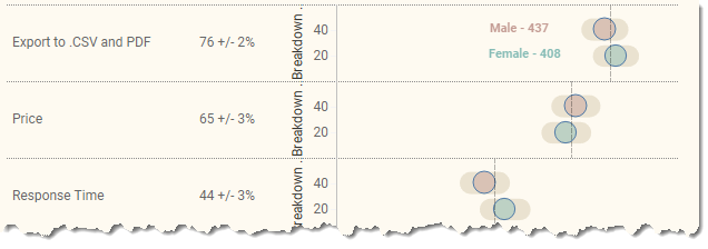
Figure 18 — Spacing between two elements with a reference line to add padding.
Conclusion
Is it worth all the effort to get the variable spacing, the colored mark labels, etc.? That’s up to you, but at a minimum you need to make sure your audience knows that when you report survey results you are providing an approximation, and your audience should know that it could be as low as X and as high as Y.
Here’s the dashboard for you to explore and download.