

I think the number one infraction in data visualization is the misuse of color.
If I were pressed for time and had to distill my recommendations on color into a Haiku, it would be this:
Make everything gray
Except the few things you think
Should be highlighted
Yes, this is simple, bordering on the simplistic, but it works in so many situations.
Consider the kaleidoscopic mess below on the left. What do you want the audience to make of this? It’s an overdose of categorical colors that provide no value. Now look at the chart on the right. The purposeful use of a highlight color makes it clear that you want people to compare Vietnam to the other countries.
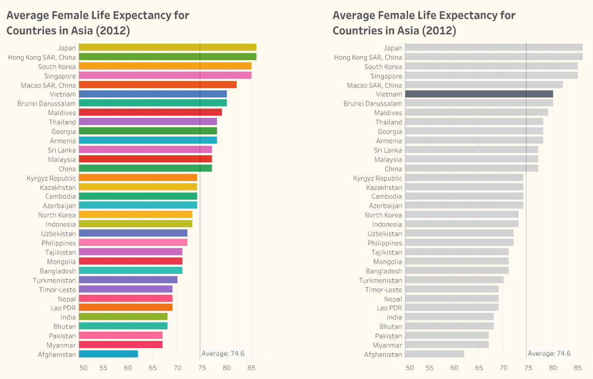
Having a different color for each country makes the chart on the left hard to read but with the chart on the right, it’s easy for your audience to know where to focus (from the book The Big Picture by Steve Wexler).
There are only five ways to use color in data visualization. Once you understand how to apply each of these approaches, your visualizations will be much more effective.
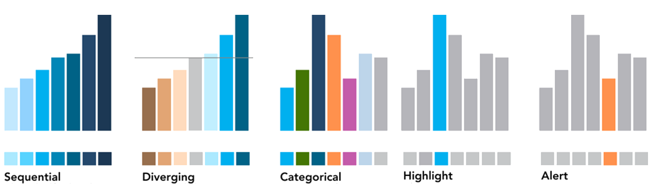
From the upcoming book Dashboards That Deliver by Andy Cotgreave, Amanda Makulec, Jeffrey Shaffer, and Steve Wexler. These “five ways” are also discussed in The Big Book of Dashboards and The Big Picture.
I make sure to cover the “five ways” in all my workshops. People who come in with headache-inducing visualizations leave with the ability to make clean, aesthetically pleasing visualizations that help your audience see what you want them to see.
Dashboards That Deliver: How to Design, Develop, and Deploy Dashboards That Work will be available September 2025.


