And some other thoughts on conditional formatting.
Overview
A few weeks ago my friend, Yamil Medina, asked me to attend a weekly livestream he hosts with his colleague at Data Meaning, Aaron Simmons.
The livestream is called 3@3: A Mystery Chart Show and I enjoyed it so much I decide to hangout the following week. Joining the hosts were panelists Erica Plemmons and my Chart Chat and Big Book of Dashboards friend and fellow author, Jeffrey Shaffer. They discussed visualizing Halloween data and nobody has more or better Halloween data than Jeff.
If you want to check out this weekly series – and perhaps participate as a panelist – check out https://www.signupgenius.com/go/10c0f4eaaa92daaffc34-33live.
So, what got my attention
This was a side note at around 56 minutes in, but it caught my attention: how do you “declutter” by not having the percent sign in each row? That is, only show the percent sign in the top row, as shown here.
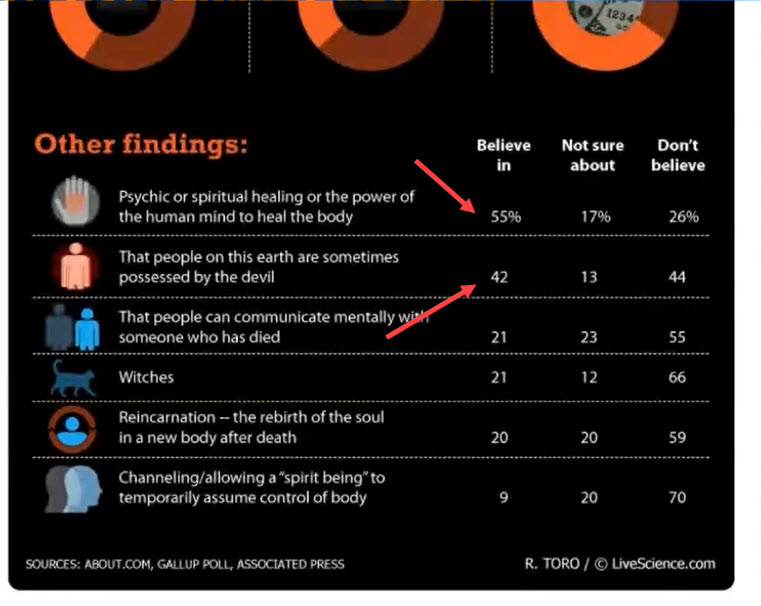
Figure 1 — Table with first row formatted differently from the other rows.
I commented in chat that this is not so easy to do in Tableau.
It is in fact, easy.
It just isn’t obvious.
Let’s see how to do it.
Creating the calcs and applying the formatting
Here’s what the unformatted data looks like.
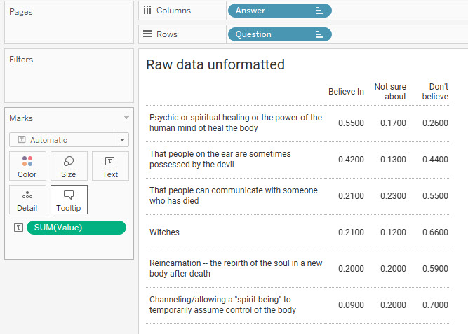
Figure 2 — Unformatted data
We’re going to create two different calculations: one for the top row and one for all the other rows.
The Top Row
Here’s the calculation for the top row (the field is called [Value Percent]).
IF FIRST()=0 THEN SUM([Value]) END
This is a table calculation that translates as “If we are the first… row… column… cell… hmm, not sure yet… but it’s the first something, then show SUM([Value])”.
Implied but not stated is that if it’s not FIRST(), we should display a null value, which would be a blank.
We need to format the calculated field to be a percentage with zero decimal places, as shown here.
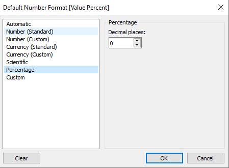
Figure 3 — Percentage format
All the Other Rows
Here’s the calculation for all the other rows (the field is called [Value Integer]).
IF FIRST()<>0 THEN SUM([Value])*100 END
This is a table calculation that translates as “If we are NOT the first… row… column… cell… hmm, not sure yet… but it’s not the first something, then show SUM([Value]) multiplied by 100”.
Implied but not stated is that if it is FIRST(), we should display a null value, which would be a blank.. Note that we are multiplying by 100 because we want to see a whole number and not a fraction / percentage.
We’ll format the calculated field as an integer with an extra space following it so that the numbers align properly. We can do this with a custom format.
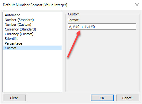
Figure 4 — Integer format with padded space using Unicode 2800.
Important: That isn’t just any trailing space after the zero. It’s a Braille Pattern Blank that you can copy and paste from this web site. Tableau will truncate a regular space.
Understanding the assembled visualization
Here’s the assembled visualization.
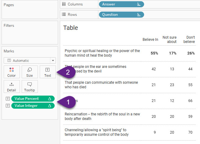
1–Note that the “Compute using” for both [Value Percent] and [Value Integer] is set to Question so that Tableau will look at rows instead of columns or cells.
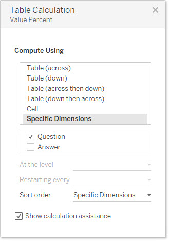
Figure 6 — Compute using is set to Question so Tableau is looking at rows (vs. columns or cells).
2–The “magic” happens when we click the Text button and look at how the text is set to display.
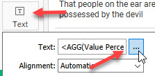
Figure 7 — Accessing the Edit Labels dialog box.
Clicking the ellipsis will display the Edit Labels dialog box.
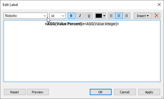
Figure 8 — Edit Label dialog box with both calculations.
BOTH fields are on the same row within the dialog box (you don’t want a carriage return). Note also that the first field is bold and in a larger font.
This approach works because if we are in the first row of the visualized table we see the first field only as the other field is null. If we’re NOT in the first row, we see the second field as the first field will be null.
Other use cases
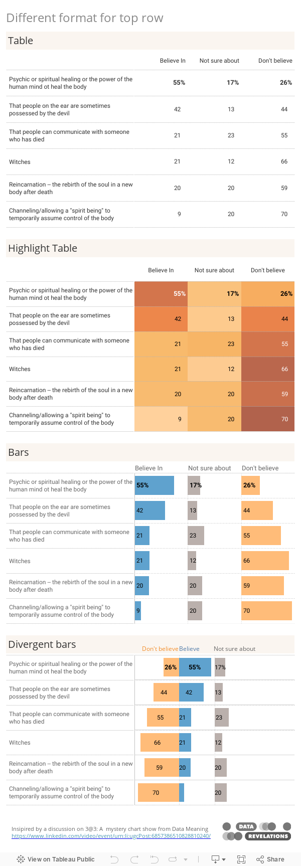
Here’s a Superstore example where we can make the sub-categories that are unprofitable stand out by having two different calculations, each with a different format.
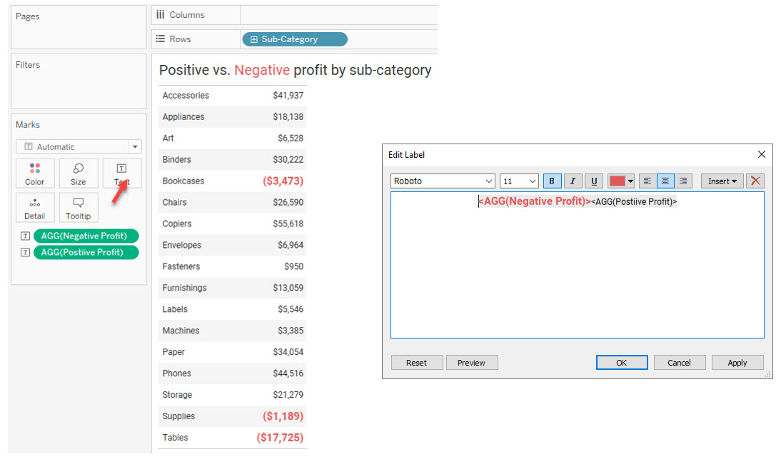
Figure 9 — Making the negative numbers stand out.
Yes, but is this a good way to present the data?
I’m glad you asked because I don’t think a simple text table is a good way to present the data (and the panelists questioned this, too).
Below you will find an embedded and downloadable dashboard that shows the text table as well as three other ways to present the same data, all of which I think are better (my preference is for the divergent stacked bars at the end).
One last thought: is this worth all the trouble? Seeing each row with the percent signs doesn’t bother me in this case–and I think Jeff stated the same during the livestream–but there may be cases where having this ability to accentuate, mute, or even hide certain values may prove useful to you.