And how many colors are too many, too?
Overview
There are a lot of ways to show measures over time for multiple categories. I want to explore what works, when it works, and make sure that a particular technique catches your interest.
But first… a big shout out to Nick Desbarats whose book, Practical Charts, provides both observations and approaches that I had not considered. Strongly recommended.
Background
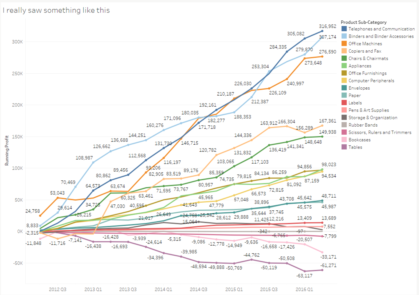
I enjoyed a great discussion during one of my data visualization and storytelling workshops. The catalyst was a combination of this hot mess “before” picture…
… combined with this uncluttered, curated “after” picture.
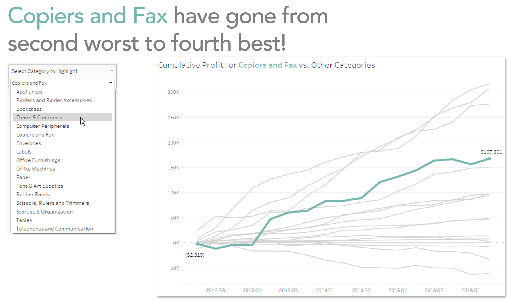
We explored how the after picture only highlights one line, shows only the starting and ending values, has a clear title takeaway, and has interactivity so the audience can focus on a different category.
Does this work?
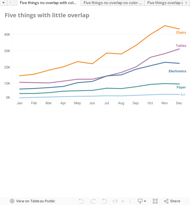
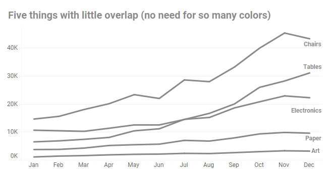
This led to one attendee sharing a visualization he had been working on which had five lines, each a different color. It looked something like this.
The attendee’s biggest concern was having a different color for each line. Indeed, anytime I see more than four categorical colors in a visualization I get nervous. Will this be too much for my audience to process?
We discussed the visualization for a bit and realized that because there was little or no overlap among the lines, we could even ditch color completely and it was still easy to understand the chart.
But what if there’s overlap?
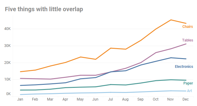
The example we had wasn’t particularly noisy, so I wanted to explore what happens when you have five lines that bounce around a bit.
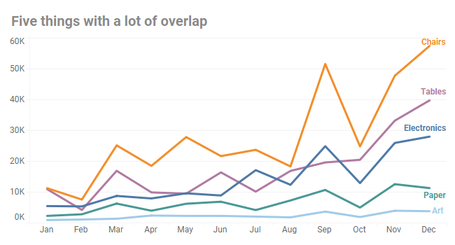
For me, this is on the threshold of non-readability. I know that is very subjective, but as a professional chart looker-atter, if I find something difficult, I can almost guarantee that my non-professional chart looker-atter audience will find it difficult, too.
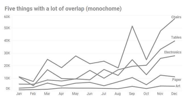
Also, the “noisy” chart fails the monochrome test, at least in my opinion, as shown below.
Answering the “It Depends” questions
My friend and co-author, Andy Cotgreave, has a t-shirt with the words “It Depends” emblazoned on the front. It’s how he (and I, for that matter) address all of the “which chart is best / how many colors should I have / is it okay to use a pie chart” questions we get during our workshops and presentations.
This is one of the reasons I like Nick Desbarats book so much. It does an effective job of moving the discussion from “It Depends” to “under these circumstances, do this.”
For example, I was ready to say, unequivocally, that ten lines, each a different color, will never work.
But in his book, Nick points out where a 10+ line chart could work.
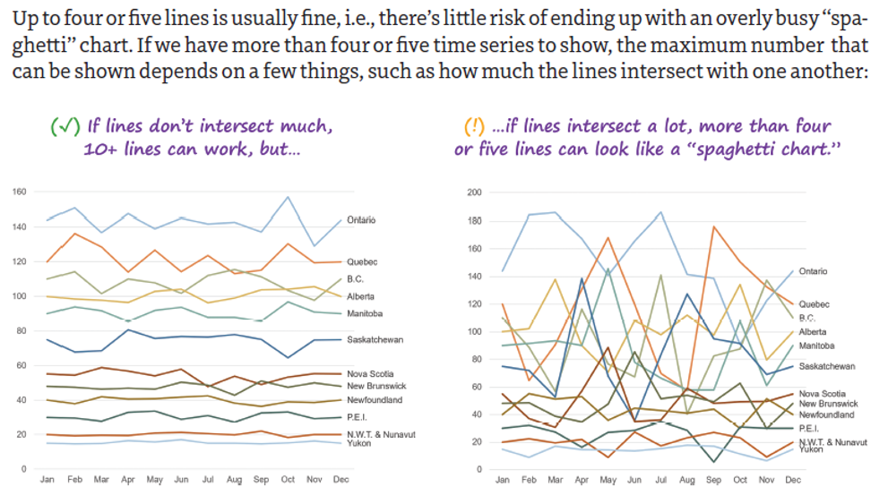
Source: Practical Charts by Nick Desbarats
I agree that the chart on the left is readable, but I still think it’s risky to try something like this in a “living” dashboard because when the data changes, the readability may change, too.
So, what would be a safer approach?
THIS is the one you should have in your arsenal
I’m going to jump to the punch line and share my preferred method for when you either have an interactive dashboard, or when you know for sure which lines are the “important” lines:
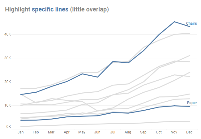
Highlight the few lines that are important and use gray for everything else.
It works when there is little overlap.
And it works when there is a lot of overlap / noise.
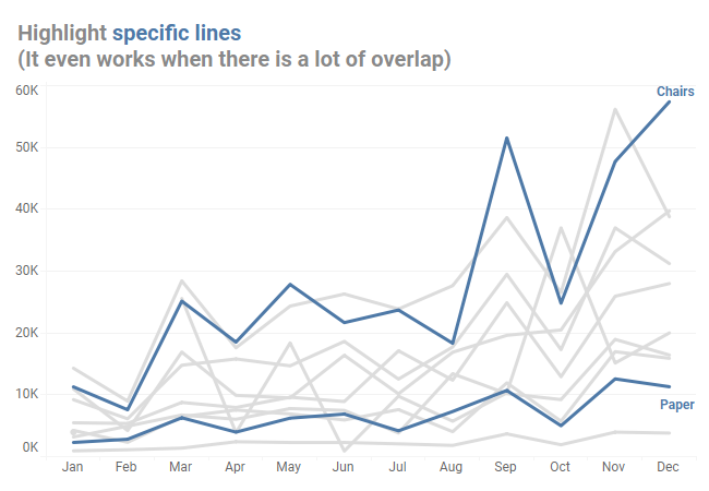
Indeed, this is the technique I used to turn the hot mess “before” picture into a clear and easy-to-understand “after” picture at the beginning of this article.
Yes, but what if I need to show all the values for all the categories at the same time?
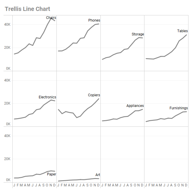
If for whatever reason you cannot just focus on a few lines. and need to show all the categories at the same time, a trellis chart (also called a “small multiples” chart) may solve your problem.
Here’s a trellis line chart.
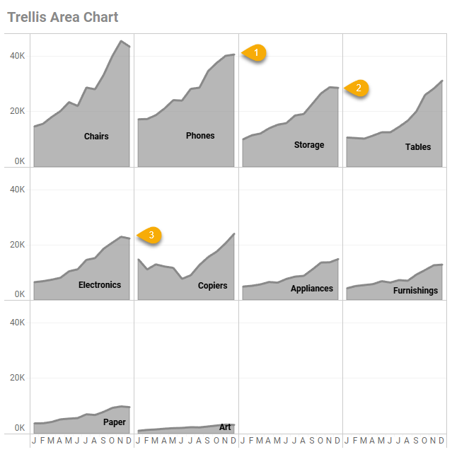
And here’s a trellis area chart.
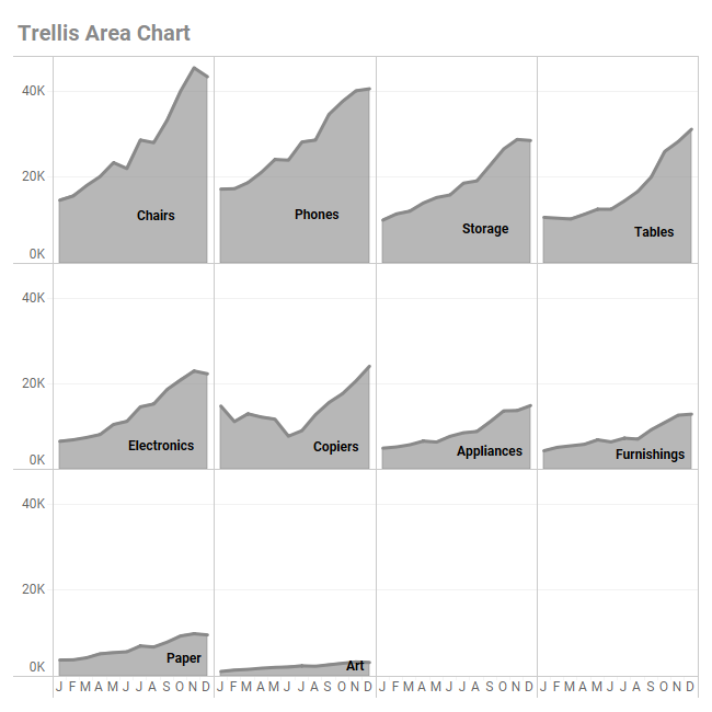
The big drawback with the trellis arrangement is that it’s difficult to make comparisons when things are in different rows or columns.
Consider the example below. While comparing (1) and (2) is reasonably easy, comparing (1) and (3) is difficult as they don’t share a common baseline.
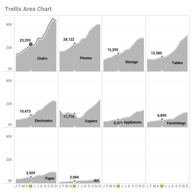
You can get around this by adding some interactivity so that when you highlight a particular point for one segment (e.g., Chairs) it will highlight the applicable point in all segments. Below we compare measures for the month of May across the ten different segments.
But … if you are offering your audience an interactive dashboard, why not just do the line highlighting that we saw earlier?
One more approach worth considering
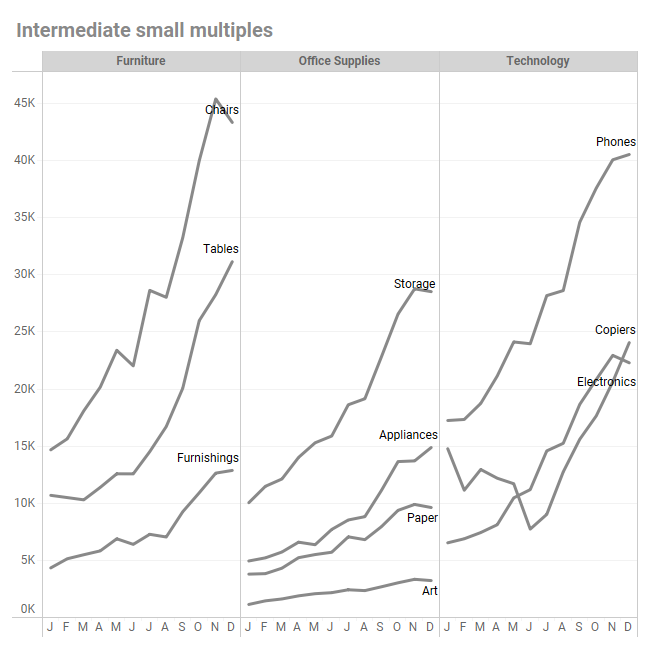
If stacking ten lines is too much, but a full trellis is too distributed, Nick Desbarats suggests trying an intermediate small multiples / trellis chart, like the one shown below.
Give it a try
I’ve embedded a downloadable Tableau workbook at the end of this article that has all of the approaches we’ve discussed here, plus a few more. Use the tabs along the top to explore the different views.