
I recently participated in a LinkedIn Live discussion about how to visualize uncertainty in survey data with Bob Walker, Anna Foard, and Jon Cohen. I find myself contemplating whether we have a type of moral obligation to try to make sure our audience understands that there may be a big difference between the survey results we report and the true results.
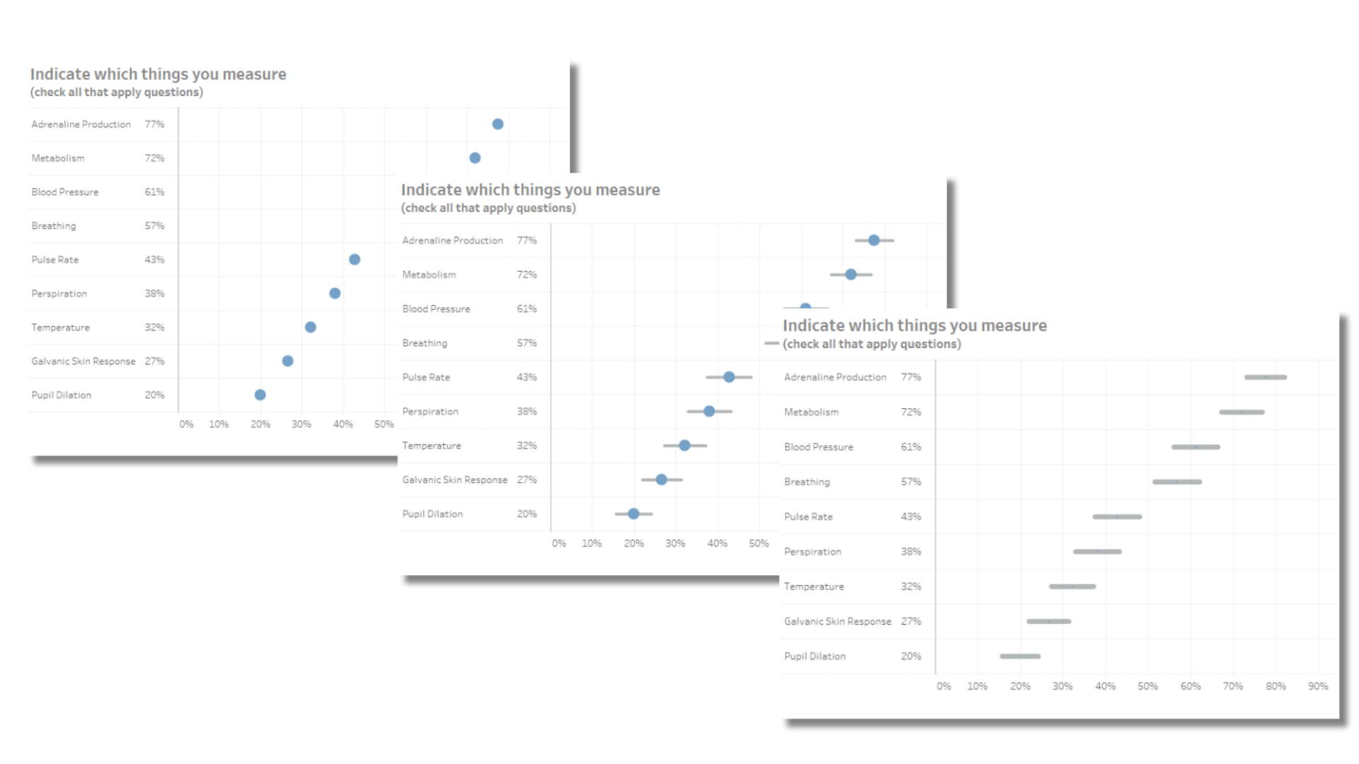
A question I posed to my colleagues was why show the result as a dot with error bars behind the dot? Why not just show the error bars? The same goes for showing a gradient—are we in fact misleading people to think that the true value is more likely to be in the center?
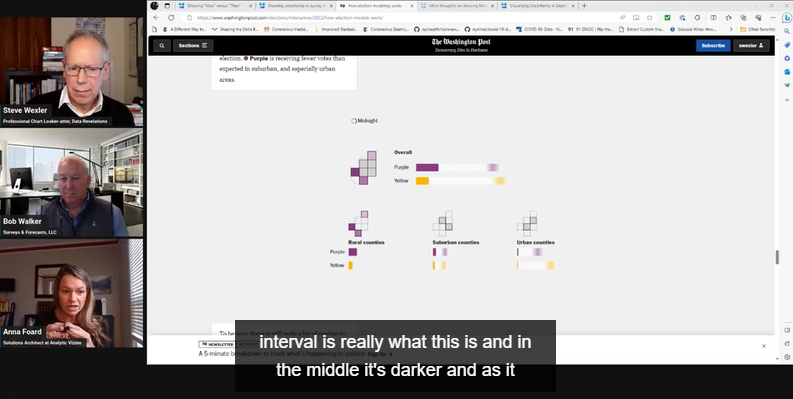
A snapshot of our LinkedIn Live session.
We’re not the only people grappling with this question. Financial Times graphics guru John Burn-Murdoch discussed this during his Outlier Conference keynote presentation and asserts humans hate uncertainty and may ignore “best practice” techniques to help them see the range of possible outcomes. He then showed other approaches to get people to see and understand uncertainty.
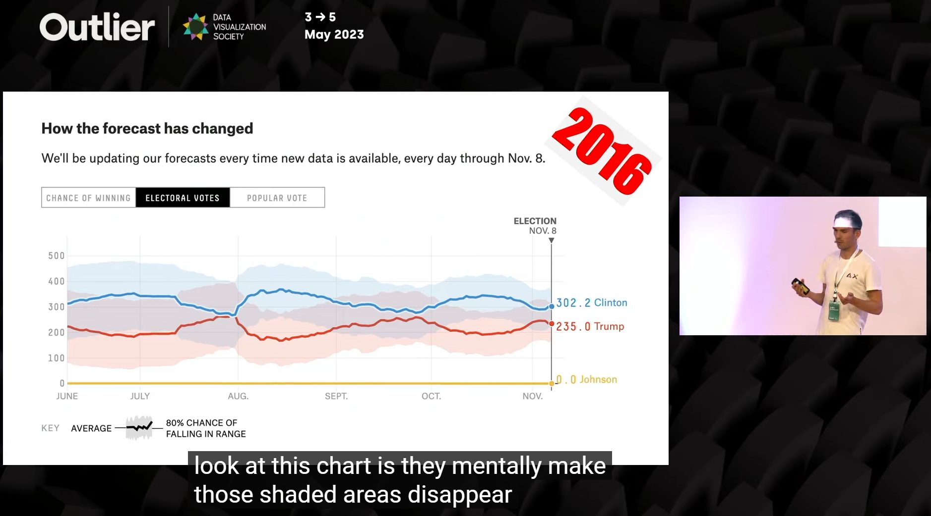
John Burn-Murdoch shows different ways 538 has shown confidence intervals.
Here’s a link to Burn-Murdoch’s presentation, queued to where he starts discussing the challenge. Great stuff.
And here again is a link to a recording of our LinkedIn Live session. Note that our discussion about whether we should just show error bars and not over-emphasize the point in the middle starts at around 29 minutes in.
Finally, in our get-together we had planned to show a survey sample simulator (say *that* three times fast!) to show that if you sampled, say, 75 people 100 times, you’d see that the surveyed results are sometimes outside of your expected error bars. You can try it for yourself here.
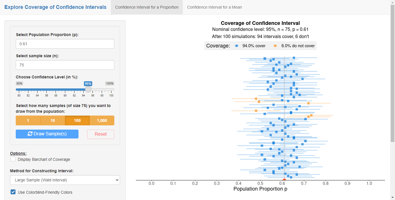
Survey Sample Simulator from ArtOfStat.com.


