Helping your stakeholders see and understand margin of error in survey data.
A deep thanks to Anna Foard and Jonathan Drummey for their assistance, Ben Jones for the foundational work behind for my initial explorations, and Ryan Corser for asking me to look into this.
Update: an earlier version of this post was titled “Visualizing Uncertainty in Longitudinal Survey Data.” Robert Walker of Surveys & Forecasts LLC points out that a longitudinal study ask the same questions to the same people over time. In my example we different people.
Background
I offer an on-demand course about visualizing survey data with Tableau and a perk that comes with the course is that I conduct monthly “what’s on your mind” sessions.
Last month Ryan Corser asked me to explore showing confidence intervals / margin-of-error around longitudinal data. That is, he wanted his stakeholders to be able to see just what plus-or-minus X points looks like with respect to Likert responses over time.
I get it. I’ve seen too many clients brush off how unreliable survey results are when you don’t have enough responses. Maybe some visual ammunition will help get across why “n=24” when you are surveying a large population is probably not good enough to make a business decision.
For this example, I look at the percentage of people who either strongly or moderately agree with various statements using a 7-point Likert scale (percent top two boxes). You can find the data set here. Note that I broke the responses up into four different years to show changes over time. The original data set did not have a date field.
Leveraging existing work
I first delved into showing statistical significance / confidence in 2015 when a client asked me to have a visual designator indicating whether an increase or decrease from a previous period was “statistically significant.” They wanted to be able to say “The percentage of people who agree went from 40% to 48%, and we can say with 95% confidence that there was in fact an increase.”
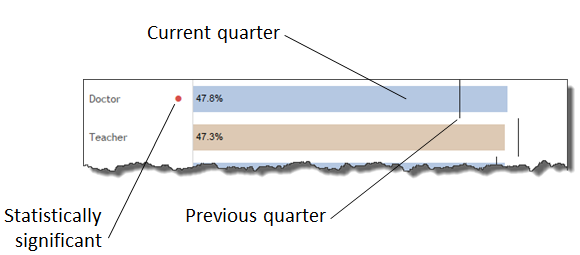
Great. The dot means the change is, for lack of a better term, noteworthy.
But wouldn’t it be great if we could easily see why there’s a dot?
Showing error bars / confidence intervals
This desire to show people just how shaky their survey results might be led to explorations of how to show error bars / confidence intervals in Tableau.
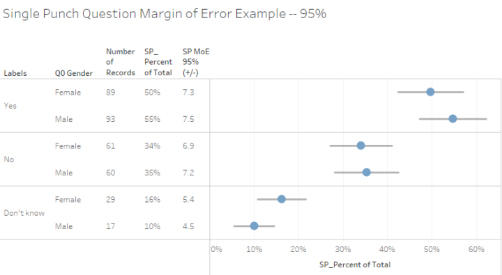
Given the overlap of the error bars in the example above (the lines going through the dots) one cannot assert with confidence that there’s a substantive difference between survey responses from men versus those from women.
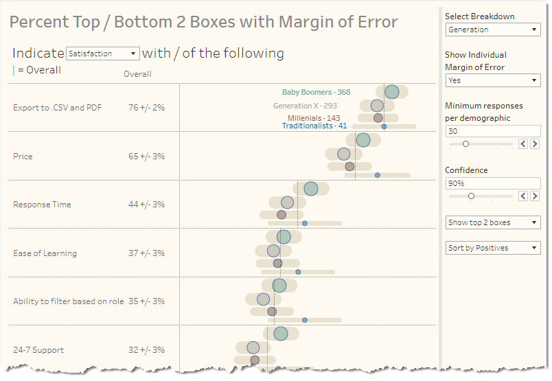
This in turn led to forays into visualizing how the number of responses directly impacts the confidence interval.
Armed with these step-by-step blog posts, let’s see how we can tackle showing the margin of error associated with Likert-scale longitudinal data.
Computing Top 2 Boxes
I copied and pasted a lot of calculated fields from the dashboards embedded in the two blog posts I cited. Not all of these fields worked “as is.” For example, the Percent Top 2 Boxes from the first example was computed like this:
SUM(

    IF [Value]>=4 THEN 1 ELSE 0 END

    )

/ SUM([Number of Records])
This translates as “If the response was a 4 or a 5, count it, then divide by everyone who answered the question.”
In our example, the questions use a 7-point Likert scale, where the “strongly agree” and “agree” were 1 and 2, respectively. I altered the calculation as follows.
SUM(IF [Values]<=2 then 1 ELSE 0 END)/COUNT([Data])
This translates as “If the response was a 1 or a 2, count it, then divide by everyone who answered the question” where COUNT([Data]) provides the same functionality as SUM([Number of Records]).
If you’re curious as to why I didn’t just create a field called [Number of Records] it’s because I used Tableau Relationship feature and didn’t do any data prep. See this blog post for a discussion.
Iterate, Iterate, Iterate
Here’s a quick walk-through of some of my visualization attempts.
I started by emulating the dots with error bars approach.
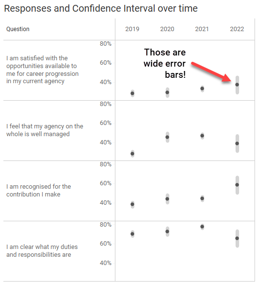
Note that the Confidence is set for 90% (P=.10). Don’t worry, the embedded dashboards at the end of this article allow you to set the Confidence to 80%, 90%, 95%, and 99%.
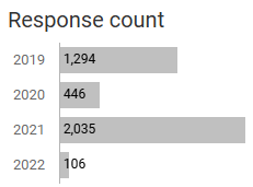
Yes, the margin of error for 2020 and especially 2022 are very wide (+/- 8 points for 2022). This is because there are considerably fewer responses for those years than for 2019 and 2021.
By the way, if you change the Confidence level to 99%, the margin of error for 2022 is +/- 13 points.
But I digress.
I then thought that since we’ve got longitudinal data, we should use lines instead of dots and came up with this.
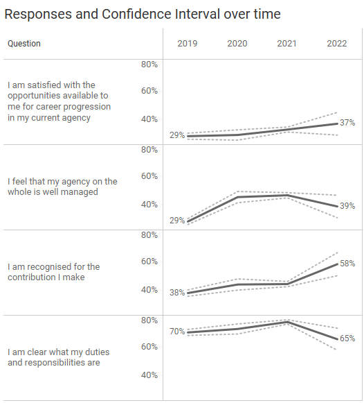
The same calculations I use to get the top and bottom ranges for the error bars drives the dotted lines.
I like the dotted lines a lot but decided that I would rather shade the regions between the dotted lines to better show the range of possible values.
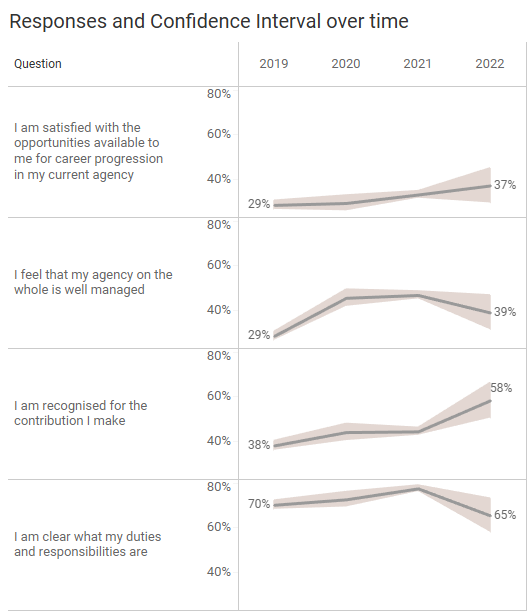
If you’re curious as to how to shade the region between two lines using Tableau, just perform an internet search. I went with what I thought was the easiest approach: an Area chart where I don’t stack the marks. You’ll find the “don’t stack” option under the “Analysis” menu. Color the bottom area white, the top area gray, and make sure to change the opacity to 100%.
Done.
So… what now?
What Assertions Can We Make?
Just what do we do with this lovely chart showing the responses with the error range shaded?
I find myself thinking about the things my clients would want to report. Something like “in 2019, X percent indicated that they agree or strongly agree that fluffernutters are delicious. In 2022 that percentage increased to Y percent.”
With that in mind, let’s just focus on the first year and the last year.
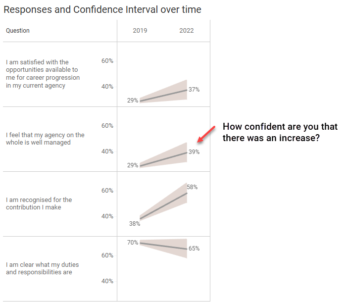
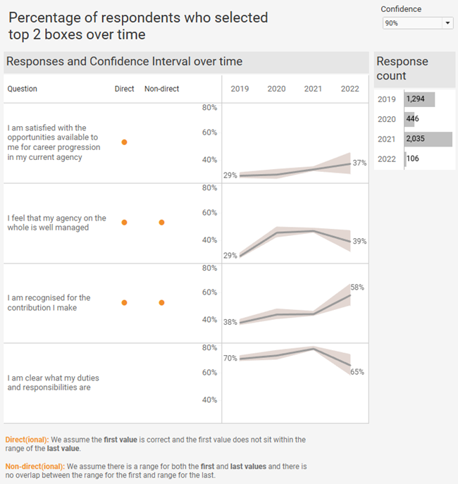
Can you say, with confidence, that for the second question (I feel that my agency on the whole is well managed) that there was an increase from 2019 to 2022? That is, that there is no overlap between the range of responses for 2019 and 2022?
Here’s another view where we use reference bands to see if the lowest possible value for 2019 might be greater than the highest value for 2022, and that the lowest for 2022 might be greater than the highest for 2019.
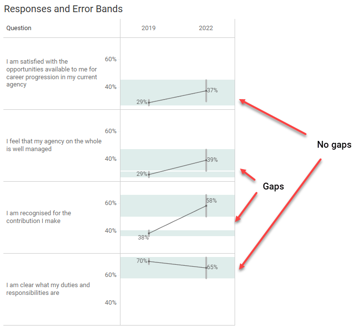
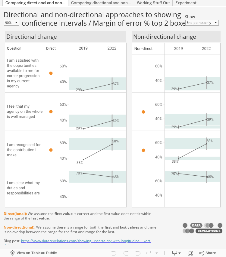
So, for the second and third questions you can assert, for 90% of samples, the resulting confidence intervals would imply the true values for 2019 are smaller than the true values for the second and third questions for 2022, although the gap for the second question is small. You should not make this assertion with the first and fourth questions as there is overlap with the margin of error bands.
Incidentally, if you increase the Confidence level to 95% the only thing you can assert is that there was an increase from 2019 and 2022 for the third question.
So, with the Confidence level set to 90%, we can see there are gaps for the second and third questions. Wouldn’t it be nice if we could just have a dot letting our audience know when the changes are “significant” and when they are not, rather than having bands and asking them to look for gaps?
And wouldn’t it be great if we could just leverage the work from the first blog post and use already-figured-out calculations for displaying a dot when the change between two periods is significant?
Steve Learns About Directional and Non-Directional Hypothesis
And that’s exactly what I did, and I got this confusing result.
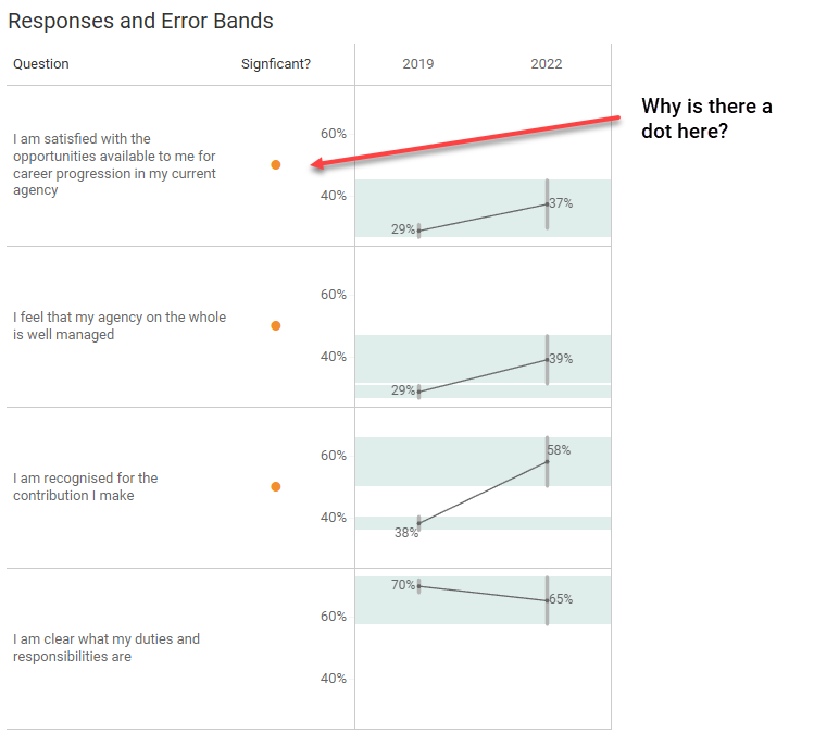
There’s no gap for the first question, so why does my calculation indicate that the change between 2019 and 2022 is statistically significant, using the tried and true z-test calculation I wrote about back in 2015?
My head-scratching led to two calls for help, the first one being to Anna Foard. Anna explained the difference between a directional and non-directional hypothesis which eventually led me to this wonderful blog post from Analytics Vidhya.
With the error bars and error bands, the assumption that there is a degree of fuzziness for 2019 and fuzziness for 2022.
With my test for statistical significance dot, the assumption is that the results for 2019 are pin-point accurate but there is fuzziness for the 2022 values.
Now I can see why we have that extra dot for the first example. There’s nothing “wrong” with it; it’s just performing a directional vs. non-directional test.
But this got me thinking about how to create a calculation that looks for overlap in the fuzzy values for 2019 and the fuzzy values for 2022.
Making a Different Dot
I’ll confess that I struggled with this as some decisions I made early in the process forced me into having to craft a table calculation.
This led to my second call, this time to Jonathan Drummey. Jonathan conducted a clinic on how to assess the data and what capabilities we might want. For example, we discussed whether we would want to have the ability to show differences for more than two periods; that is, looking at multiple periods and not just the starting and ending period.
For the sake of simplicity, I elected to just look at the starting and ending periods. My apologies in advance that all the calcs are hard coded to look at 2019 and 2022.
Here’s the pseudocode for what we need to determine.
If the upper limit for Top 2 Boxes % for 2019 is greater than or equal to the lower limit of the Top 2 Boxes % for 2022

OR

If the lower limit for the Top 2 Boxes for 2019 is greater than or equal to the upper limit of the Top 2 Boxes % for 2022 then there is an overlap so don’t display a dot; otherwise, display a dot.
This appears simple enough. Why not just have a calculation like this one?
IF MAX(YEAR([Date]))=2019 THEN [Top 2_Lower limit] END
The problem is that our visualization needs to break things up into different years and that the calculation for 2019 is only available for 2019. When I’m in the 2022 column, Tableau can’t “see” what the value was for 2019, it just knows what the value is for 2022.
Here’s a snippet of the worksheet I crafted with Jonathan to see how the fields all work together.
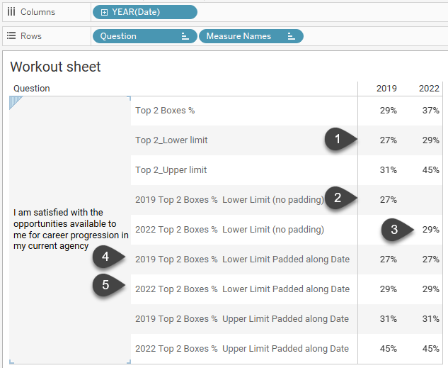
In (1) we can see the lower limits for 2019 and 2022. In (2) and (3) I have separate calculations for 2019 and 2022 but because they render nulls and aren’t present across both columns, we can’t perform calculations on them.
But notice the values for (4) and (5) and how they render the same results for both columns.
Ah, now we’re talking!
Just how did we get that?
I had started to look into LOOKUP() and PREVIOUS_VALUE() calcs (and if I ever plan to compare more than two periods I’ll look into this again). Jonathan suggested something far simpler to pad the values across both columns and ensure that the lower limit for 2019 is present in both the 2019 and 2022 columns.
WINDOW_MAX(IF MAX(YEAR([Date]))=2019 then [Top 2_Lower limit] END)
By computing this by [Date] it makes Tableau apply the calculation across all columns.
We fashioned three additional table calculations and then combined them into this calculation for Non-direct dot.
IF [2019 Top 2 Boxes %  Upper Limit Padded]>=[2022 Top 2 Boxes %  Lower Limit Padded]

OR

[2019 Top 2 Boxes %  Lower Limit Padded]>=[2022 Top 2 Boxes %  Upper Limit Padded]

THEN "" else "⬤"

END
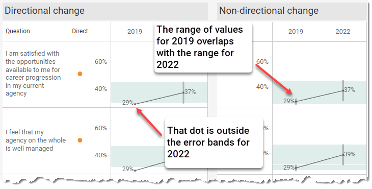
Here’s a view that has a dot for both the directional and non-directional approaches. You’ll also find an interactive version of this at the end of the blog post.
Important: I don’t think I would subject my stakeholders to two different dots. Decide which approach is most appropriate and just show one dot.
Conclusion
The main purpose of data visualization is to help people better see – and understand – their data. My hope is that with this article you have more tools to help people see when they can, and when they should not, make assertions about longitudinal survey results.
Here’s the embedded workbook with various dashboards. Feel free to tinker and download.