
By Steve Wexler and Jeffrey Shaffer
January 9, 2017
Please also see follow-up post.
Overview
Makeover Monday, started by Andy Kriebel in 2009 and turned into a weekly social data project by Kriebel and Andy Cotgreave in 2016, is now one of the biggest community endeavors in data visualization. By the end of 2016 there were over 3,000 submissions and 2017 began with record-breaking numbers, with over 100 makeovers in the first week. We are big fans of this project and it’s because of the project’s tremendous success and our love and respect for the two Andys (and now Eva Murray) that we feel compelled to write this post.
Unfortunately, 2017 started off with a truly grand fiasco as over 100 people published findings that cannot be substantiated. In just a few days the MM community has done a lot damage (and if it doesn’t act quickly it will do even more damage.)
What happened
Woah! That’s quite an indictment. What happened, exactly?
Here’s the article that inspired the Makeover Monday assignment.
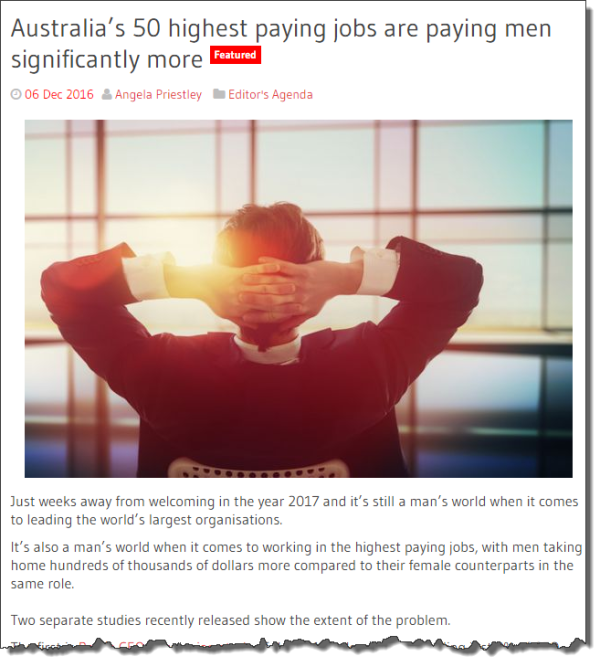
Figure 1 — Source article for Makeover Monday. See http://www.womensagenda.com.au/talking-about/editors-agenda/item/7544-australia-s-50-highest-paying-jobs-are-paying-men-significantly-more
So, what’s the problem?
The claims in the article are wrong. Really, really wrong.
And now, thanks to over 100 well-meaning people, instead of one website that got it really, really wrong there are over 100 tweets, blog posts, and web pages that got it really, really wrong.
It appears that Makeover Monday participants assumed the following about the data and the headline:
- The data is cited by Makeover Monday so it must be good data.
- The data comes from the Australian Government so it must be good data that is appropriate for the analysis in question.
- The headline comes from what appears to be a reputable source, so it must be true.
Some Caveats
Before continuing we want to acknowledge that there is a wage gap in Australia; it just isn’t nearly as pronounced as this article and the makeovers suggest.
The data also looks highly reputable; it’s just not appropriate data for making a useful comparison on wages.
Also, we did not look at all 100+ makeovers. But of the 40 that we did review all of them parroted the findings of the source article.
Some makeover examples
Here are some examples from the 100+ people that created dashboards.
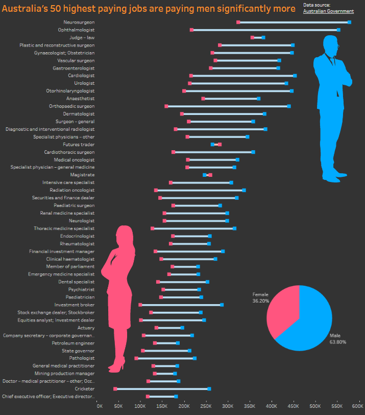
Figure 2 — A beautiful viz that almost certainly makes bogus claims. Source: https://public.tableau.com/profile/publish/Australias50highestpayingjobsarepayingmensignificantlymore
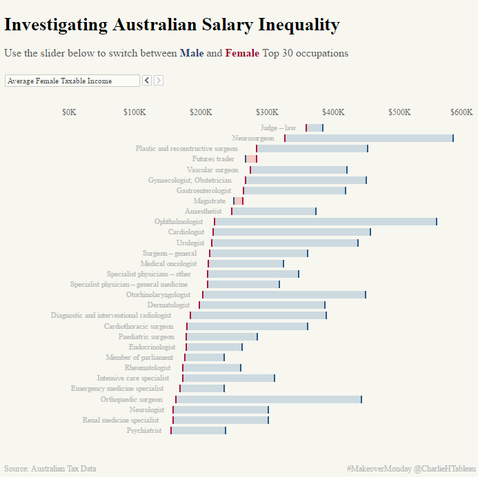
Figure 3– Another beautiful viz that almost certainly makes bogus claims. Source: https://public.tableau.com/profile/publish/MM12017/Dashboard1#!/publish-confirm
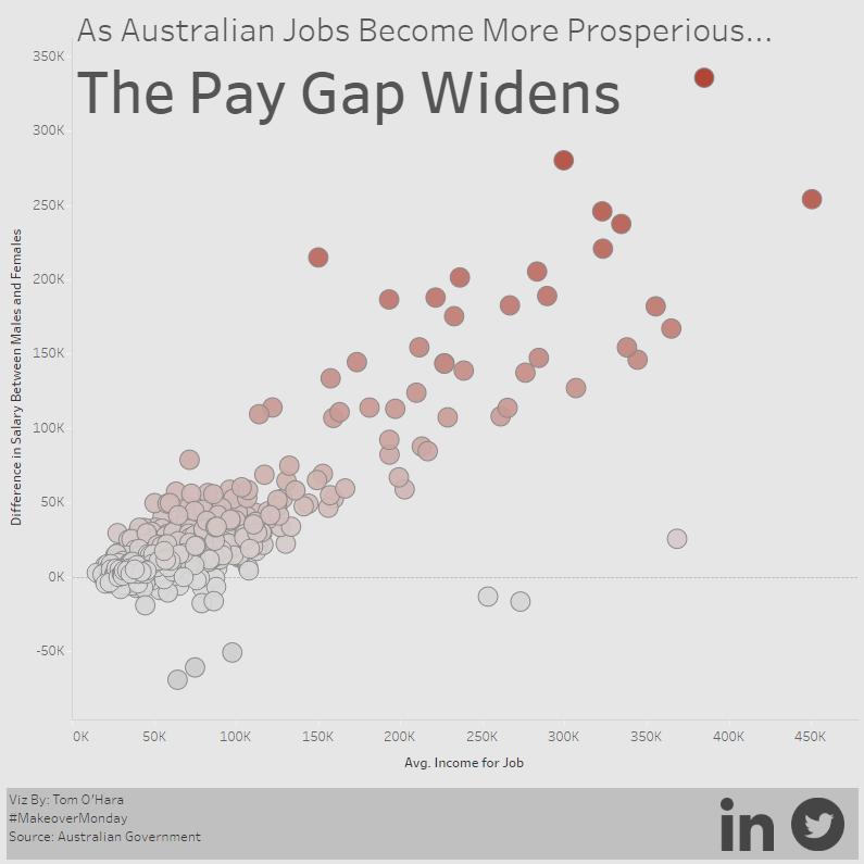
Figure 4 — A third beautiful viz that almost certainly makes bogus claims. Source: https://public.tableau.com/profile/publish/AustraliaPayGap_0/Dashboard1#!/publish-confirm
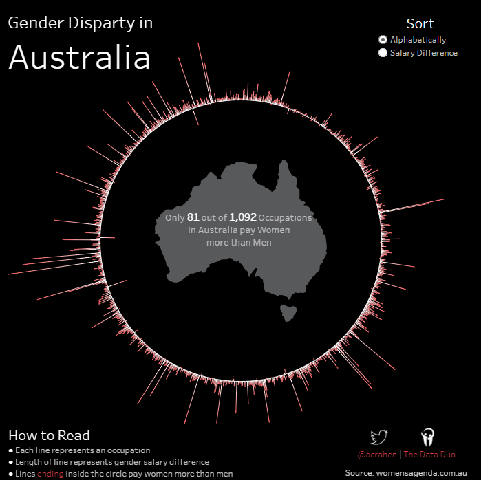
Figure 5 — Yet another beautiful viz that almost certainly makes bogus claims. Source: https://public.tableau.com/views/GenderDisparityinAustralia/GenderInequality?:embed=y&:display_count=yes&:showVizHome=no#1
Goodness! These dashboards (and the dozens of others that we’ve reviewed) are highlighting a horrible injustice!
[we’re being sarcastic]
Let’s hold off before joining a protest march.
Why these makeovers are wrong
Step back and think for a minute. Over 100 people created a visualization on the gender wage gap and of the dashboards we reviewed, they all visualized, in some form, the difference between male Ophthalmologists earning $552,947 and females that only earned $217,242 (this is the largest gap in the data set.)
Did any of these people ask “Can this be right?”
This should be setting off alarm bells!
There are two BIG factors that make the data we have unusable.
One — The data is based on averages, and without knowing the distributions there’s no way to determine if the data provides an accurate representation.
Here’s a tongue-in-cheek graphic that underscores why averages may not be suited for our comparison.
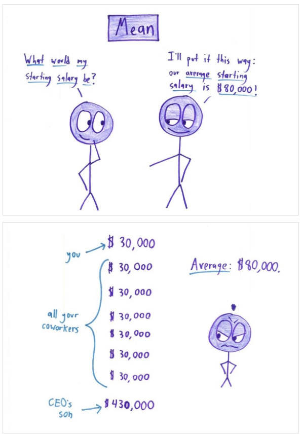
Figure 6 — The danger of using averages. From Why Not to Trust Statistics.
Here’s another real-world graphic from Ben Jones that compares the salaries of Seattle Seahawks football players.
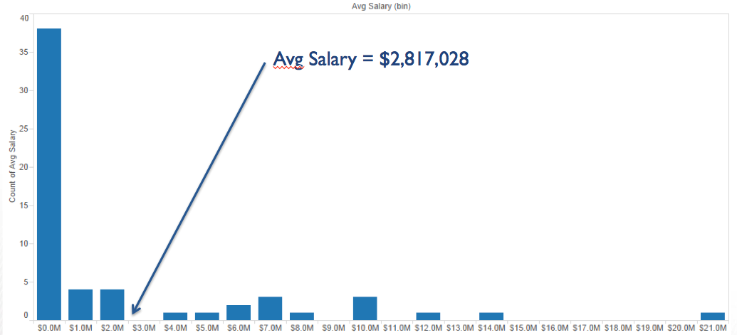
Figure 7 — Seattle Seahawks salary distributions. Source: Ben Jones.
Ben points out
The “average” Seahawks salary this year is $2.8M. If you asked the players on the team whether it’s typical for one of them to make around $3M, they’d say “Hell No!”
Two — The data doesn’t consider part time vs. full time work. The data is from tax returns and doesn’t take into account the number of hours worked.
Let’s see how these two factors work with a “for instance” from the source data.
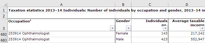
Figure 8 — A snippet of the source data in question.
So, there are 143 women Ophthalmologists making an average of $217K and 423 males making an average of $552K.
Are the women in fact being paid way less? On average, yes, but suppose the following were the case:
Of the 143 women, 51 work only 25 hours per week
And of those 423 men, 14 of them are making crazy high wages (e.g., one of them is on retainer with the Sultan of Brunei).
Could the 51 part-time workers and the 14 insanely-paid workers exaggerate the gap?
Absolutely.
Is this scenario likely?
About the Sultan of Brunei? Who knows, but about hours worked?
Very likely.
We did some digging and discovered that as of 2010, 17% of the male workforce in Australia was working part time while 46% of the female workforce was working part time.
This single factor could explain the gap in its entirety.
Note: Not knowing the number of hours worked is only one problem. The data also doesn’t address years of experience, tenure, location, or education, all of which may contribute to the gap.
Findings from other surveys
We did some more digging…
Data from the Workplace Gender Equality Agency (an Australian Government statutory agency) shows that in the Health Care field, 85% of the part-time workers in 2016 were female. This same report shows a 15% pay gap for full-time Health Care employees and only a 1% gap for part-time employees.
Finally, a comprehensive study titled Differences in practice and personal profiles between male and female ophthalmologists, was published in 2005. Key findings from this survey of 254 respondents show:
- 41% of females worked 40 hours per week compared with 70% for males.
- 57.5% of females worked part-time compared with 13.6% for males.
- The average income for females was AUS$ 38,000 less than males, not $335,000 less.
(Yes, that’s still a big gap, but it’s almost 10 times less than what the article claims).
Why this causes so much damage
It would keep me up at night to think that something I did would lead to somebody saying this:
“Wait! You think the wage gap here is bad; you should see what it’s like in Australia. Just the other day I was looking at this really cool infographic…”
So, here we are spreading misinformation. And it appears we did it over 100 times! The visualizations have now been favorited over 500 times, retweeted, and one was featured as the first Tableau Viz of the Day for 2017.
We’re supposed to be the good guys, people that cry foul when we see things like this:
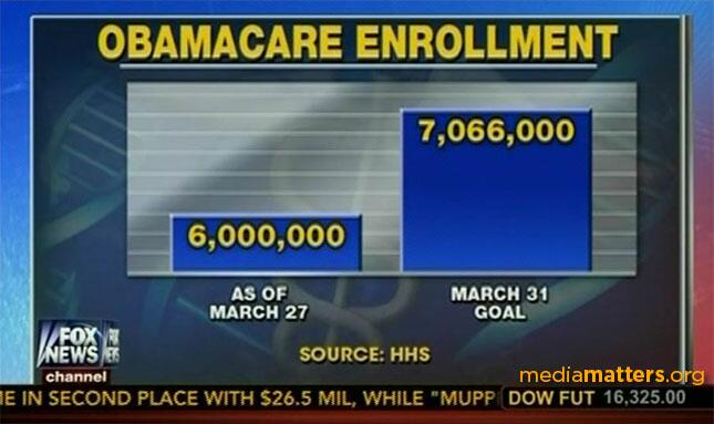
Figure 9 — Notorious Fox News Misleading Graphic.
Publishing bogus findings undermines our credibility. It suggests we value style over substance, that we don’t know enough to relentlessly question our data sources, and that we don’t understand when averages work and when they don’t.
It may also make people question everything we publish from now on.
And it desensitizes us to the actual numbers.
Let us explain. There is clearly a gender wage gap in Australia. The Australian government reports the gender wage gap based on total compensation to be around 26% for all industries, 23% for full-time and 15% for full-time health care (base pay is a smaller gap). While we can’t calculate the exact difference for full-time or part-time ophthalmologists (because we only have survey data from 2005), it appears to be less than 15%.
Whatever the number is, it’s far less than the 150% wage gap shown on all the makeovers we reviewed.
And because we’ve reported crazy large amounts, when we see the actual amount — say 15% — instead of protesting a legitimate injustice, people will just shrug because 15% now seems so small.
How to fix this
This is not the first time in MM’s history that questionable data and the lack of proper interrogation has produced erroneous results (see here and here.) The difference is that this time we have more than 100 people publishing what is in fact really, really wrong.
So, how do we, the community, fix this?
- If you published a dashboard, you should seriously consider publishing a retraction. Many of you have lots of followers, and that’s great. Now tell these followers about this so they don’t spread the misinformation. We suggest adding a prominent disclaimer on your visualization.
- The good folks at MM recommend that participants should spend no more than one hour working on makeovers. While this is a practical recommendation, you must realize that good work, accurate work, work you can trust, can take much more than one hour. One hour is rarely enough time to vet the data, let alone craft an accurate analysis.
- Don’t assume that just because Andy and Eva published the data (and shared a headline that too many people mimicked without thinking) that everything about the data and headline is fine and dandy. Specifically:
- Never trust the data! You should question is ruthlessly:
- What is the source?
- Do you trust the source? The source probably isn’t trying to deceive you, but the data presented may not be right for the analysis you wish to conduct.
- What does the data look like? Is it raw data or aggregations? Is it normalized?
- If it’s survey data, or a data sample, is it representative of the population? Is the sample size large enough?
- Does the data pass a reasonableness test?
- Do not trust somebody else’s conclusions without analyzing their argument.
Remember, the responsibility of the data integrity does not rest solely with the creator or provider of the data. The person performing the analysis needs to take great care in whatever he / she presents.
Alberto Cairo may have expressed it best:
Unfortunately, it is very easy just to get the data and visualize it. I have fallen victim of that drive myself, many times. What is the solution? Avoid designing the graphic. Think about the data first. That’s it.
We realize that the primary purpose of the Makeover Monday project is for the community to learn and we acknowledge that this can be done without verified data. As an example, people are learning Tableau everyday using the Superstore data, data that serves no real-world purpose. However, the community must realize that the MM data sets are real-world data sets, not fake data. If you build stories using incorrect data and faulty assumptions then you contribute to the spread of misinformation
Don’t spread misinformation.
Jeffrey A. Shaffer
Follow on Twitter @HighVizAbility
Steve Wexler
Follow on Twitter @VizBizWiz
Additional reading
Why not trust statistics. Read this to see why the wrong statistic applied the wrong way makes you just plain wrong (thank you, Troy Magennis).
Simpson’s Paradox and UC Berkeley Gender Bias
The Truthful Art by Alberto Cairo. If everyone would just read this we wouldn’t have to issue mass retractions (you are going to publish a retraction, aren’t you?)
Avoiding Data Pitfalls by Ben Jones. Not yet available, but this looks like a “must read” when it comes out.
Sources:
1. Trend in Hours worked from Australian Labour Market Statistics, Oct 2010.
2. Workplace Gender Equality Agency Data Explorer
http://data.wgea.gov.au/industries/1
3. Differences in practice and personal profiles between male and female ophthalmologists, Danesh-Meyer HV1, Deva NC, Ku JY, Carroll SC, Tan YW, Gamble G, 2007.
https://www.ncbi.nlm.nih.gov/pubmed/17539782?dopt=Citation
4. Gender Equity Insights 2016: Inside Australia’s Gender Pay Gap, WGEA Gender Equity Series, 2016.
5. Will the real gender pay gap please stand up, Rebecca Cassells, 2016.
http://theconversation.com/will-the-real-gender-pay-gap-please-stand-up-64588


