Overview
So, you’ve created a wonderful collection of survey data dashboards that have innumerable demographic filters so that users can, for example, just see responses from left-handed Los Angeles Lakers fans between the ages of 34 and 39.
So, what’s the problem?
Actually, there are two problems. The first occurs when extreme filtering reduces the number of responses so much that the results are statistically meaningless. The second is that you may inadvertently allow people to “glean” who has answered a survey. For example, if you conduct a salary survey you want participants to be assured that nobody will be able to see individual responses. But if you have too many filters it may be possible to winnow down the results so you can guess who provided the answer.
Fortunately, it’s easy to set up a graceful way to suppress a chart and display an error message in its place when the “n” count gets too low.
How it works
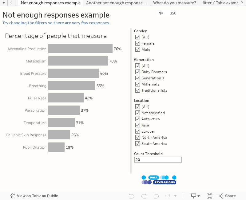
Consider the dashboard shown in Figure 1. Notice that the upper right corner shows that with nothing filtered there are a total of 350 responses.
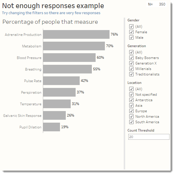
Figure 1 — A simple dashboard showing results for a check-all-that-apply question.
Also notice there’s a parameter control that allows you to specify the cut-off point for displaying the visualization.
Now let’s see what happens if we use the filters to winnow down the number of responses to the point that there are fewer than 20 (Figure 2.)
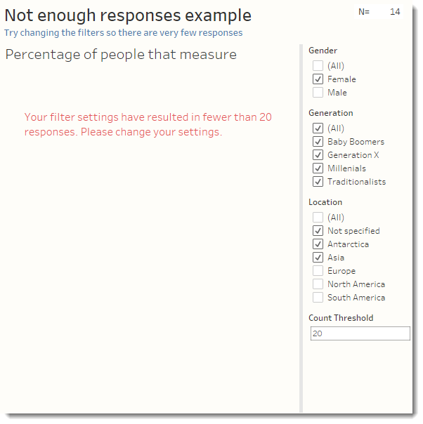
Figure 2 — With too few responses the bar chart is suppressed and the warning message is displayed.
What’s happening here is that there are two floating charts both with similar filters that looks at how many survey responses there are. The bar chart in Figure 1 is set to appear if the number of responses is greater than or equal to 20. The warning message (it’s just a Tableau worksheet) appears if the number of responses is fewer than 20.
How the filters work
Let’s look first at what drives the bar chart (Figure 3.)
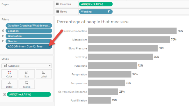
Figure 3 — Pill settings and filters for the bar chart.
Notice in particular there is a field called [Minimum Count] that is on Filters card and that it is set to True. The field [Minimum Count] is defined as follows:
![Figure 4 -- How [Minimum Count] is defined.](https://datarevelations.com/wp-content/uploads/2016/10/04_MinimumCount.png)
Figure 4 — How [Minimum Count] is defined.
So, the visualization will only appear if there are at least 20 responses; otherwise the filter “kills” the viz and the only thing we see is the title.
Now, how does the secondary visualization work? Let’s have a look (Figure 5.)
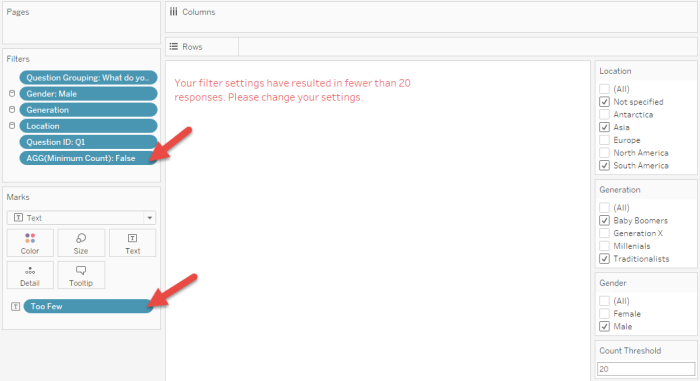
Figure 5 — Pill and filter settings for the “warning” visualization.
Notice that [Minimum Count] is also on the Filter card but is set to False. We’re seeing the viz (the red message) because the filters in place result in fewer than 20 responses.
And just what is producing the message? It’s the field [Too Few] that’s been placed on the Text button on the Marks card. The field is defined as follows.
![Figure 6 -- Definition of the field [Too Few].](https://datarevelations.com/wp-content/uploads/2016/10/06_TooFewField.png)
Figure 6 — Definition of the field [Too Few].
Why use floating elements?
We certainly could cram the two visualizations into a container and make sure that when one is displayed the other only takes up a few pixels. I elected to go with the floating approach but made sure that the secondary viz was set to be in back of the primary viz.
Is that all there is to it?
For a check-all-that-apply question, that’s all you need to know, but some question and visualization types may need different approaches.
Consider Figure 7 where we see a jitterplot comparing salary data for men and women where each dot represents a response from an individual survey participant.
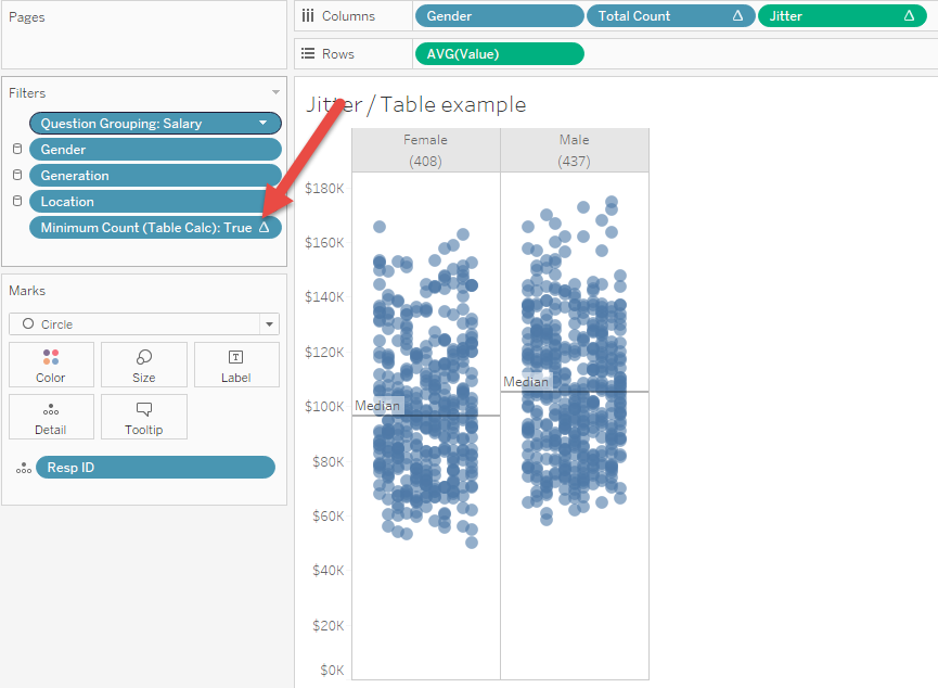
Figure 7 — Pill and filter configuration for a jitterplot visualizing salary data.
Notice that we have a different field (one that uses a Table calculation) on the Filters card.
There’s also a very different setup to display the warning message for this visualization as we cannot simply base this on SUM([Number of Records]).
I will leave it to the reader to explore how this these are set up. Just let me know when you come up with a better approach.
Conclusion
If you’re visualizing survey data and giving users filters you should come up with a game plan for what to do if there are too few responses. In this blog post (and the embedded, downloadable workbook) I present two approaches for two types of survey questions. Other questions types (for example, Likert-scale questions) will need some modifications to what I’ve presented here.