Overview
Perhaps you’ll be presenting to a packed boardroom, or maybe you’ll be conversing one-on-one with a supervisor, colleague, or client. Either way, you’ll need to be equipped with facts that people can see and understand. But before you give that presentation, or have that conversation, take this workshop – and learn why that pie chart you planned to include would be a terrible choice!
Whether you’re creating your own charts, using someone else’s, or you just need to be more confident in how to use and interpret graphs, this workshop will help you become fluent in the language of charts and dashboards.
Packed with great examples created in Excel, Tableau, Power BI, and Qlik, among others, this one-stop resource empowers you to extract the most important information from data visualizations quickly and accurately, act on key insights, solve problems, persuade others, and make the right decisions for your organization every time.
Length
Two 90-minute sessions spread out over two days
Who should attend this workshop?
The Benefits
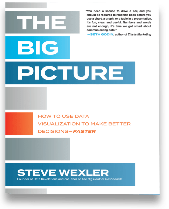
Topics will be based on the author’s book The Big Picture: How to Use Data Visualization to Make Better Decisions—Faster and will include
Materials

Each attendee will receive a copy of The Big Picture: How to Use Data Visualization to Make Better Decisions—Faster
“You need a license to drive a car, and you should be required to read this book before you use a chart, a graph, or a table in a presentation. It’s fun, clear, and useful. Numbers and words are not enough, it’s time we got smart about communicating data.”
—SETH GODIN, author of This Is Marketing
“Steve Wexler’s graphs are vivid, funny, practical, and highly informative—and so is this book.”
—TIM HARFORD, bestselling author of The Undercover Economist and The Data Detective
“Steve Wexler has done for data visualization what Dale Carnegie did for the art of making friends and influencing people, and Strunk and White did for writing. The Big Picture helps professionals at every level of an organization master the fundamentals and develop better “maps” that lead to better strategies.”
—JOHN C. PITTENGER, former SVP of Corporate Strategy for Koch Industries, Inc.
About the Instructor

Steve has worked with ADP, Gallup, Johnson & Johnson, Deloitte, ExxonMobil, Convergys, Consumer Reports, The Economist, ConEd, D&B, Marist, Cornell University, Stanford University, Tradeweb, Tiffany, McKinsey & Company, and many other organizations to help them understand and visualize their data. Steve is a five-time Tableau Zen Master, Iron Viz Champion, and on the advisory board to the Data Visualization Society.
His presentations and training classes combine an extraordinary level of product mastery with the real-world experience gained through developing thousands of visualizations for dozens of clients.
Steve has taught thousands of people in both large and small organizations and is known for conducting his seminars with clarity, patience, and humor.


