

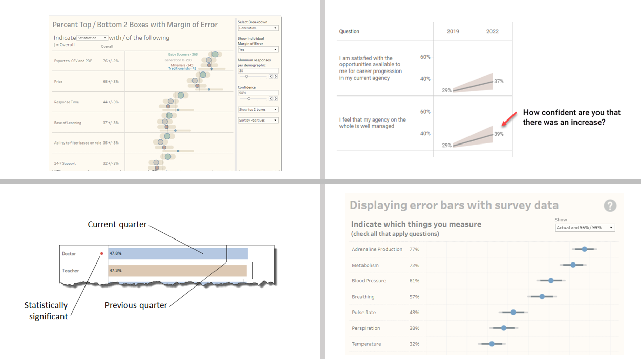
Last month an attendee of my Visualizing Survey Data Using Tableau course asked me to explore showing confidence intervals / margin-of-error around longitudinal data. That is, he wanted his stakeholders to be able to see just what plus-or-minus X points looks like with respect to Likert responses over time.
I get it. I’ve seen too many clients brush off how unreliable survey results are when you don’t have enough responses. Maybe some visual ammunition will help get across why “n=24” is probably not good enough to make a business decision.
I realize that over the years I’ve accumulated a lot of ways to help people visualize uncertainty in survey data, so this month I’m opening up the discussion and share what I’ve learned with anyone that wants to participate.
And…
Joining me will be statistics and data visualization ninja, Anna Foard.
We hope to see you there.

