
Let me show you a few techniques that will allow you to ditch color legends and in so doing make it easier for your audience to understand the charts you create.
Direct Labeling Lines
Here’s a “before” picture of a simple line chart with a color legend.
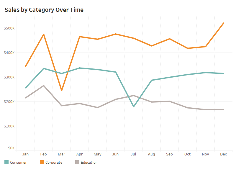
Figure 1 – Line chart with color legend.
The problem here is that you are asking your audience to look in one location to see the lines and then a different location to determine what each line represents, as in “I see there is an orange line… what does orange mean? Oh, it’s ‘Corporate.’ I see there is a teal line… what does teal mean?”
Compare this with a chart where we label each line.
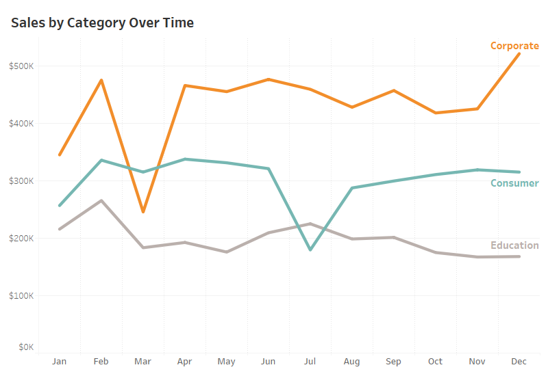
Figure 2 – Line chart with direct labeling.
Not only is it easier, but with direct labeling you don’t even have to use color, or some mechanism to distinguish the different lines (solid, dotted, dashed, etc.)
Direct Labeling Bars
Here’s a before picture of a stacked bar chart.
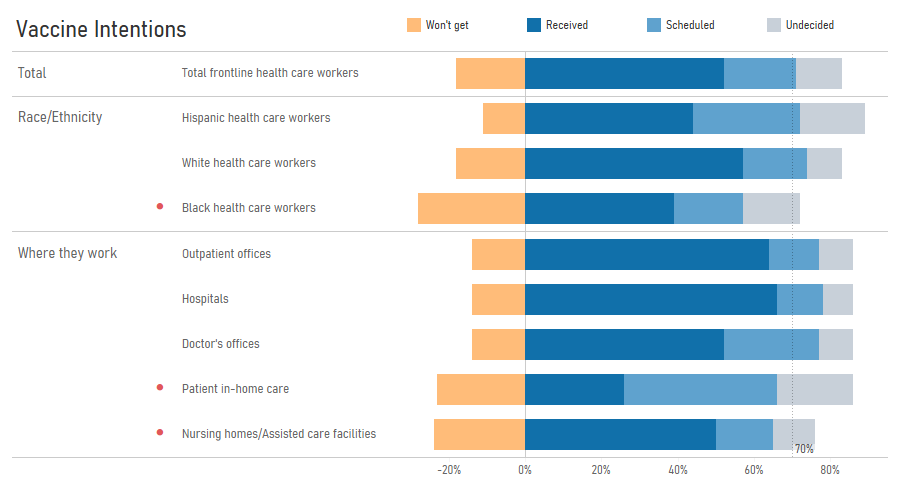
Figure 3 — Stacked bar chart with color legend along top.
I’ll admit this isn’t bad as the color legend is very close to the first set of stacked bars. I have no quibble with this one but would try to avoid the one shown in Figure 4.
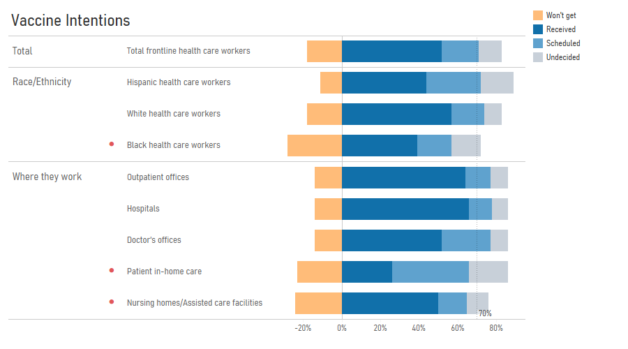
Figure 4 — Stacked bar chart with color legend along the side. This one is harder to interpret.
You can also place the color legend in the title itself, as shown in Figure 5.
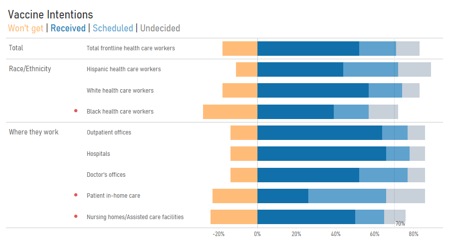
Figure 5 — Stacked bar chart with the color legend in the title.
My preference would be to directly label the first set of stacked bars, as shown in Figure 6.
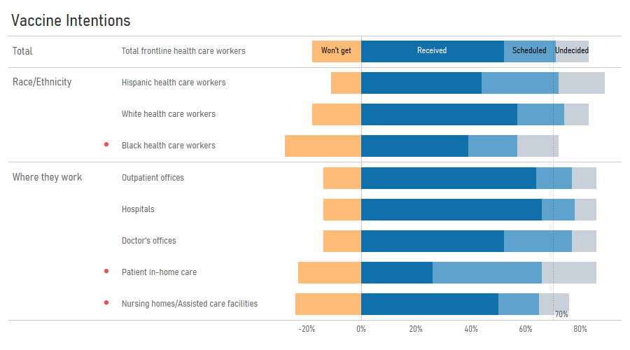
Figure 6 — Stacked bar chart with first row labeled.
How to do direct labeling in Tableau
There are at least two ways to label the first row of stacked bars.
Consider the example below where we place ATTR([Response]) on label. If you’re wondering why the ATTR() it has to do with the divergent stacked bar chart I’m using as it stops Tableau from creating a lot of extra rows. In most cases you won’t have to worry about this and can just please [Response] on Labels.
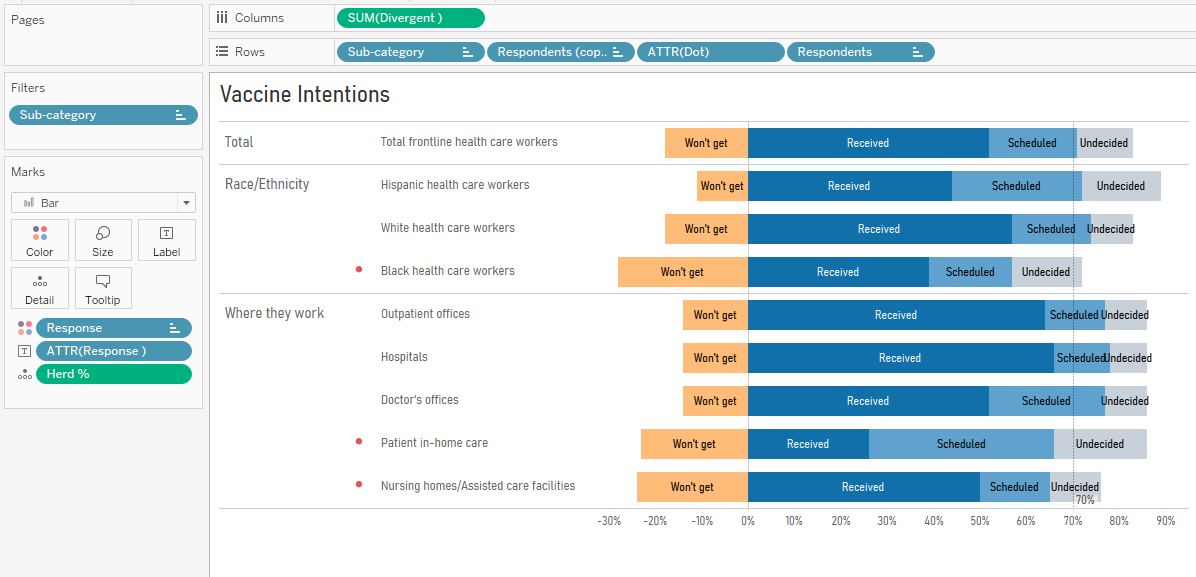
Figure 7 — Stacked bar chart with all mark labels showing.
The first thing we need to do is turn off mark labels, as shown in Figure 8.
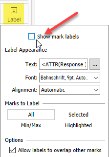
Figure 8 — Turn off mark labels.
Now we need to select the marks we want to label, right-click, select “Mark Label” and select “Always Show.”
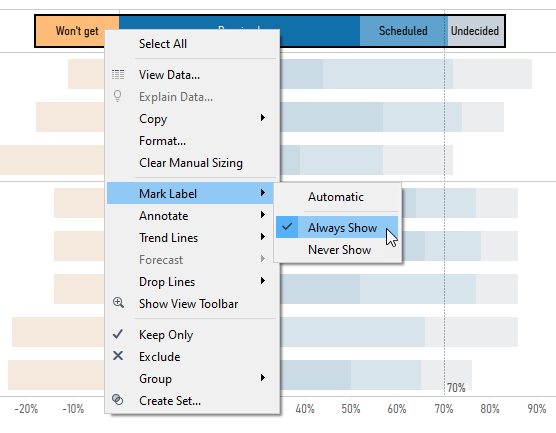
Figure 9 — Selecting the mark labels we always want to display.
So, mission accomplished, right?
Yes, unless we change the sort order of the rows which will give you something like what we see in Figure 10.
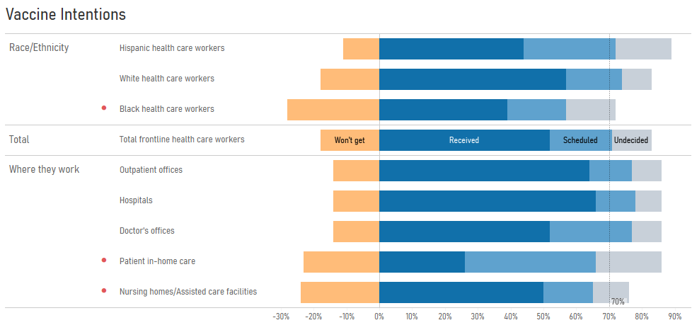
Figure 10 — Showing only certain mark labels may produce unexpected results.
How can we craft a solution where only the labels on the first row are displayed, no matter what is in the first row?
A simple table calculation will do the trick.
Create a calculated field called [Just top row] and define it as
IF FIRST()=0 THEN ATTR([Response]) END
This translates as “If we’re in the first row of the partition—however that might be set up—display ATTR([Response]); otherwise, don’t display anything.”
This will be full proof, assuming your “compute using” is set to Table (Down).
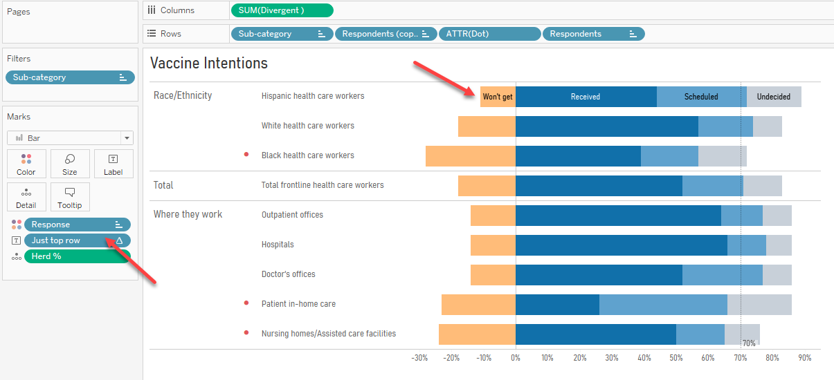
Figure 11 — Using a smarter calculation to endure that whatever is in the first row gets labeled.
Yes, but what about my numbers?
In both the line chart and stacked bar chart we’ve sacrificed showing all the numbers so we can label only key elements.
But was it really that much of a sacrifice? Here’s the line chart with every mark labeled with numbers … and it’s a really cluttered mess.
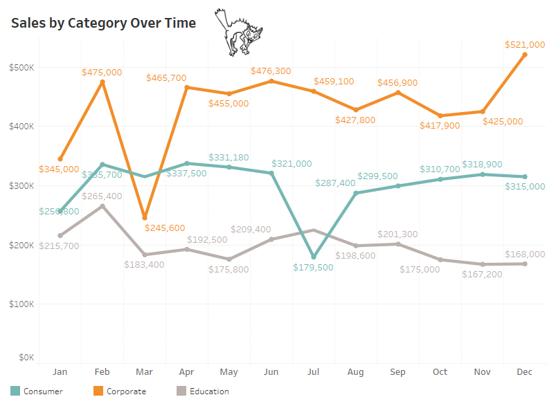
Figure 12 — Labeling every mark is one of the major sources of chart clutter.
Conclusion
One of the major reasons to create a data visualization is to reduce the time to insight for your audience. Removing the need for a color legend may help you with that goal.


