 Review of
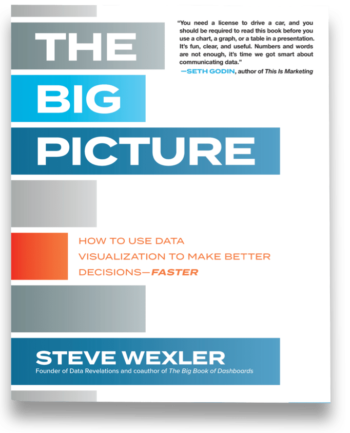
The Big Picture: How to Use Data Visualization to make Better Decisions — Faster
by Steve Wexler
From The Financial Times, May 2021
 Evidence-based decision-making. It is a seductive concept, yet one that is very often tantalisingly out of reach. Steve Wexler believes it is because “spreadsheets aren’t enough”, that information needs to be transmitted with meaning and clarity of purpose, a task for which data visualisation is ideally suited.
A seasoned data visualisation evangelist, Wexler has conceived this book not for chart-making practitioners like himself, but for “the 99% of business professionals who don’t create data visualisations”.
The core of the book addresses the age-old dilemma of how to stop all business dashboards being full of boring line, pie and bar charts when that is the limit of most people’s chart literacy. Wexler discusses “xenographphobia” — a “fear of unusual graphics” — and explores the need to determine whether a chart is too complex or an executive too closed-minded to receiving insights from new forms of data presentation.
Carefully selected examples abound, drawn from a wide range of business environments, to make a specific point about chart design that promote greater chart fluency.
The book concludes with a look at how you can change your organisation with data visualisation, where a series of examples document how companies have benefited from adopting a progressive data visualisation strategy.
Like much of what precedes it, the examples in this section serve mostly as carrots — incentives to do things better — but the stick of the book’s bottom line is never far away: “If you don’t develop this ability, your organisation is going to be trounced by competitors [that do].”


