
Or
How I stopped worrying and learned to love appreciate the Marimekko
March 19, 2017
Overview
Readers of my blog know that I suffer from what Maarten Lambrechts calls xenographphobia, the fear of unusual graphics. I’ll encounter a chart type that I’ve not seen before, purse my lips, and think (smugly) that there is undoubtedly a better way to show the data than in this novel and, to me, unusual chart.
That was certainly my reaction to “Marimekko Mania” when Tableau 10.0 was first released. I didn’t see a solid use case for this chart. There were some wonderful blog posts from Jonathan Drummey and Bridget Cogley on the subject, but I just wasn’t buying the need for the chart type.
Note: It turns that for many situations you can make a perfectly fine Marimekko just using table calculations. I’ll weigh in on this later.
Enter Emma Whyte and Workout Wednesday
My “I’ll never need to use that” arrogance was disrupted a few weeks ago when I read this blog post from Emma Whyte. The backstory is that Emma reviewed a Junk Charts makeover of a Wall Street Journal graphic, really liked the makeover, and decided to recreate it in Tableau.
Here’s the Wall Street Journal graphic.
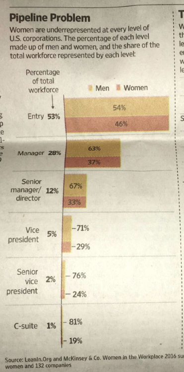
Figure 1 — Source of inspiration for Junk Charts and Emma Whyte. From a 2016 survey by LeanIn.org and McKinsey & Co.
There are two important things the data is trying to tell us:
- The percentage of women decreases, a lot, the higher up you go in the corporate hierarchy; and,
- There are far more entry-level positions than there are managers than there are VPs, etc.
The chart does a good job on the first point but only uses text to covey the second point.
Contrast this with Emmy Whyte’s visualization:
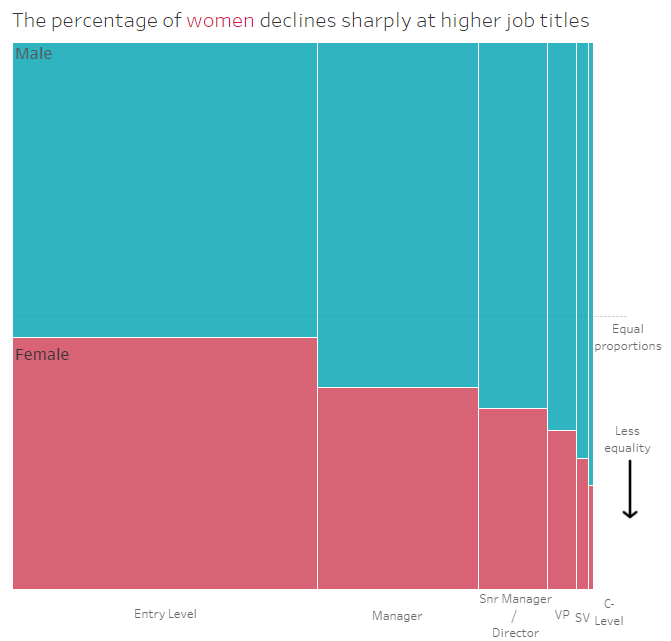
Figure 2 — Emma Whyte’s makeover.
Whoa.
I immediately “grokked” this. There are way more men than women among VPs, Senior VPs, and in the C-Suite, but look how much narrower those bars are! True, I cannot easily compare how much wider the Entry Level column is than the VP column, but is that really important?
Is the Marimekko in fact the “right” way to show this?
Being a little bit stubborn I was not ready to declare a Marimekko victory so I decided to see if I could build something that worked as well, if not better, using more common chart types.
Anything You Can Do, I Can Do…
I won’t go through all ten iterations I came up with but I will show some of my attempts to convey the data accurately and with the visceral wallop I get from Emma’s makeover.
100% Stacked Bar with Marginal Histogram
Putting a histogram in the margin has become a “go to” technique when I’m dealing with highlight tables and scatterplots so I thought that might work in this situation. Here’s a 100% stacked bar chart combined with a histogram.
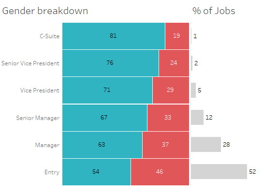
Figure 3 — 100% stacked bar with marginal histogram.
I was so convinced this would just smoke the Marimekko. I mean just look how easy it is to make accurate comparisons!
That may be true, but I think the Marimekko in question does a better job.
Connected Dot Plot
Here’s another attempt using a connected dot plot.
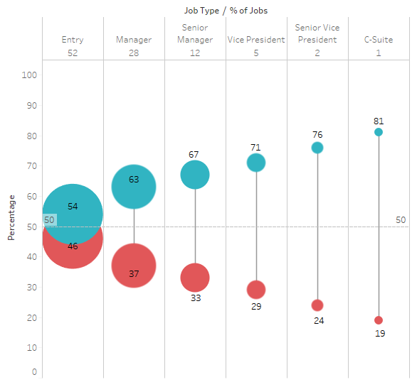
Figure 4 — Connected dot plot where the size of the circles reflects the percentage of the workforce.
Here the lines separating the circles show the gender gap and the size of the circles reflects the percentage of the workforce.
OK, I think the gap is well represented but the spacing between job levels is a fixed width. In my pursuit of accuracy I needed to find a way spread the circles based on percentage of the workforce.
Diverging Lines with Bands
Figure 5 shows two diverging lines with circles and bands that are proportionate to the percentage of the workforce (Entry level is 52 units wide, Manager is 28 units wide, and so on).
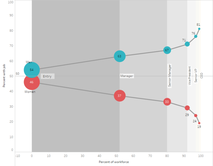
Figure 5 — Diverging lines with dots and correctly-sized circles and bands
But why are the lines sloping? Shouldn’t the lines be flat for each job level?
Flat Lines
Here’s a similar approach but where the lines stay flat for each job level.
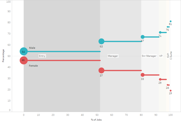
Figure 6 — Flat lines and accurate circles and bands.
More Approaches and the Graphic from the Actual Report
All told I made ten attempts. The calculation I came up with for Figure 5 also made it possible to create a Markimekko just using a simple table calculation.
Note: I asked Jonathan Drummey to have a look at the Marimekko-with-table-calc approach and he points out that in both my example and Emma Whyte’s example the data isn’t “dense” so you can break the visualization simply by right-clicking a mark and selecting Exclude. That said, the technique is fine for static images and dashboards where you disable the Exclude functionality.
I also reviewed the full Women in the Workplace report and saw they used an interesting pipeline chart to relate the data.

Figure 7 — “Pipeline” chart from Women in Workplace report (LeanIn.Org and McKinsey & Co.)
I applaud the creativity but have a lot of problems with the inaccurate proportions. Notice that this chart also has a sloping line suggesting a continuous decrease as you go from one level to another.
And The Winner is…
For me, Emma Whyte’s Marimekko does the best job of showing the data in a compelling and accurate format and I thank Emma for presenting such a worthwhile example.
Will I use this chart type in my practice?
It depends.
If the situation calls for it, I would try it along with other approaches and see what works best for the intended audience.
Here’s a link to the Tableau workbook that contains a copy of Emma Whyte’s original approach and many of my attempts to improve upon it. If you come up with an alternative approach that you think works well, please let me know.
Postscript
Big Book of Dashboards co-author Jeff Shaffer encouraged me to make some more attempts. Here’s a work in progress using jittering.
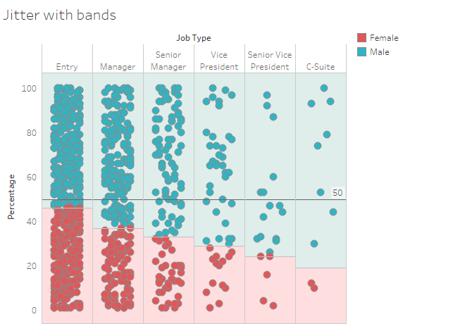
I think this looks promising.


