More thoughts on the Markimekko chart and in particular how to build one in Tableau.
April 4, 2017
Overview
Given my reluctance to embrace odd chart types and my conviction that I would find something better I was surprised to find myself last month writing about — and endorsing — the Marimekko chart.
If I was surprised then I’m absolutely gobsmacked to be writing about it again.
What precipitated all this was another very good example of the chart in the wild. After admiring it I couldn’t help but “look under the hood” (hey, we are talking about Tableau Public and people sharing this stuff freely) and I thought that the dashboard designer was working harder than he needed to build the visualization.
So, if people are going to use these things I thought I would share an alternative, and I think easier, technique for building them.
The Great Example from Neil Richards
Here’s the terrific Makeover Monday dashboard from Neil Richards where we see the likelihood of certain jobs being replaced by automation.
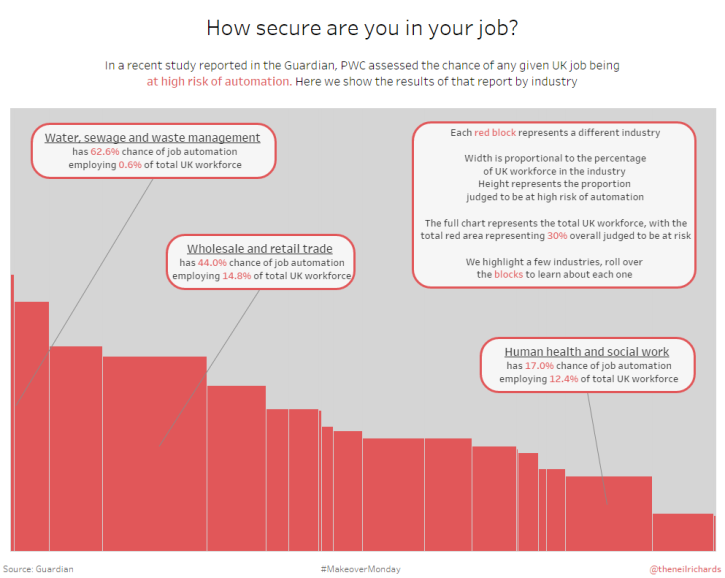
Neil does a great job highlighting some of the more interesting findings, but if you want to know more than what Neil highlights you’ll need to explore the dashboard on your own.
Notice that in both this case and in Emma Whyte’s we are dealing with only two data segments; e.g., male vs. female and at-risk vs. not at-risk jobs. Having only two colors is one of the main reasons why the chart works well.
Okay! Uncle! I agree that under the right conditions this is a useful chart and I can see what you may want to make one.
But is there an easier way to make one?
An Easier Way to Create a Markimekko Chart in Tableau
It turns out the same technique Joe Mako showed me six years ago for building a divergent stacked bar chart works great for fashioning a Markimekko. Let’s see how to do this using Superstore data with fields similar to what was available in both Emma and Neil’s dashboards.
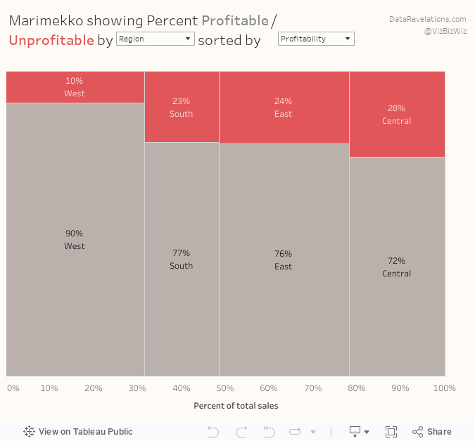
Let’s say I want to compare the magnitude of sales with the profitability of items by region. Figure 2 shows the overall magnitude of sales but makes comparing profitability difficult.
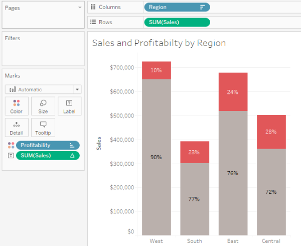
Figure 2 — Overall sales is easy to see but comparing profitability across regions is difficult.
Here’s another attempt using a 100% stacked bar chart.
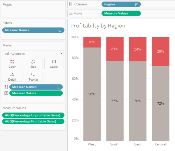
Figure 3 — Showing profitability with a 100% stacked bar chart.
Yes, this does a much better job allowing us to compare the profitability of each region, but there’s no way to easily glean that Sales in the West is almost double sales in the South (which is easy to do in Figure 2.)
So, how can we make the regions that have large sales be wide and the regions that have small sales be narrow?
Understanding the Fields
Before going much further let’s make sure we understand the following three fields:
- Percentage Profitable Sales
- Percentage Unprofitable Sales
- Sales Percentage of
[Percentage Profitable Sales]
This is defined as
SUM(IF [Profit]>=0 THEN [Sales] END)/SUM(Sales)
… and translates as “if the profit for an item within a partition is profitable, add it up, then divide by the total sales within the partition.”
This is the field that gives us the 90%, 77%, 76%, and 72% results shown in Figure 3.
[Percentage Unprofitable Sales]
This is defined as
1 - [Percentage of Profitable Sales]
… and gives us the 10%, 23%, 24%, ad 28% shown in Figure 3.
[Sales Percentage of]
This is defined as
SUM([Sales]) /TOTAL(SUM([Sales]))
… and we will use it to compute the percentage of sales across the four regions (i.e., show me the sales for one region divided by the sales for all the regions). Here’s how we might use it in a visualization.
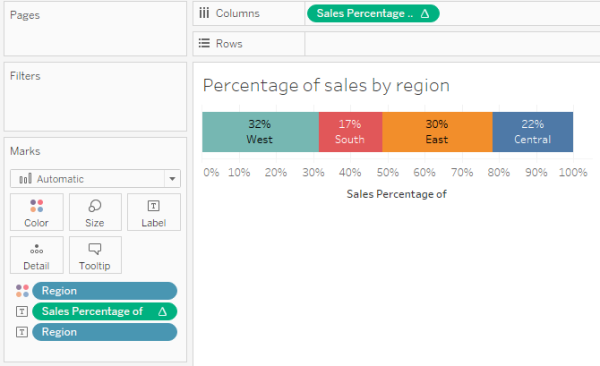
Figure 4 — Using the calculation to figure out how wide each region should be.
So, in Figure 4 we can see that the West segment is a lot thicker than the South segment.
How can we apply this additional depth to what we had in Figure 3?
Make it Easy to See if the Math is Correct
At this point it will be helpful to see the interplay of the various measures and dimensions using a cross tab like the one shown in Figure 5.

Figure 5 — Cross tab showing the relationship among the different measures and dimensions.
The first four columns are easy to interpret:
“I see that sales in the West is $725,458 of which 10% is unprofitable and 90% is profitable. That $725,458 represents 31.6% of the total sales.”
But how is the field called [Start at] defined and how are we going to use it?
Understanding [Start at]
[Start at] is defined as
PREVIOUS_VALUE(0)+ZN(LOOKUP([Sales Percentage of],-1))
This is the calculation that figures out where the mark should start while [Sales Percentage of] will later determine how thick the mark should be. Let’s see how this all works together.
![Figure 6 -- How [Start at] and [Sales Percentage of] will work together. Note that “Compute Using” for the two table calculations is set to [Region].](https://datarevelations.com/wp-content/uploads/2017/04/06_HowItWorks.png)
Figure 6 — How [Start at] and [Sales Percentage of] will work together. Note that “Compute Using” for the two table calculations is set to [Region].
PREVIOUS_VALUE(0)
Tells Tableau to look at whatever is the value for [Sales at] for the row above and if there is no row above make the value 0 (see Item 1 in Figure 6, above.)
Add to this the value for [Sales Percentage of] in the previous row (Item 2 which is also not present) and you get 0 + 0 (Item 3).
For the East region we want to start wherever West left off (Item 3 plus Item 4, which gives us item 5) and make the mark 29.5% wide (item 6).
For the Central region we want to start wherever the previous region left off (Item 5 plus item 6, which gives us item 7) and make the mark 21.8% wide (Item 8).
Let’s see how this all fits together into the Marimekko visualization in Figure 7.
![Figure 7 -- Using [Start at ] and [Sales Percentage of] to make the Marimekko work.](https://datarevelations.com/wp-content/uploads/2017/04/07_Mari-1.png)
Figure 7 — Using [Start at ] and [Sales Percentage of] to make the Marimekko work.
- [Start at] is on columns and determines the starting point (how far to the right) for each of the regions.
- [Sales Percentage of] is on Size and determines how thick the bars should be.
- Size is set to Fixed width, left aligned, where Fixed means the measure on the Size shelf is determining the thickness.

Figure 8 — Size must be fixed and left-aligned.
Some Interesting Findings
I built a parameter-driven version of the Marimekko (embedded at the end of this blog post) that allows the viewer to select different dimensions and different ways to sort. Here’s what happens when we look at Sub-Category sorted by Profitability.

Figure 9 — Profitability by Sub-Category.
Okay, not a big surprise here given how many visualizations we’ve all seen showing that Tables are problematic.
That said, I was in for a surprise when I broke this down by state and sorted by the magnitude of sales, as shown below.

Figure 10 — Profitability by state, sorted by Sales.
Wow, after 11 years of living with this data set I never realized that 60% of the items sold in Texas were unprofitable. Who knew?
To be honest I’m not convinced we need a Marimekko to see this clearly. A simple sorted bar chart will do the trick, as shown in Figure 11.
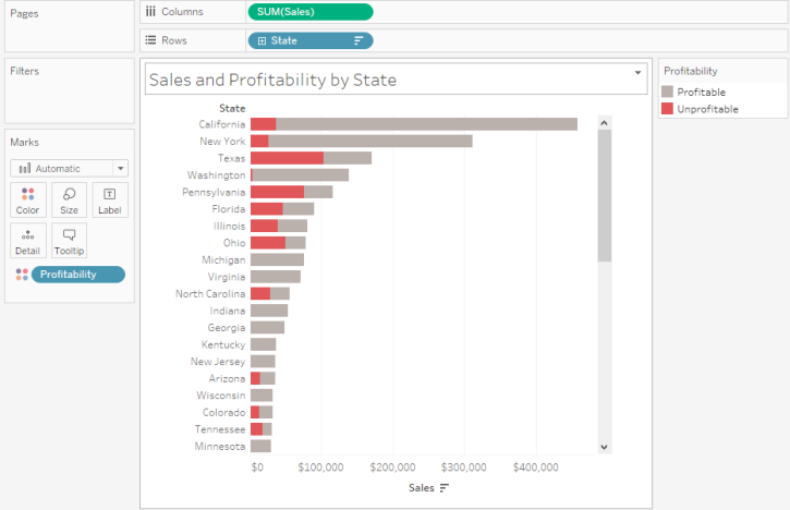
Figure 11 — Sorted bar chart.
Indeed, I think this very simple view is better than the Marimekko in many respects.
I guess it depends what you’re trying to get across.
See for Yourself
I’ve included an embedded workbook that has the Superstore example as well as versions of the visualizations Emma Whyte and Neil Richards built, but using this alternative technique.
I encourage you to think long and hard before deploying a Marimekko. But if you do decide to build one I hope the techniques I explored here will prove useful.