April 25, 2017
Overview
I became a big fan of adding a marginal histogram to scatterplots when I first saw them applied in Tableau visualizations from Shine Pulikathara and Ben Jones.
For those not familiar with how these work, consider the scatterplot shown in Figure 1 that shows the relationship between salary and age.
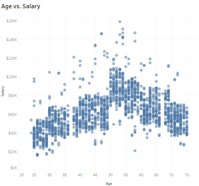
Figure 1 — Comparing Age and Salary on a scatterplot
Some interesting things here; for example, we can see that salaries appear to be highest between ages 50 and 55 and lowest among the youngest and older workers.
But look what happens when we add marginal histograms to the x and y axes (Figure 2.)
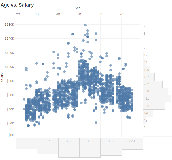
Figure 2 — Scatterplot with marginal histogram
Whoa! The two bar charts to the right and below the main chart add a lot of insight into the data. We don’t just see the correlations, but now we can also see age demographics and salary distribution in the organization.
Marginal Histograms and Jitterplots
The marginal histogram works with other visualizations as well. Consider the dot plot with jitter (jitterplot) example from Lean management tool innovator LeanKit in Figure 3.
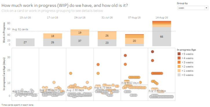
Figure 3 — Individual and aggregate vies of important data from LeanKit
The combination of the individual data points (the jittered dots that represent Kanban cards) and the aggregated data (stacked bar charts) tells a more complete story than having only the aggregation or only the individual dots.
Marginal Histograms and Highlight Tables
Readers of this blog know I like highlight tables and often use them as a “visualization gateway drug” to move people from cross tabs to more insightful ways of looking at their data.
But as great as they are, they do not lend themselves to accurate comparisons of the data. Consider Figure 4 where we see the percentage of sales broken down by region.
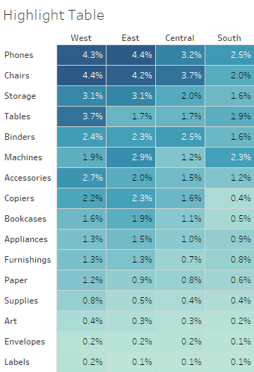
Figure 4 — Sorted highlight table showing percentage of sales by sub-category and region
Yes, I can see that Phones in the East is a lot darker than Copiers in the West, but without the numbers there’s no way to could do an exact comparison as I don’t know of anyone that can look at just the color coding and exclaim “ah, that cell is twice as blue as that other cell.”
But look what happens when we add the marginal histogram to the visualization, as shown in Figure 5.
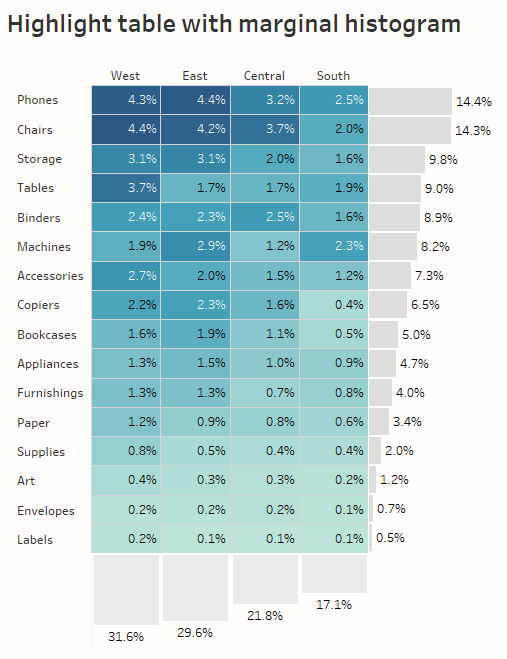
Figure 5 — Sorted highlight table with marginal histograms. Here we see percentage of sales.
So much added insight, and so little added screen real estate!
I’ll confess that the histograms don’t work quite as well if you have negative values. Here’s what it looks like if we look at percentage of profit broken down by sub-category and region.
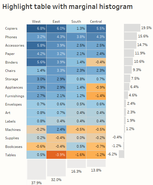
Figure 6 — Sorted highlight table with marginal histograms. Here we see percentage of profit.
Because we have bars pointing in different directions for the histogram on the right the look isn’t quite as clean, but it certainly works.
See for Yourself
I’ve included an embedded dashboard below where you can experiment with different metrics and different sorting choices. Feel free to download and “look under the hood.”
Note that making this type of dashboard is not very difficult; the only tricky part is getting the three elements to align properly. Ben Jones gets into those particulars in his blog post.

