May 10, 2017
Overview
A nod of appreciation to Tom Davenport who first brought this issue to my attention.
Most organizations want to wildly exceed customer expectations for all facets of all their products and services, but if your organization is like most, you’re not going to be able to do this. Therefore, how should you allocate money and resources?
First, make sure you are not putting time and attention into things that aren’t important to your customers and make sure you satisfy customers with the things that are important.
One way to do this is to create a survey that contains two parallel sets of questions that ask customers to indicate the importance of certain features / services with how satisfied they are with those products and services. A snippet of what this might look like to a survey taker is shown in Figure 1.

Figure 1 — How the importance vs. satisfaction questions might appear to the person taking the survey.
How to Visualize the Results
I’ve come up with a half dozen ways to show the results and will share three approaches in this blog post. All three approaches use the concept of “Top 2 Boxes” where we compare the percentage of people who indicated Important or Very Important (the top two possible choices out of five for importance) and Satisfied or Very Satisfied (again, the top two choices for Satisfaction).
Bar-In-Bar Chart
Figure 2 shows a bar-in-bar chart, sorted by the items that are most important.
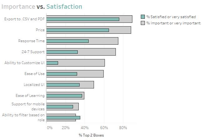
Figure 2 — Bar-in-bar chart
This works fine, as would having a bar and a vertical reference line.
It’s easy to see that we are disappointing our customers in everything except the least important category and that the gap between importance and satisfaction is particular pronounced in Ability to Customer UI (we’re not doing so well in Response Time, 24-7 Support, and East of Use, either.)
Scatterplot with 45-degree line
Figure 3 shows a scatterplot that compares the percent top 2 boxes for Importance plotted against the percent top 2 boxes for Satisfaction where each mark is a different attribute in our study.
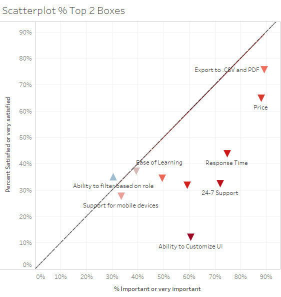
Figure 3 — Scatterplot with 45-degree reference line
The goal is to be as close to the 45-degree line as possible in that you want to match satisfaction with importance. That is, you don’t want to underserve customers (have marks below the line) but you probably don’t want to overserve, either, as marks above the line suggest you may be putting to many resources into things that are not that important to your customers.
As with the previous example it’s easy to see the one place where we are exceeding expectations and the three places where we’re quite a bit behind.
Dot Plot with Line
Of the half dozen or so approaches the one I like most is the connected dot plot, shown in Figure 4.
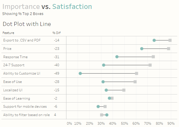
Figure 4 — Connected dot plot. This is the viz I like the most.
(I placed “I like most” in italics because all the visualizations I’ve shown “work” and one of them might resonate more with your audience than this one. Just because I like it doesn’t mean it will be the best for your organization so get feedback before deploying.)
In the connected dot plot the dots show the top 2 boxes for importance compared to the top 2 boxes for satisfaction. The line between them underscores the gap.
I like this viz because it is sortable and easy to see where the gaps are most pronounced.
But what about a Divergent Stacked Bar Chart?
Yes, this is my “go to” viz for Likert-scale things and I do in fact incorporate such a view in the drill-down dashboard found at the end of this blog post. I did in fact experiment with the view but found that while it worked for comparing one feature at a time it was difficult to understand when comparing all 10 features (See Figure 5.)
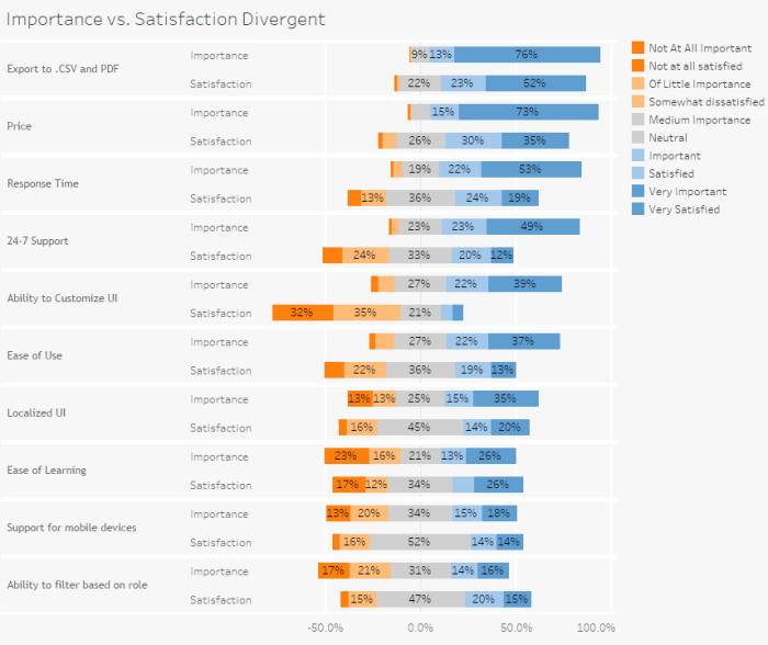
Figure 5 — Divergent stacked bar overload (too much of a good thing).
How to Build This — Make Sure the Data is Set Up Correctly
As with everything survey related, it’s critical that the data be set up properly. In this case for each Question ID we have something that maps that ID to a human readable question / feature and groups related questions together, as shown in Figure 6.
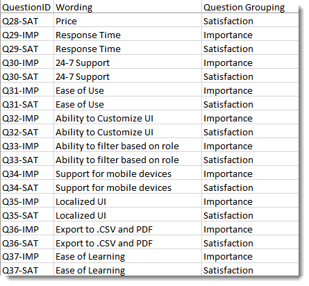
Figure 6 — Mapping the question IDs to human readable form and grouping related questions
Having the data set up “just so” allows us to quickly build a useful, albeit hard to parse, comparison of Importance vs. Satisfaction, as shown in Figure 7.
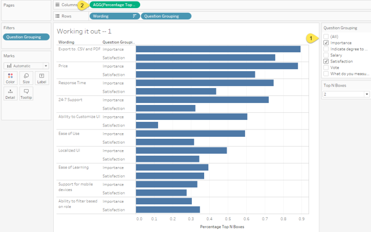
Figure 7 — Quick and dirty comparison of importance vs. satisfaction.
Here we are just showing the questions that pertain to Importance and Satisfaction (1). Note that measure [Percentage Top 2 Boxes] that is on Columns (2) is defined as follows.

Figure 8 — Calculated field for determining the percentage of people that selected the top 2 boxes.
Why >=3? It turns out that the Likert scale for this data went from 0 to 4, so here we just want to add up everyone who selected a 3 or a 4.
Not Quite Ready to Rock and Roll
This calculated field will work for many of the visualizations we might want to create, but it won’t work for the scatterplot and it will give us some headaches when we attempt to add some discrete measures to the header that surrounds our chart (the % Diff text that appears to the left of the dot plot in Figure 4.) So, instead of having a single calculation I created two separate calculations to compute % top 2 boxes Importance and % top 2 boxes Satisfaction. The calculation for Importance is shown in Figure 9.
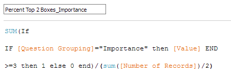
Figure 9 — Calculated field for determining the percentage of folks that selected the top two boxes for Importance.
Notice that we have all the rows associated with both the Importance questions and Satisfaction “in play”, as it were, but we’re only tabulating results for the Importance questions so we’re dividing by half of the total number of records.
We’ll need to create a similar calculated field for the Satisfaction questions.
Ready to Rock and Roll
Understanding the Dot Plot
Figure 10 shows what drives the Dot Plot (we’ll add the connecting line in a moment.)
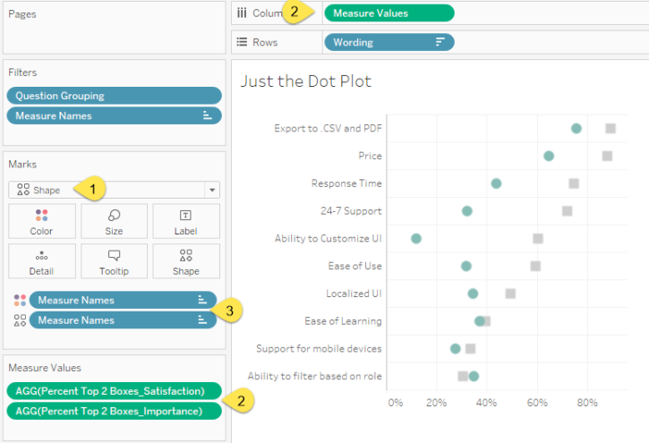
Figure 10 — Dissecting the Dot Plot.
Here we see that we have a Shape chart (1) that will display two different Measure Values (2) and that Measure Names (3) is controlling Shape and Color.
Creating the Connecting Line Chart
Figure 11 shows how the Line chart that connects the shapes are built.
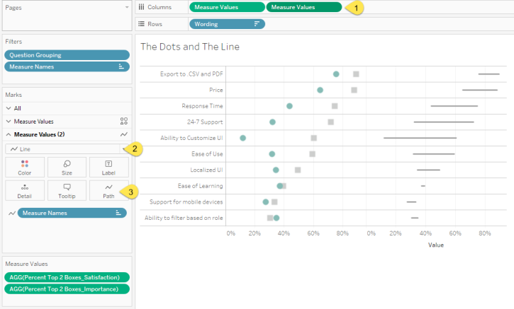
Figure 11 — Dissecting the Line chart.
Notice that Measure Values is on Rows a second time (1) but the second instance the mark type is a Line (2) and that the end points are connected using the Measure Names on the Path (3). Also notice that there is no longer anything controlling the Color as we want a line that is only one color.
Combining the Two Charts
The only thing we need to do now is combine the two charts into one by making a dual axis chart, to synchronize the secondary axis, and hide the secondary header (Figure 12.)
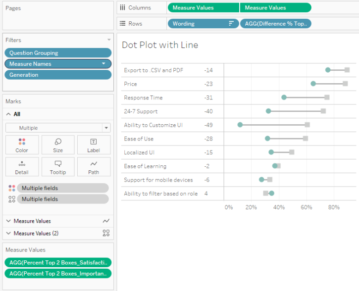
Figure 12 — the Completed connected Dot Plot.
What to Look for in the Dashboard
Any chart that answers a question usually fosters more questions. Consider the really big gap in Ability to Customize UI. Did all respondents indicate this, or only some?
And if one group was considerably more pronounced than others, what were the actual responses across the board (vs. just looking at the percent top 2 boxes)?
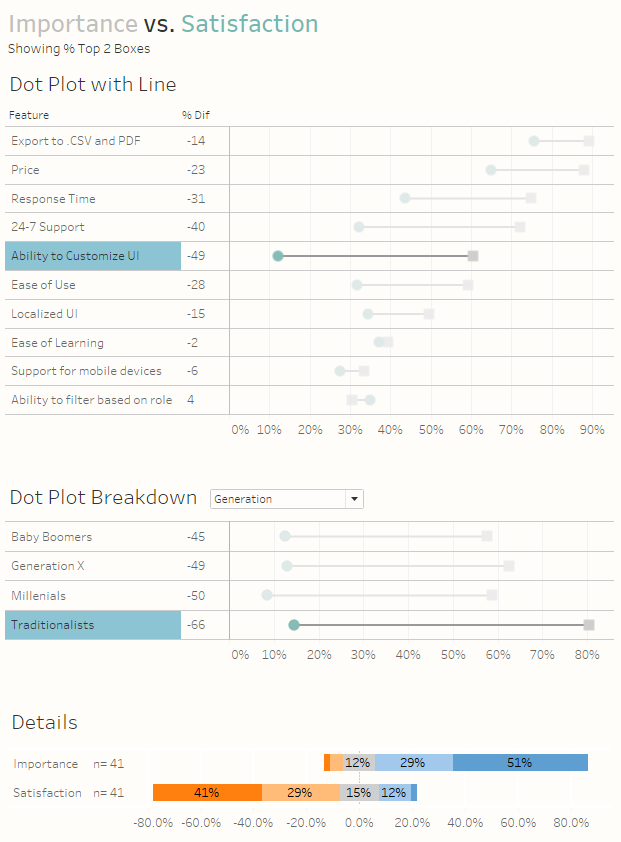
Figure 13 — Getting the details on how one group responded
The dashboard embedded below shows how you can answer these questions.
Got another approach that you think works better? Let me know.


