
The Importance of feedback, iteration, and constant improvement in data visualization (and finding people that will tell you when you are full of crap.)
July 5, 2017
Overview
People ask me how three opinionated people can write a book like The Big Book of Dashboards together. Didn’t we disagree on things? How were we able to work out our differences?
I can’t speak for Jeff Shaffer and Andy Cotgreave, but I’m very glad I found two fellow authors that would challenge every assertion I had, as it made for a much better book.
And why did it work?
It worked because we had one, overarching goal in common.
Clarity.
When people ask me about the process I think of a band breaking up because of “artistic differences.” That didn’t happen with the three of us because we weren’t trying to create art. For certain, we wanted dashboards that were beautiful, but more than anything else we wanted dashboards that allow the largest number of people to get the greatest degree of understanding with a minimum amount of effort.
Let me take you through a case study on how the Churn dashboard came into fruition and how following the approach we used can help you make better dashboards.
Background
I had just finished presenting the third day of three days’ worth of intensive Tableau training when an attendee showed me a data set like the one below.

Figure 1 — Subscribers gained and lost over time within different divisions
I asked the attendee what she thought she needed to be able to show and she said it was important to know when and where things were really good (i.e., many more people signing up than cancelling) and where and when things were really bad (i.e., more people cancelling than signing up).
She also stressed that management would insist on seeing the actual numbers and not just charts.
This is not a horse, It’s a dashboard
Here’s a famous quote attributed to car designer Alec Issigonis:
“a camel is a horse designed by a committee.”
The main idea is that you will run into problems if you attempt to incorporate many people’s opinions into a single project.
This was not the case with the Churn dashboard as we received more input from more people over a longer period than any other dashboard in the book — and it resulted in a much better product than if I had just gone at it alone.
Let’s look at the evolution of the dashboard.
Churn, take one
Here’s an image of one of my first attempts to show what was happening for Division A.
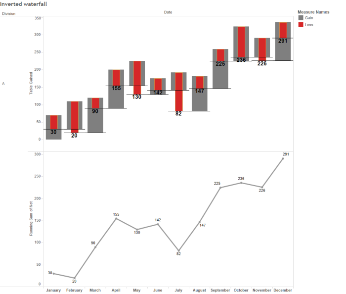
Figure 2 — Early attempt at showing churn.
Starting with the left side of the top chart, we see a starting point for the month (0 for January, 30 for February, 20 for March, etc.) the number of people subscribing (the gray bars going up) and the number of people cancelling (the red bars going down). It’s easy to see that I had more people subscribing than cancelling in January, and more people cancelling than subscribing in February.
The second chart shows the running sum over time.
Churn, takes two through fifty
Here’s a collage of some additional endeavors, many of which I didn’t even bother to share with others.
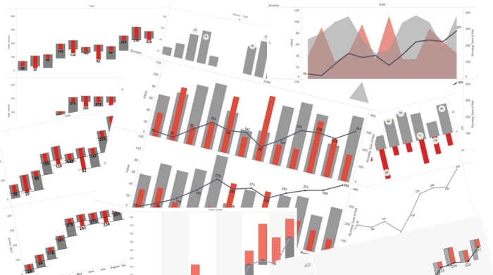
Figure 3 — A collage of multiple attempts to show churn.
Most of my attempts were fashioned around some type of GANTT / Waterfall chart but one chart that showed promise for a small group of reviewers was a juxtaposed area chart, dubbed the “mountain” chart by one client who was kind enough to give me feedback.

Figure 4 — The “mountain” chart. Beware of dual axes charts.
While some people “got” this most had a problem with the negative numbers (the cancellations depicted as red mountains) being displayed as a positive. The idea was to allow people to see in which months the negatives exceeded the positives and you can in fact see this easily (February, May, and especially July). But most people were simply confused, even after receiving an explanation of how the chart worked.
In addition, superimposing a second chart (in this case the running total line) almost always invites confusion as people must figure out how the axes work (e.g., “do the numbers on the left axis apply to the area chart or to the line?)
Getting closer, but Andy doesn’t buy it (and I’m glad he didn’t)
I thought I had a winner in the chart shown below.
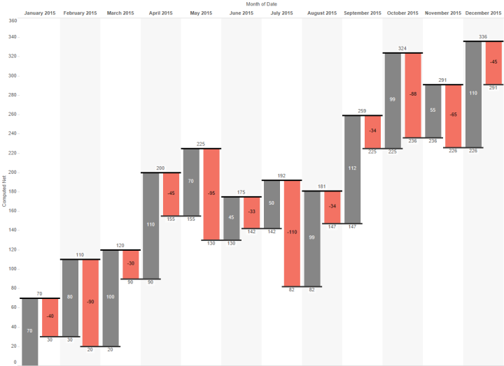
Figure 5 — Overly complicated waterfall chart.
I showed this to Andy and he just didn’t buy it. It was then that I realized that I had lost my “fresh eyes” and what was clear to me was not clear to somebody else, even somebody as adept at deciphering charts as Andy. Andy explained that he was having trouble with the spacing between charts and the running totals. It was just too hard for him to parse.
I took the feedback to heart and realized that the biggest problem was that there should be no spacing between the gray bar and the red bar for a particular month, but to get that clustering and spacing I would need to work around Tableau’s tendency not to cluster bar charts.
Fortunately, Jonathan Drummey had written a blog post on how to cajole Tableau into clustering the bars within each month together and I was able to fashion this view, which made it into the final dashboard.
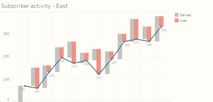
Figure 6 — Gains, losses, and running total, all in one reasonably easy-to-understand chart.
Note: I don’t expect people unfamiliar with this chart type to be able to read it without some instruction. As with a bullet chart and other chart types that people may never have seen before, when you publish a novel chart you will have to either sit down with the audience member or prepare a short video explaining how the pieces fit together.
Showing the details, but Jeff doesn’t buy it (and I’m glad he didn’t)
You may recall that one of the requirements is that people using the dashboard would need to see the numbers driving the chart. I suggested adding the text table shown below.

Figure 7 — Details, details, details
When I showed this to Jeff there was a long pause, and then I recall him saying something along the lines that he didn’t think this added much to the analysis. By this time I had worked with Jeff for well over a year and I knew that “I don’t think this adds much” was Jeff’s way of politely telling me that he hated that component of the dashboard.
I started to argue with him that there was a stated demand by the audience to show the actual numbers driving the charts when I realized that Jeff was in fact correct — just showing the numbers didn’t add much and there was a better way to meet the requirement and provide additional insight.
Use a highlight table.

Figure 8 — D’oh! How did I miss this? I’m usually the one yelling at people for just having a text table when they can instead have a value-added text table. Just look at East in July!
I wish I had put in BANs!
I got a great deal from reviewing the dashboards other people submitted to the book and now wish I could go back in time and borrow some techniques from those dashboards and apply them to my own. Indeed, there isn’t one dashboard that I built for the book that I wouldn’t like to modify and that is certainly the case with the Churn dashboard. Here’s the version that is in the book.
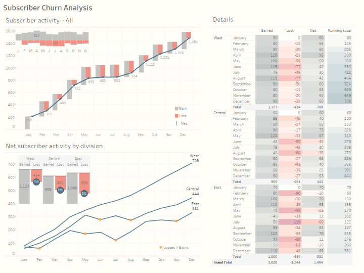
Figure 9 — Churn dashboard, as shown in The Big Book of Dashboards
Here’s the dashboard I would submit now.
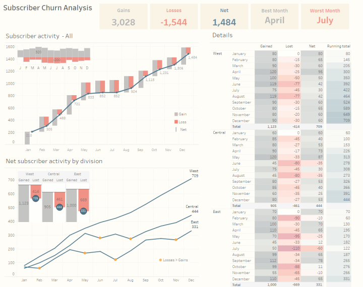
Figure 10 — Churn dashboard with BANs (Big-Ass Numbers)
See the difference? There are BANs (Big-Ass Numbers) along the top and, as I’ve written previously, these elements can do a lot to help people understand key components of a dashboard: they can be conversation starters (and finishers), provide context to adjacent charts, and serve as a universal color legend.
Conclusion and Resources
If I could only make one recommendation on how to make better dashboards it would be to find people who will give you good, constructive feedback on whether what you’ve built is as clear as you think it is. Gird yourself for a lot of revisions and be prepared to add refinements, but it will be more than worth it.
Want to know more about the Churn dashboard? That chapter from The Big Book of Dashboards is available online at http://bit.ly/dashboardsbook
Do you work with Tableau and want to download the Churn packaged workbook? You can download it from http://bigbookofdashboards.com/dashboards.html.
Want to purchase The Big Book of Dashboards? You can get it here.
Postscript: I asked Jeff and Andy to review this post before it went live. Jeff had some ideas on how I might modify the BANs to make them clearer. It never ends.


