August 3, 2017
In my last blog post I pointed out that I wish I had put BANs (big-ass numbers) in the Churn dashboard featured in chapter 24 of the book (see https://www.datarevelations.com/iterate.html.)
I had a similar experience this week when I revisited the Net Promoter Score dashboard from Chapter 17. I’ve been reading Don Norman’s book The Design of Everyday Things and have been thinking about how to apply many of its principles to dashboard design.
On thing you can do to help users decode your work is to ditch the legend and add a color key to your dashboard title.
Here’s the Net Promoter Score dashboard as we present it in the book. Notice the color legend towards the bottom right corner.
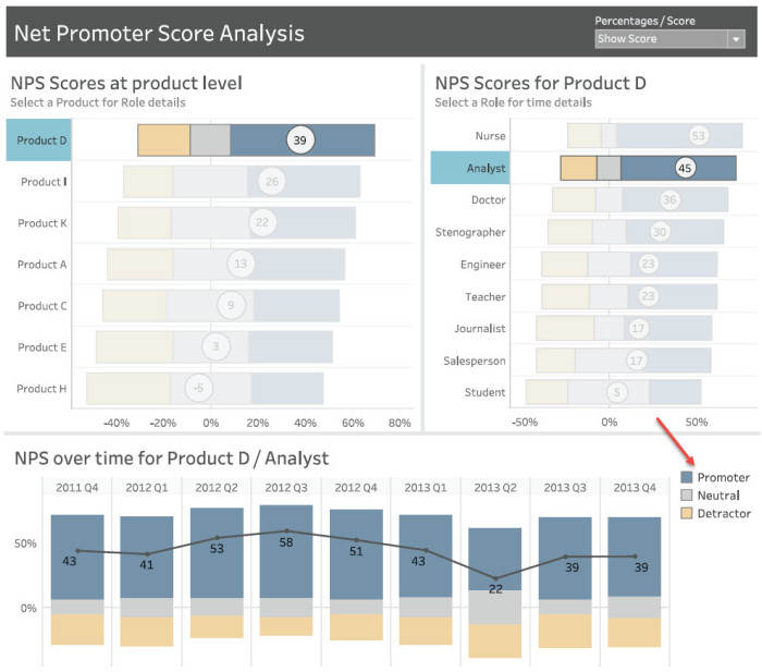
Figure 1 — Net Promoter Score dashboard from The Big Book of Dashboards.
Why did I place the legend out of the natural “flow” of how people would look at the dashboard? Why not just make the color coding part of the dashboard title, as shown below?
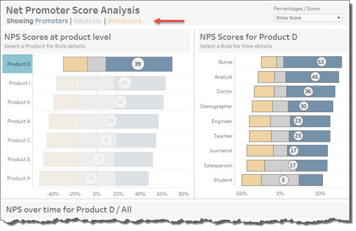
Figure 2 — Making the color legend part of the title.
I’m not losing sleep over this as this is probably a dashboard that people will be looking at on a regular basis; that is, once they know what “blue” means they won’t need to look at the legend.
But…
Every user will have his / her “first time” with a dashboard, so I recommend that wherever possible make the legend part of the “flow.” For example, instead of the legend being an appendage, off to the side of the dashboard…
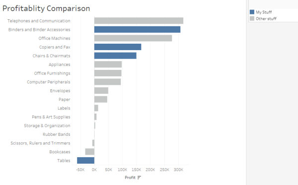
Figure 3 — Color legend as an appendage.
Consider making the color legend part of the title, as shown here.
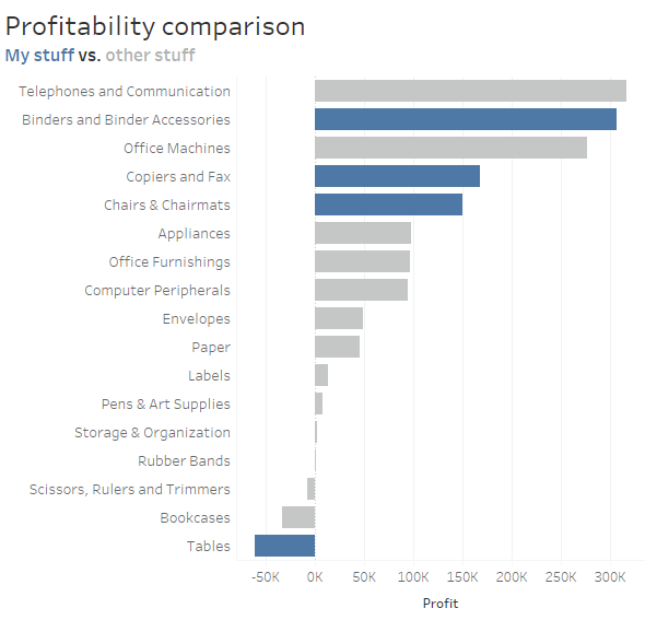
Figure 4 — Color coding integrated into the title.


