And… what did they choose?
March 8, 2017
Overview
I’ve discussed how to visualize check-all-that-apply questions in Tableau. Assuming your survey is coded as Yes = 1 and No = 0, you can fashion a sorted bar chart like this the one shown in Figure 1 using the following calculation.
SUM([Value]) / SUM(Number of Records)
The field [Value] would be 0 or 1 for each respondent that answered the question.
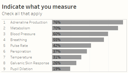
Figure 1 — Visualizing a check-all-that-apply question
I’ve also discussed how we can see break this down by various demographics (Gender, Location, Generation, etc.)
What I’ve not blogged about (until now) is how to answer the following questions:
- How many people selected one item?
- Two items?
- Five items?
- Of the people that only selected one item, what did they select?
- Of the people that selected four items, what did they select?
Prior to the advent of LoD calculations this was doable, but a pretty big pain in the ass.
Fortunately, using examples that are “out in the wild” we can cobble together a compelling way to show the answers to these questions.
Visualizing How Many People Selected 1, 2, 3, N Items?
One of the best blog posts on Level-of-Detail expressions is Bethany Lyons’ Top 15 LoD Expressions.
It turns out the very first example discusses how figure out how many customers placed one order, how many placed two orders, etc. This will give us exactly what we need to figure out how many people selected 1, 2, 3, N items in a check-all-that-apply question.
Here’s the calculation that will do the job.

Figure 2 — The LoD calculation we’ll need.
This translates as “for the questions you are focusing on (and you better have your context filters happening so you are only looking at just the check-all-that-apply stuff), for each Resp ID, add up the values for all the questions people answered.”
Remember, the responses are 0s and 1s, so if somebody selected six things the SUM([Value]) would equal 6.
So, how do we use this?
The beautiful thing about using FIXED as our LoD keyword is that it allows us to turn the results into a dimension. This means we can put How Many Selected on columns and CNTD(Resp ID) on rows and get a really useful histogram like the one shown in Figure 3.
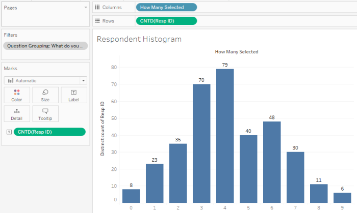
Figure 3 — Histogram showing number of respondents that selected 0 items, 1 item, 2 item, etc.
Notice the filter settings indicating that we only want responses to the check-all-that-apply questions. Further note that this filter has been added to the context which means we want Tableau to filter the results before computing the FIXED LoD calculation.
So, what did these People Select?
Okay, now we know how many people selected one item, two items, etc.
Just what did they select?
Because we set [How Many Selected] using the FIXED keyword we can use it like any other dimension. That is, it will behave just like [Gender], [Location], and so on.
Borrowing from an existing technique (the visual ranking by category that I cited earlier) we can fashion a very useful dashboard that allows us to see some interesting nuances in the data. For example, while Metabolism is ranked second overall with 70% of people selecting it, it ranked seventh among those that only selected one item (with only 4%), while 84% of people that selected four items selected it (Figure 4.)
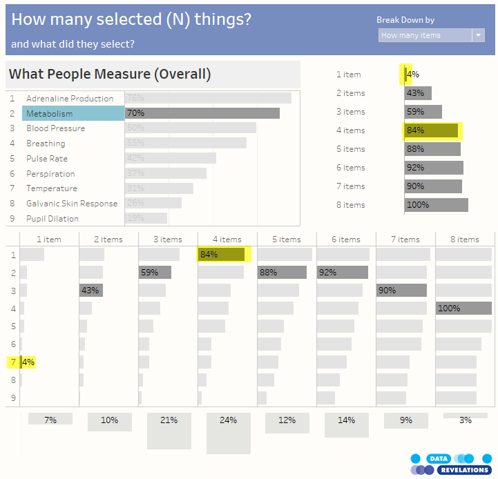
Figure 4 — Metabolism is ranked second overall with 70%, but only 4% of folks that chose one item selected it.
Similarly, check out the breakdown for Blood Pressure which is ranked third with 60% overall but is ranked first among folks that only measure one thing (Figure 5.)
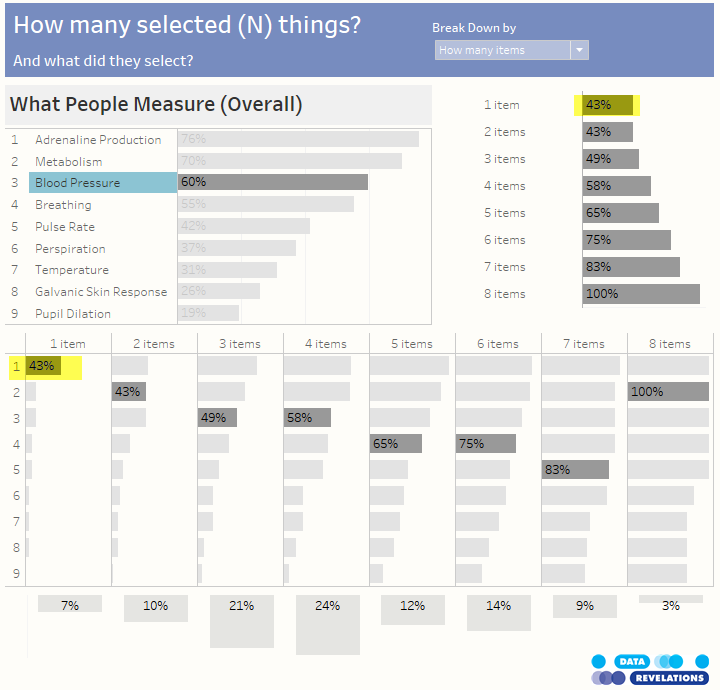
Figure 5 — Metabolism is ranked third overall with 60%, but was ranked first among those that only selected on item.
Other Useful Features of the Dashboard
The Marginal Histogram
The marginal histogram along the bottom of the chart shows you the breakdown of responses.

Figure 6 — Marginal histogram shows distribution of responses
Tool Tips Help Interpret the Findings
The ordinal numbers can be confusing as sometimes the number 2 means the number of items selected and other times it is the ranking. Hovering over a bar explains how to interpret the results.
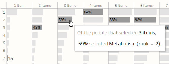
Figure 7 — Tool tips help you interpret the results.
Swap Among Different Dimensions
While this is first and foremost a blog post about showing how many people selected a certain number of items (and what they selected) it was very easy to add a parameter that allows you to swap among different dimensions. In Figure 8 we see the break down by Location.
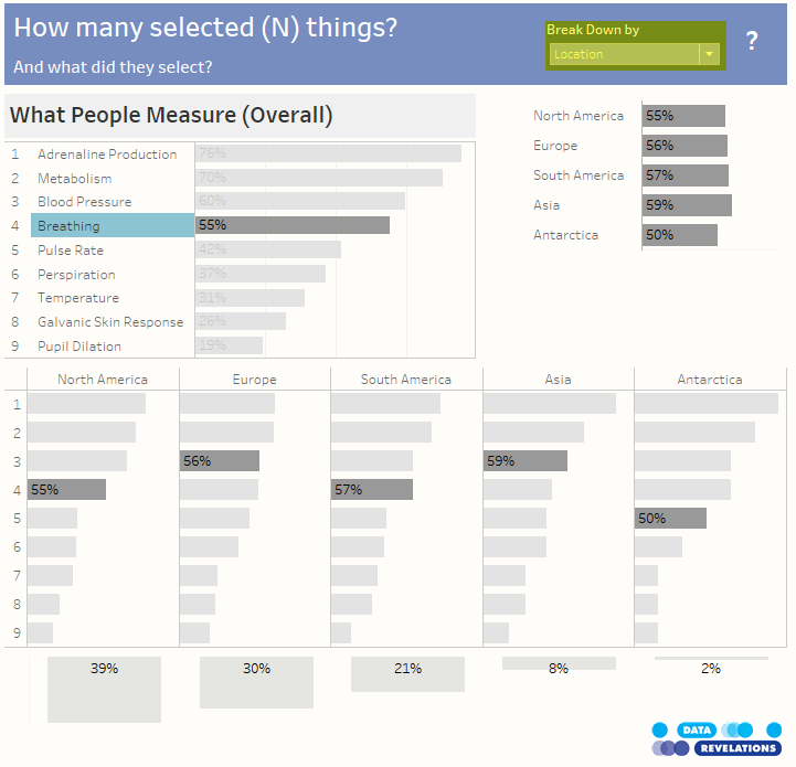
Figure 8 — Use the Break Down by parameter to see rank and magnitude for the selected item among different dimensions, in this case Location.
Here’s the embedded workbook for you to try out and download.

