February 22, 2017
Overview
Earlier this week Gartner, Inc. published its “Magic Quadrant” report on Business Intelligence and Analytics (congratulations to Tableau for being cited as a leader for the fifth year in a row).
Coincidentally, this report came on the heels of one of my clients needing to create a scatterplot where there were four equally-sized quadrants even though the data did not lend itself to sitting in four equally-sized quadrants.
In this blog post we’ll look at the differences between a regular scatterplot and a balanced quadrant scatterplot, and show how to create a self-adjusting balanced quadrant scatterplot in Tableau using level-of-detail calculations and hidden reference lines.
The Gartner Magic Quadrant
Let’s start by looking at an example of a balanced quadrant chart.
Here’s the 2017 Gartner Magic Quadrant chart for Business Intelligence and Analytics.
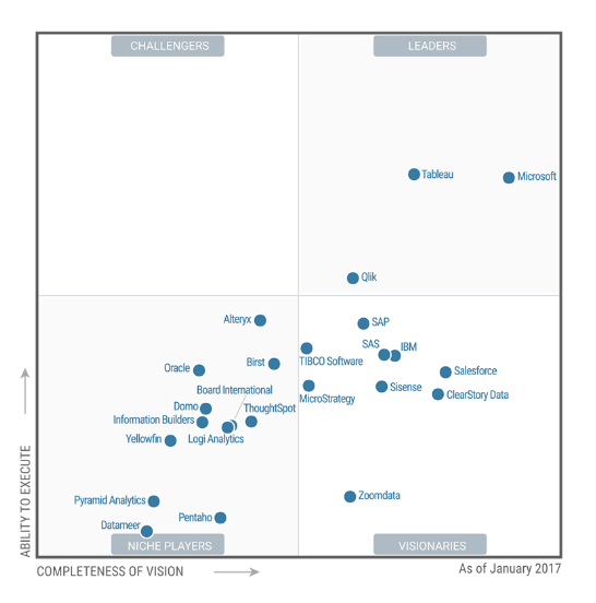
Figure 1 — 2017 Gartner Magic Quadrant for Business Intelligence and Analytics
Notice that there aren’t measure numbers along the x-axis and y-axis so we don’t know what the values are for each dot. Indeed, we don’t know how high and low your “Vision” and “Ability to Execute” scores need to be to fit into one of the four quadrants. We just know that anything above the horizontal line means a higher “Ability to Execute” and anything to the right of the vertical line means a higher “Completeness of Vision.” That is, we see how the dots are positioned with respect to each other versus how far from 0 they are. Indeed, you could argue that the origin (0, 0) could be the dead center of the graph as opposed to the bottom left corner.
This balanced quadrant is attractive and easy to understand. Unfortunately, such a well-balanced scatterplot rarely occurs naturally as you will rarely have data that is equally distributed with respect to a KPI reference line.
A Typical Scatterplot with Quadrants
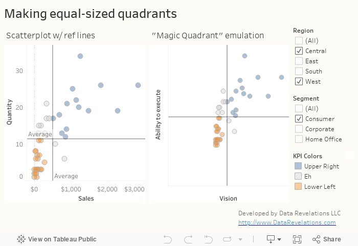
Consider Figure 2 below where we compare the sum of Sales on the x-axis with the sum of Quantity on the Y-Axis. Each dot represents a different customer.
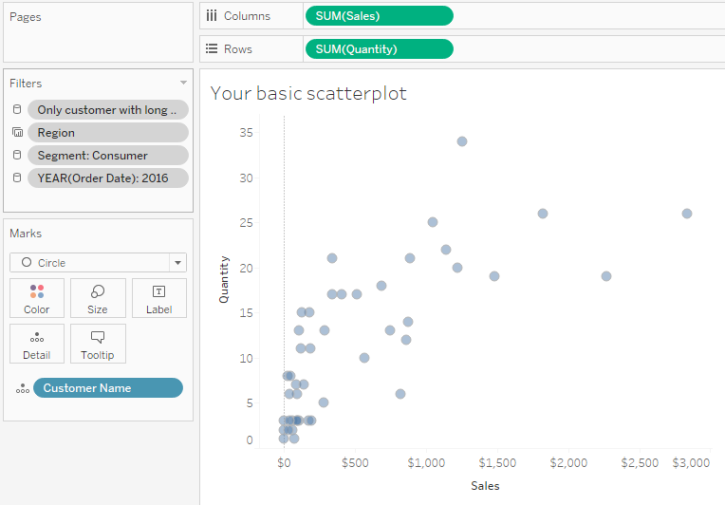
Figure 2 — Scatterplot comparing sales with quantity where each dot represents a customer.
Now let’s see what happens if we add Average reference lines and color the dots relative to these reference lines.
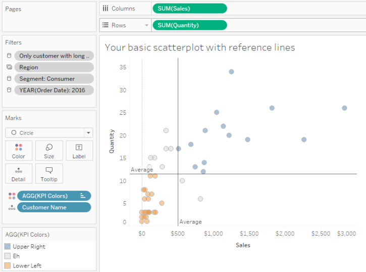
Figure 3 — Scatterplot with Average reference lines.
I think this looks just fine as it’s useful to see just how scattered the upper right quadrant is and just how tightly clustered the bottom left quadrant is. That said, if the values become more skewed it will become harder to see how the values fall into four separate quadrants and this is where balancing the quadrants can become very useful.
Note: The quadrant doesn’t have to be based on Average. You can use Median or any calculated KPI.
“Eyeballing” what the axes should be
We’ll get to calculating the balanced axes values in a moment but for now let’s just “eyeball” the visualization and hard code minimum values for the x and y axes.
Let’s first deal with the x-axis. The maximum value looks to be around $3,000 and the average is at around $500 so the difference between the average line and maximum is around $2,500.
We need the difference between the average line and minimum value to also be $2,500 so we need to change the x-axis so that it starts at -$2,000 instead of 0.
Applying the same approach to the y-axis we see that the maximum value is around 34 and the average is around 11 yielding a difference of 23 (34 -11). We need the y-axis to start at 23 units less than the average which would be -12 (11 – 23).
Here’s what the chart looks like with these hard-coded axes.
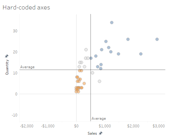
Figure 4 — Balanced quadrants using hard-coded axes values.
If we ditch the zero lines we’ll get a pretty good taste of what the final version will look like.
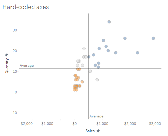
Figure 5 — Balanced quadrants with zero lines removed.
So, this works… in this one case. But what happens if we apply different filters?
We need to come up with a way to dynamically adjust the axes and we can in fact do this by adding hidden reference lines that are driven by level-of-detail calculations.
Adding Reference Lines
We need to come up with a way to calculate what the floor value should be for the x-axis and the y-axis. The pseudocode for this is:
Figure out what the maximum value is and subtract the average line value, then, starting from the average line, subtract the difference we just computed.
Applying a little math, we end up with this:
-(Max Value) + (2*Average Value)
Let’s see if that passes the “smell” test for the y-axis.
-34 + (2*11) = -12
Now we need to translate this into a Tableau calculation. Here’s the calculation to figure out the y-axis reference line.
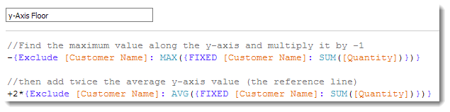
Figure 6 — Formula for determining the y-axis reference line.
And here’s the same thing for the x-axis:
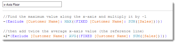
Figure 7 — Formula for determining the x-axis reference line.
Now we need to add both calculations onto Detail and then add reference lines as shown below.
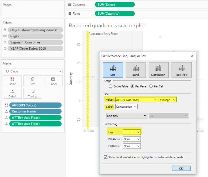
Figure 8 — Adding the x-axis reference line. Notice that the line is currently visible. Further note that we could be using Max or Min instead of average as the value will stay the same no matter what.
Here’s what the resulting chart looks like with the zero lines and reference lines showing.
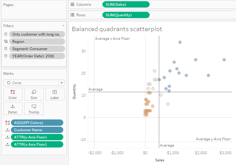
Figure 9 — Auto-adjusting balanced quadrant chart with visible reference lines and zero lines. The reference lines force the “floor” value Tableau uses to determine where the axes should start.
Hiding the lines, ditching the tick marks, and changing the axes labels
Now all we need to do is attend to some cosmetics; specifically, we need to format the reference lines so there are no visible lines and no labels, as shown in Figure 10.
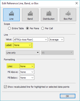
Figure 10 — Hiding lines and labels
Then we need to edit the axes labels and hide the tick marks as shown in Figure 11.
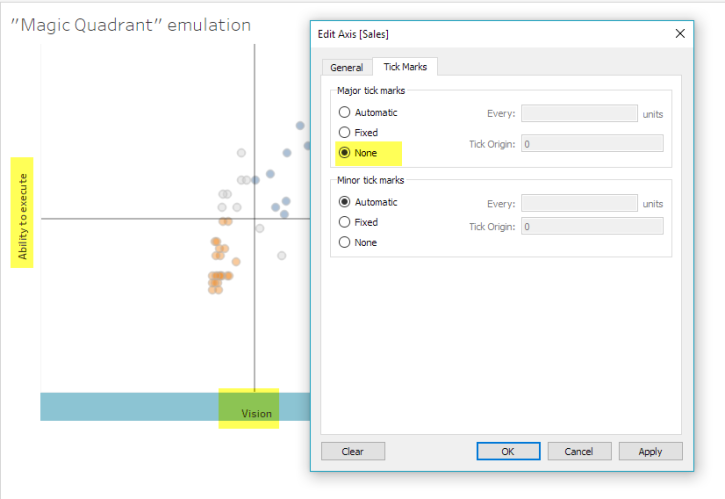
Figure 11 — Editing the axes labels and removing tick marks.
This will yield the auto-adjusting, balanced quadrant chart we see in Figure 12.
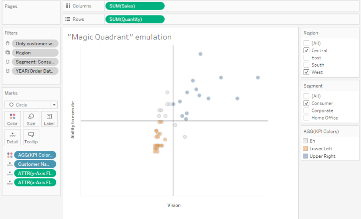
Figure 12 — The completed, auto-adjusting balanced quadrant chart.
Other Considerations
What happens if instead of the values spreading out in the upper right we get values that spread out in the bottom left? In this case we would need to create a second set of hidden reference lines that force Tableau to draw axes that extend further up and to the right.
Also note that since we are using FIXED in our level-of-detail calculations we need to make sure any filters have been added to context so Tableau processes these first before performing the level-of-detail calculations.
Could I have used a table calculation instead of an LoD calc? I first tried a table calculation and ran into troubles with trying to specify an average for one aspect of the calculation and a maximum for another aspect using the reference line dialog box. I may have given up too early but got tired of fighting to make it work.
Note: Jonathan Drummey points out that we can in fact use INCLUDE instead of FIXED here so we would not have to use context filters. If you go this route make sure to edit the feeder calcs for the KPI Dots field ([Quantity — Windows Average LoD] and [Sales — Windows Average LoD]) so these use INCLUDE as well.
Give it a try
Here’s a dashboard that allows you to compare a traditional scatterplot with reference lines with the auto-adjusting balanced quadrant chart. Feel free to download and explore.