
Overview
Prior to working with Jeffrey Shaffer and Andy Cotgreave on the The Big Book of Dashboards I tended to look at BANs — large, occasionally overstuffed Key Performance Indicators (KPIs) — as ornamental rather than informational. I thought they just took up space on a dashboard without adding much analysis.
I’ve changed my mind and now often recommend their use to my clients.
In this blog post we’ll see what BANs are and why they can be so useful.
Examples of BANs
Here are several examples of dashboards featured in The Big Book of Dashboards, all of which use BANs.
Figure 1 — Complaints dashboard by Jeffrey Shaffer
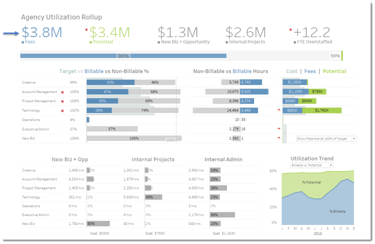
Figure 2 — Agency Utilization dashboard by Vanessa Edwards
Figure 3 — Telecom Operator Executive dashboard by Mark Wevers / Dundas BI
Why these BANs work
The BANs in these three dashboards are useful in that they provide key takeaways, context, and clarification. Let’s see how they do these things.
Key takeaways
If you had to summarize the first dashboard in a just a few words, how would you do that? The BANs shown in Figure 4 get right to the point.

Figure 4 — Concise complaints summary (we’ll discuss the colors in a moment).
The same can be said of the BANs in the Agency Utilization dashboards. By looking at the first two BANs in Figure 5, we can see that the agency made $3.8 million but could make $3.4 million more if it were to meet its billable goals. That is the most important takeaway and it’s presented in big, bold numbers right at the top of the dashboard.

Figure 5 — If we had to distill this entire dashboard down to one key point, it would be that the current sales are $3.8M but they could be $3.4M more.
Context
The Three BANs in the Telecom Operator Executive dashboard (Figure 3) not only provide key takeaways but also provide context for the charts that appear to the right of each BAN. Consider the strip shown in Figure 6 which starts with the proclamation that ARPU (Average Revenue Per User) is $68.
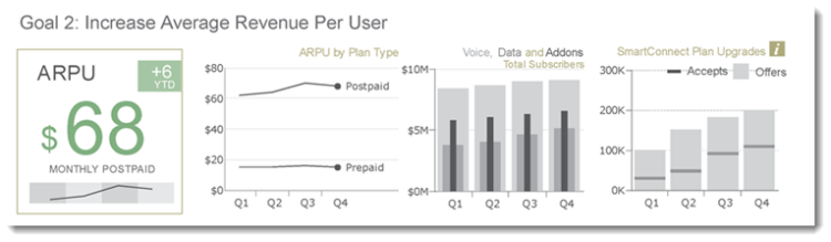
Figure 6 — What contributes to Postpaid ARPU being $68?
The images to the right explain everything that goes into making the $68 (Comparison of Postpaid to Prepaid, Voice, Data, Addons breakdown, etc.)
Note that the dashboard designer packs a lot of very useful information into the box that surrounds the BAN; specifically, ARPU is up $6 YTD, but is down in Q4 compared to Q3 (that’s how to interpret the line atop the shaded bars).
Clarification
The BANs in Figures 1 and 3 aren’t just conversation starters / key takeaways, they are also color legends that clarify the color coding throughout the dashboard.
Consider the Complaints dashboard; the BANs indicate that Closed is teal and Open is red. Armed with this knowledge we know exactly what to make of the chart in Figure 7.
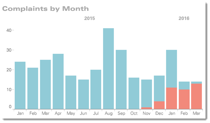
Figure 7 — Everything prior to November 2016 is closed and only a handful of things in November are open.
The same goes for the Agency Utilization dashboard. The BANs inform us that blue represents Fees and green represents Potential so I know exactly how to interpret bars that are those colors when I look at a chart like the one shown in Figure 8.
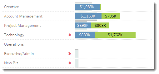
Figure 8 — Because the BANs told me how to interpret color, we can see that for Technology the company billed $883K but could bill an additional $1,762K if it were to hit its targets.
Conclusion
BANs can do a lot to help people understand key components of your dashboard: they can be conversation starters (and finishers), provide context to adjacent charts, and serve as a universal color legend.
Make sure to check out Adam McCann’s excellent post on 20 different ways to visualize KPIs. Some great stuff here!
Note: While I’ve tried to show how effective BANs can be I did not address how a particular font can help / hurt your BAN initiative.
The Big Book of Dashboards co-author Jeff Shaffer has been studying font use and has a fascinating take on the new fonts Tableau added to their product this past year. You can read about it here.


