Overview
I’ve had a spate of requests from clients to show how survey responses rank across different categories and I’ve come up with a way that makes it very easy to see where the big stories are.
Note that this approach works for any measure that can be ranked, not just survey responses.
Let’s see what I mean…
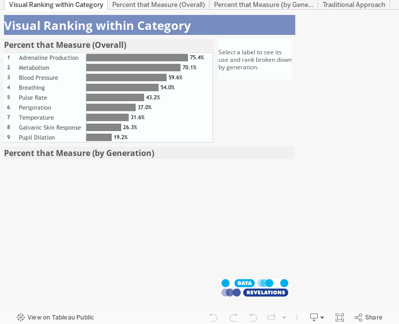
Consider the bar chart below that shows the results to a survey question “indicate which of the following that you measure; check all that apply”.

Figure 1 — Percentage of respondents that measure selected items, ranked from highest to lowest.
Traditional approach to showing rank within a category
Now, suppose you wanted to see the percentages and rankings broken down by different demographic components (e.g., location, gender, age, etc.). There are myriad Tableau knowledge base articles and blog posts on how to do this and they lead to results that look like the one shown in Figure 2.
Note: Pretty much all of those articles and blog posts are now obsolete as they make clever use of the INDEX() function. With Tableau 8.1 you can use the RANK(), or one of its variations, and not have to go through as many hoops.

Figure 2 — Traditional approach to showing ranking within a category.
I find this a tough read. Even if I add a highlight action it’s still hard for me to see where a particular item ranks across the four categories.

Figure 3 — Ranking within a category with highlighting.
Don’t try to show everything at once
My solution is place the Generation on the Columns shelf and to not show everything at once, but to instead allow the user to explore each of the possible responses and see how these responses rank across the different categories.
Consider the dashboard shown below where the top worksheet shows the responses across all categories.

Figure 4 — Dashboard with no item selected.
Now see what happens when we select one of the items in the list.
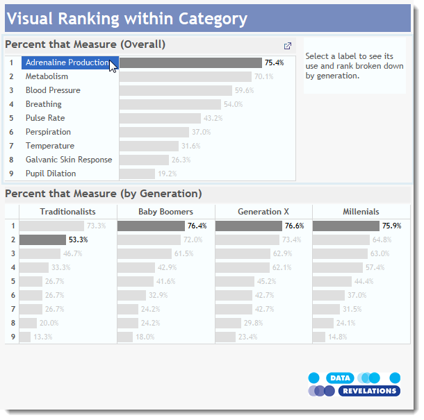
Figure 5 — Dashboard with an item selected shows that items rank and percentage across different generations.
Okay, not much to report here – Adrenaline Production is ranked first in three categories and second among Traditionalists, although Traditionalists’ measure it quite a bit lower than the other three groups. Still, we’re not seeing any wide swings.
But look what happens when we select Breathing…

Figure 6 — Breathing: our first big story.
Now that’s a big story! And it pops out so clearly.
Reporting vs. interacting
This is all fine and good if you publish this as an interactive dashboard and you expect people to, well, interact; but what happens if you want to publish this as a static graphic in a magazine?
The solution is to find where the big stories are and show those in the magazine; that is, do the work for your reader and show him / her where the big differences are. In fact, that is exactly what I’ve done in Figure 7.
How the dashboard works
Here’s how the top part of the dashboard is set up.

Figure 7 — Configuration of top worksheet.
Rank is defined as
RANK_UNIQUE([CheckAll_Percent])
Note that we’re addressing the table calculation using Wording.
Notice also that Wording is on the Rows shelf.
The bottom part of the dashboard is set up like this.

Figure 8 — Configuration of the bottom worksheet.
Goodness, we can’t tell what any of the bars mean because Generation is on the Columns shelf and Wording is on the Level of Detail and not Rows. If you put it on Rows you get something that looks like this.

Figure 9 — Placing Wording on the rows shelf tells a different and harder-to-understand story.
The key takeaway is that we cannot make a single visualization that tells the story. You need both the first and second visualizations working together.
A Filter and a Highlight Action
We use both a Highlight and a Filter action to make the two visualizations work well. The Filter action is there to make the second worksheet disappear once you clear the selection in the first worksheet; The Highlight action highlights where the item appears in the second worksheet.
Here are the two actions:

Figure 10 — Two actions tied to the same mouse click.
The Filter action is defined as follows.

Figure 11 – Definition of the Filter action.
This tells Tableau that when a user selects something from the first worksheet (Percent that Measure-Overall) it should filter the second worksheet (Percent that measure-by Generation) by the field Temp. Temp is just a string constant that I’ve placed on the color shelf; it’s only use is that we have to filter by something in order for the Exclude all values setting to work (and that is critical for the behavior of the dashboard.)
Here’s how the Highlight action is defined.

Figure 12 — Definition of the Highlight action.
This tells Tableau that when a user selects something from the worksheet on top, Tableau should highlight items in the second worksheet using Wording as the selected field (where Wording is the dimension we placed on the level of detail rather than on the Rows shelf.)
Conclusion
I’ve found this approach to showing of rank across categories very useful and it’s been a very big hit with my clients. By placing the categories across columns and using highlight actions we make it very easy to see where the big differences are among different respondent groups.