… and some thoughts on the evolving art and science of visualizing data
I tend to gravitate towards occupations that are hard to explain. I started my professional life, and continue to be, a music arranger and orchestrator. I can tell by people’s perplexed looks that they are wondering if I’m the guy that decides where the brass section should sit in the pit.
I run into similar problems when I tell people I’m a data visualization consultant. I was trying to come up with a concise way to explain what that is when I came across an excellent blog post from Stephen Few.
I take this and turn it into that
I do encourage you to read the full post (you can do it now if you like; I’ll wait).
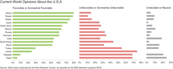
I was struck by the first example where Few shows how hard it is to glean any meaning from a text table. Here’s his example of poll results published on the PBS website from a 2004 study by the Pew Center for Research.
I have to work very hard to get a sense of which countries have the most positive sentiments towards the U.S.A. and which have the most negative.
Few proposes a different way to present the data that makes it much easier to see, rank, and understand the findings.
Yes! This exercise encapsulates what it is that I do! I take “this” and turn it into “that”, thereby allowing companies to better see, understand, and glean insights into their data.
An alternative to the alternative and how the industry keeps evolving
I cannot just listen to music. My training and proclivities force me to dissect the music I hear so that I can understand what’s going on inside the music.
A similar thing happens when I see a data visualization. After taking in the presentation I stop and wonder if there is an alternative approach that would allow me to better understand what’s going on and thereby draw better conclusions that in turn allow me to make better decisions.
In a moment I’m going to suggest an alternative to Few’s approach but I do want to emphasize that the data visualization field is very new and it’s the free exchange of ideas that’s pushing people to create new ways visualize data. A perfect example of this is my own evolution in displaying Likert scale data (see Likert Scales – The Final Word). It was discussions with friends and colleagues Naomi Robbins and Joe Mako that resulted in what I think is a better way to explore and glean insights from the World Opinions data.
The divergent (or staggered) stacked bar chart
Consider the screenshot of a dashboard below where we skew the stacked bars right and left based on overall positive and negative sentiment. Note that you will find a working dashboard at the end of this post.
If you split the neutral responses evenly you see that, overall, Poland has the most positive sentiment and Egypt the most negative.
But what happens if you eliminate the neutrals? If you sort by least negative you see certain things pop out.
Here Poland is ranked first and Jordan is last (and notice how polarized Jordan is).
Compare this with the view when you remove the neutral responses and sort by most positive.
In this case Kenya is ranked first and Egypt is last.
Conclusion
The divergent stacked bar is my “go to” viz type whenever I deal with Likert scale data. The only downside is that is takes a bit more time to create in Tableau and it warrants using a color legend, something I try to avoid where possible.
But this divergent stacked bar chart is my Likert-scale viz of choice today. Who knows what people will create in the coming years that does an even better job of helping people understand their data.
Oh, and I now have a compact explanation of just what it is I do. I turn a this into a that.
Postscript: I’ve been thinking about this and want to modify my explanation… let’s change it to “I take this and I try to turn it into the best that that’s possible”.


