Overview
Although I was on vacation in April of 2023, I did see this twitter post. Daniel Zvinca’s response knocked my socks off.
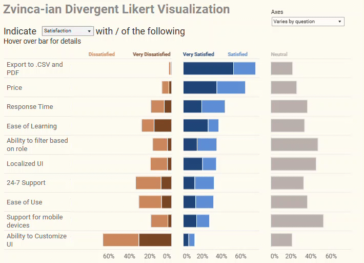
Here’s the post from Cole Knaflic.

And here was Daniel’s response.
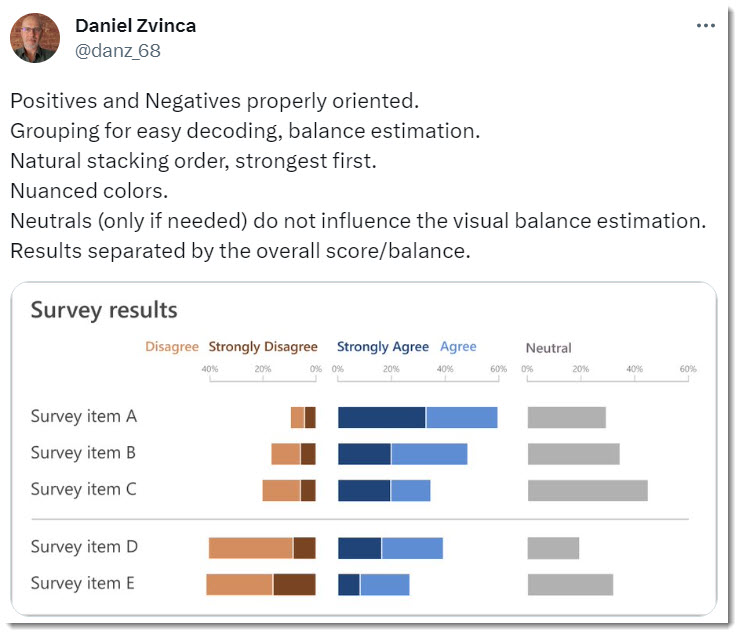
“Goodness, yes” I thought. This addresses the shortcomings of what I’ll call the “inside out” approach for displaying Likert scale survey results.
Readers of my blog know I’m on an ongoing quest to find the best way to visualize Likert scale data. I wrote this post explaining why I like divergent stacked bars, but with the more concentrated values hugging the baseline.
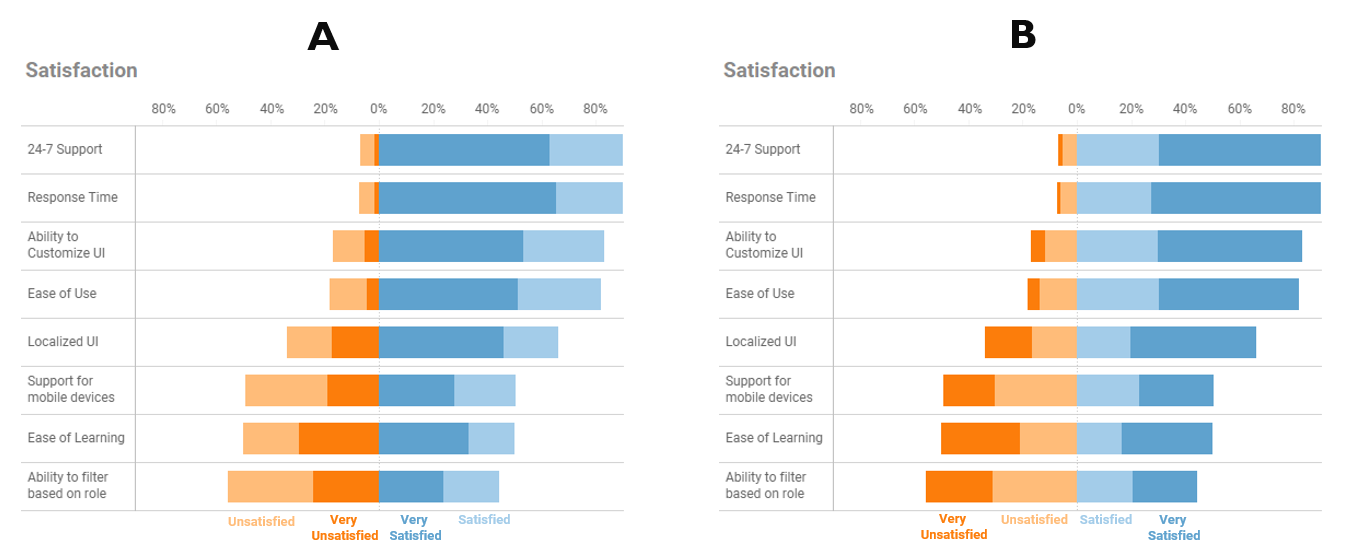
In the post I make my case for (A) is a better than (B), but agree that this ordering is not intuitive:
Unsatisfied
Very Unsatisfied
Very Satisfied
Satisfied
I think Daniel’s version, with the gaps between the segments, makes the ordering more intuitive.
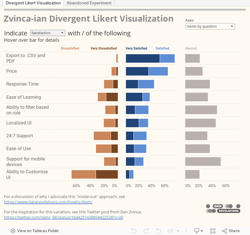
I decided to emulate Daniel’s approach in Tableau. Note that you can find the embedded, downloadable workbook at the end of this article.
Looking under the hood
The main part of the visualization consists of four different worksheets that I’ve stitched together in a dashboard. I experimented with doing everything on one sheet, but I found there were too many hoops I had to go through to get all the highlighting to work the way I wanted.
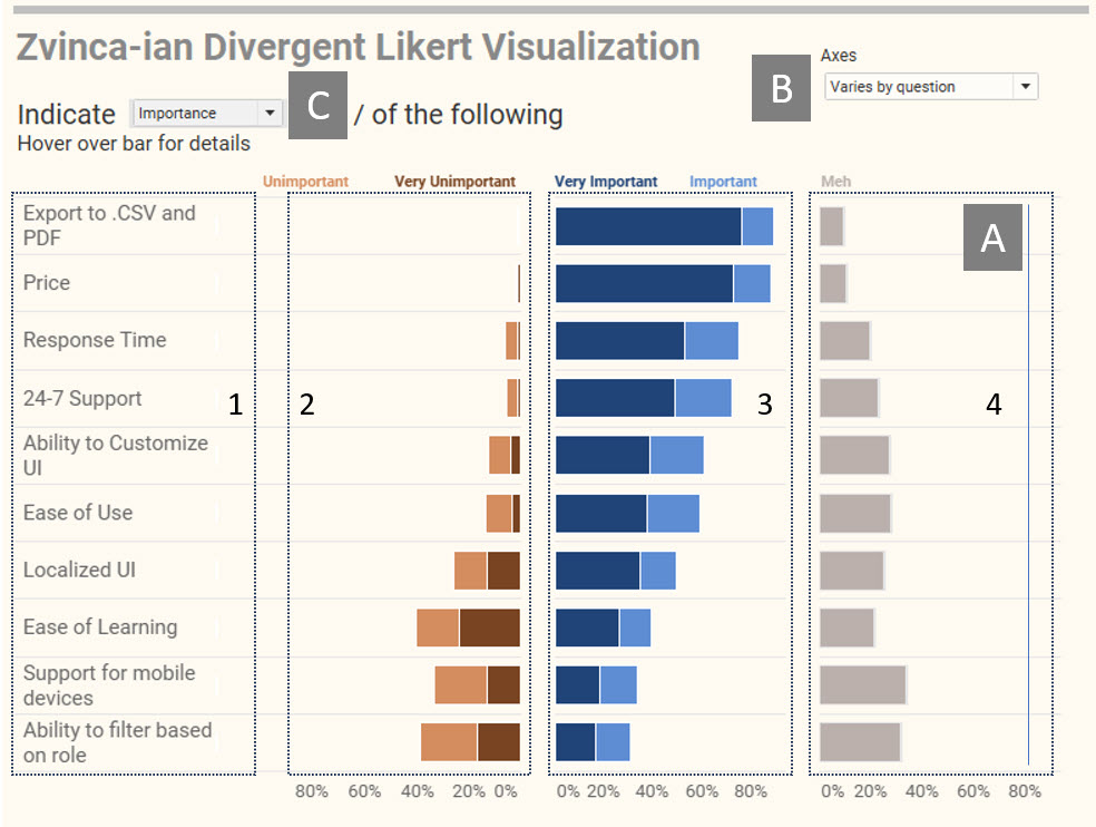
There is also a hidden reference line (A) in three of the worksheets that ensures that the length of the axis is the same length for the negatives, the positives, and the neutrals. This reference line is controlled by the field [Pos Ref Line (LoD)].
I got a little fancy with the Axes parameter (B) which determines if the length of the axes should be consistent across all question groups, or should it lengthen / shorten based on each question group (C). You may also notice that the categories along the top also change as you change the question group.
Give it a try
Here’s the dashboard. Try hovering over bars, changing the question grouping, etc.
And of course, feel free to download and apply the approach to your own survey data.