A big thanks to Josh Wilson for encouraging me to write about this and an extra big thanks to Jonathan Drummey for doing the heavy lifting on making the AND approach work.
A downloadable dashboard with all the examples can be found at the end of this post.
Overview
While cutting / filtering a question by a single-select question is straightforward, doing the same with a check-all-that-apply question has been a source of angst for me since I first started using Tableau ages ago. Fortunately, with the advent of Tableau’s new-ish Relationship feature (where Tableau joins different data sources if and when needed) cutting / filtering by a check-all-that-apply question only stings a little bit. Before we get into the details I want to issue two caveats.
Caveat one – you may not have enough responses
As survey designers do what they can to accommodate survey respondents I’ve seen a lot of single-punch demographic questions get turned into multi-punch, particularly around race / ethnicity and gender. In my admittedly limited experience, the number of people who select more than one race or more than one gender is very small (around 2%). Rather then trying to filter and cut by the multi-punch questions I think combining into “two or more” makes more sense. By all means, report on what the breakdown of the two or more is, but I’m not sure what insights you will glean by trying to parse questions by a multi-select question when 98% of the respondents only chose one item.
Caveat two – performance
This “join-when-needed” feature works great for the smallish data set I have (845 respondents yielding 24K rows for the main data set and 7K rows for the secondary data set with the pivoted check-all-that-apply questions). Jonathan Drummey has run into performance difficulties using Relationships and large data sets (e.g., thousands of respondents for a multi-year survey). As I use this feature more I’ll experiment with various settings and try to find a particular threshold for where the technique works and when the data is too unwieldy.
Okay… let’s see how to do this.
Getting the data just so… for cutting / filtering by a check-all-that-apply question
There are only two things different from what I recommend in Getting your data just so.
The first is that on the preparation side I add a calculated field called [Number of Records] and give it a value of 1. When I reshape the data so that it is tall, this will place a “1” in each row. I need to do this because we’re going to be using Tableau’s Relationship feature and I cannot simply create that field inside of Tableau (see WTF? Why doesn’t this survey data stuff work? if you’re not already up to speed with this.)
I’m also going to create a separate data set with just the check-all-that-apply questions, reshaped / pivoted so that we have thousands of rows just devoted to the single check-all-that-apply question in my survey (and yes, this will work if you have a several such questions.)
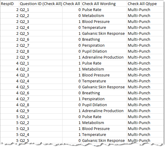
Here’s a snippet of what this separate data set looks like:
And here’s an image of the Tableau Prep file that adds the [Number of Records] field to the main survey data source and that creates the separate data source with the pivoted check-all-that-apply questions.
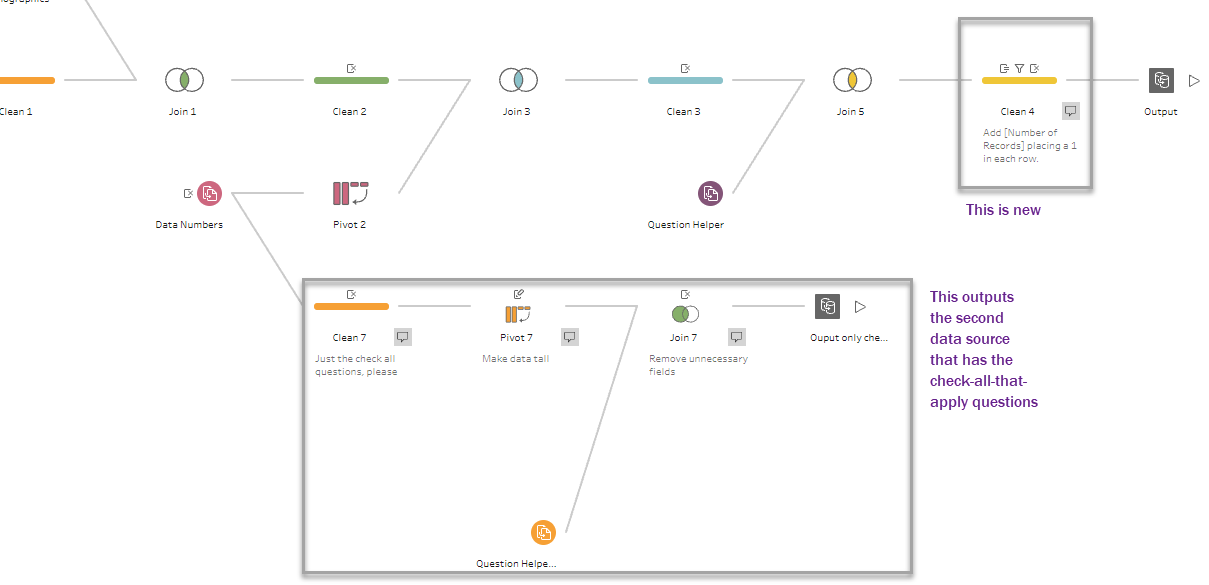
This is pretty much the same flow I discuss in Getting your data “just so” using Tableau Prep although the stuff in boxes is new. Note that I elected to create the second data set in the same Tableau Prep file, but you could do this in a separate Prep file.
You can download the packaged Tableau Prep file here.
Adding the pivoted check all questions to the mix
I’m going to open an existing workbook that already has a lot of questions visualized. I want to show that when I add the new data set using Tableau’s Relationship feature, nothing breaks. Assuming you have a [Number of Records] field in the data set already, everything that was working will still be working and I will not suddenly have nine times as many rows as I had before.
Here’s what adding this new data source looks like.
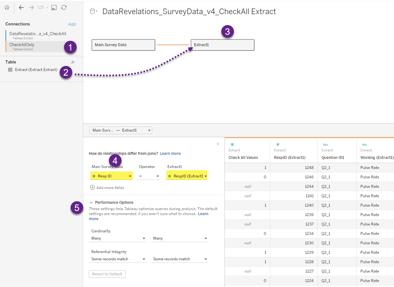
I added the CheckAllOnly data source (1) and dragged the table with the not-so-helpful name “Extract” (2) onto the canvas (3). I then “related” the main data source and this new data source using the Resp ID field (4).
Note the performance options (5). I’ve not changed any of the settings but if I were to run into performance issues I would see if changing one of these settings improves things. Incidentally, the second data source has a lot of nulls as most survey respondents didn’t bother to answer the check-all-that-apply question. I could have removed the null responses, but we may want to compare results between those that answered the question and those that skipped it.
Give the table a useful name
“Extract1” is not a very helpful name, so I suggest renaming is to something useful, as I do below.
Adding the Check-All question do our demographic breakdown (OR approach)
Here’s a typical single-punch question that has a flexible breakdown parameter in that we can show overall responses (i.e., breaking down by “None”) or break down by Gender, Generation, or Location. Note that all those options were single punch questions.
Let’s see how we can add the Check-all-that-apply questions to the drop down… and make it work.
But first, let’s explore that second data set.
So… what have we got here?
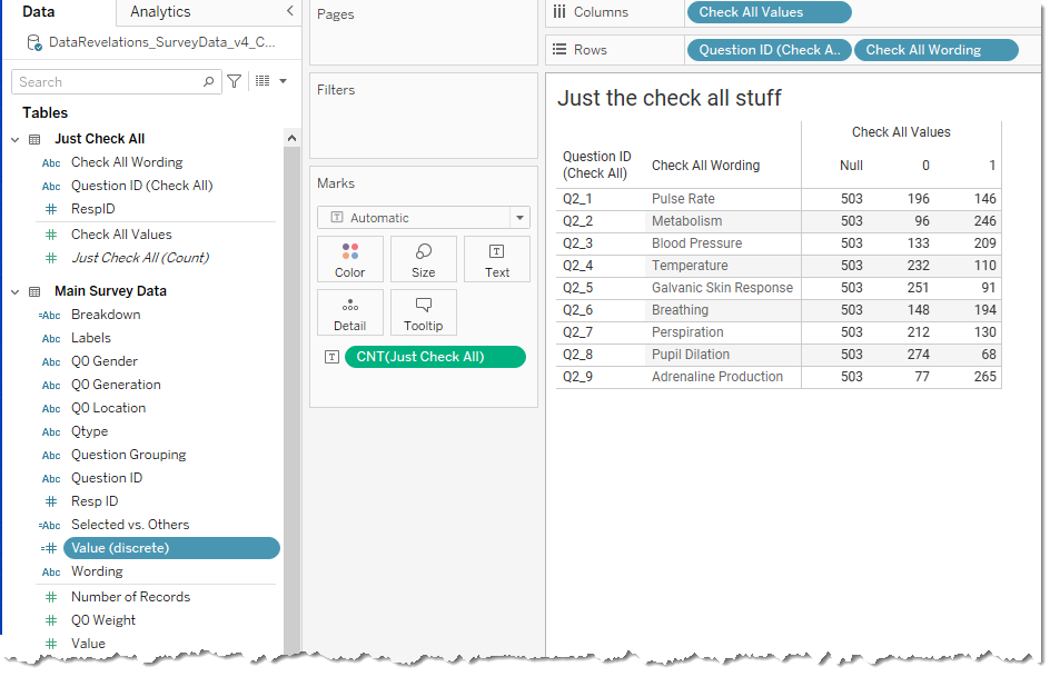
We’re just looking at the Check All data set. A lot of people didn’t answer the question (the Nulls) and we can see how many checked an item (the 1’s) and how many did not (the 0’s).
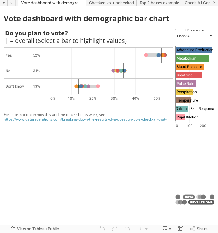
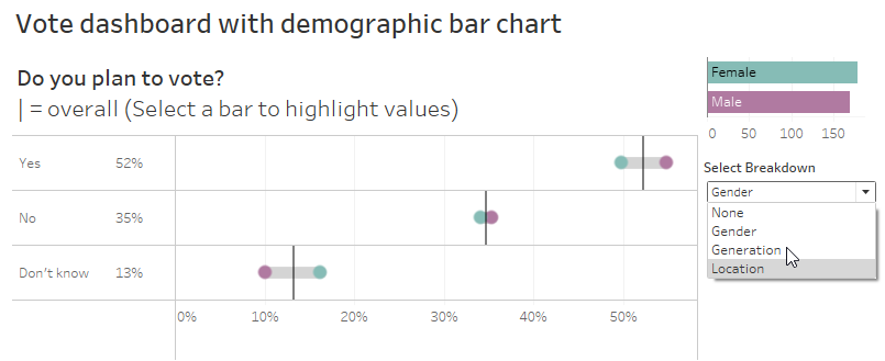
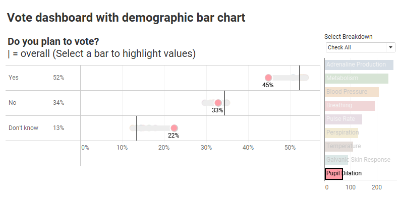
So, looking at the “Do you plan to vote” connected dot plot showing two dots for gender, we want to see this question with nine dots for all the different check all options we have.
And we want to make sure we only see responses from folks who selected “yes” for those options; that is, responses with a 1 vs a 0 or a Null.
Here’s how the components fit together.
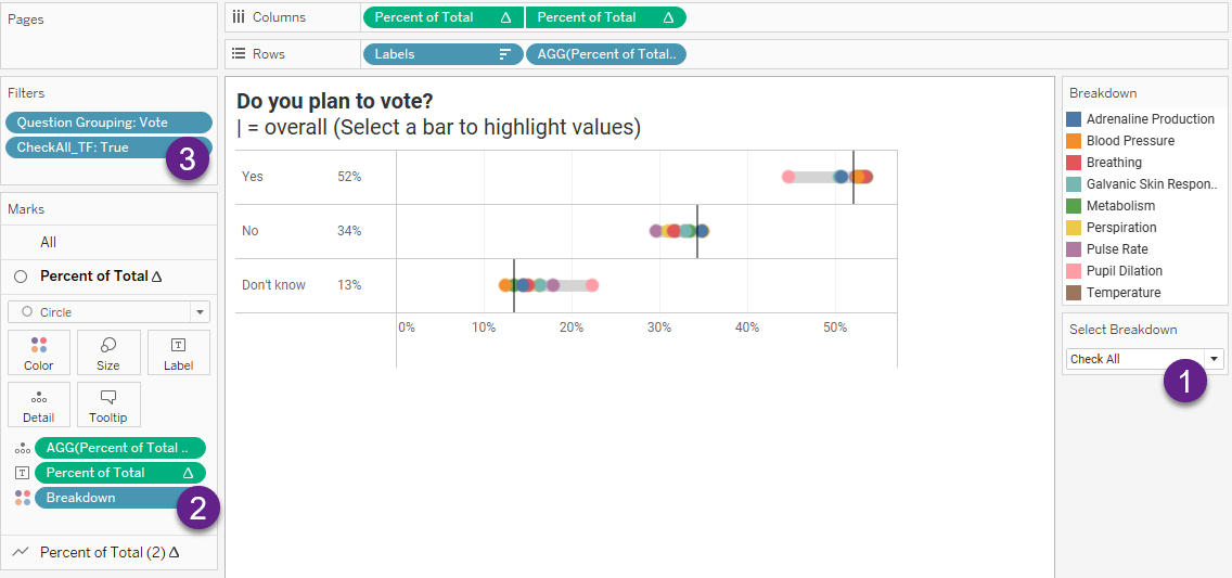
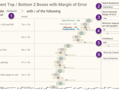
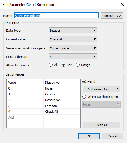
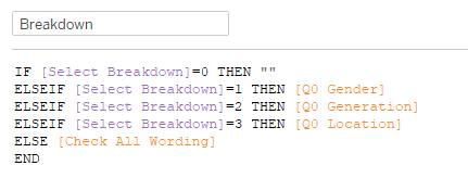
There are now five choices for the breakdown parameter (1):
Notice that the field [Breakdown] is on color in (2) above. Breakdown is defined as follows.
Notice also there is a True / False filter in play (3). Here’s how CheckAll_TF is defined.
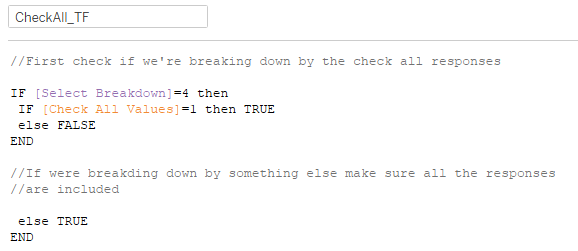
Here we are telling Tableau that if we’re breaking things down by the Check All question then only show responses from people who have a 1 recorded for the check all option. If the value is 0 or Null we don’t want to see that person’s response.
But… if the breakdown is anything else (e.g., Gender) we don’t want to exclude folks who didn’t answer the check all question or who may not have selected an option, so we set the value to TRUE.
If we place this on the Filter shelf and set it to only show True values it will work.
Addressing some readability issues
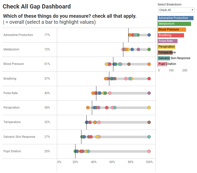
That’s a LOT of multi-colored dots on that connected dot plot / gap chart. Indeed, I think it warrants a “scaredy cat” icon as that’s just too much stuff to parse.
But it CAN be useful if we offer some interactivity or just highlight the components we find noteworthy. For example, here we highlight responses from people who measure pupil dilation.
Ah, that’s a lot easier to understand. And just what’s up with those pupil dilation measurers? Far fewer of them answer “Yes”.
Or so it seems.
But before we come to any conclusion, please realize that these respondents selected other items as well; that is, we are looking at responses from people who selected Pupil Dilation who may also have selected something else (more on this in a moment).
Enjoying the flexibility
Now that we have this parameter-based breakdown feature in place, it will work for other visualizations.
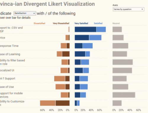
Here’s a percent top 2 boxes Likert visualization that shows the breakdown by the check-all-that-apply question.

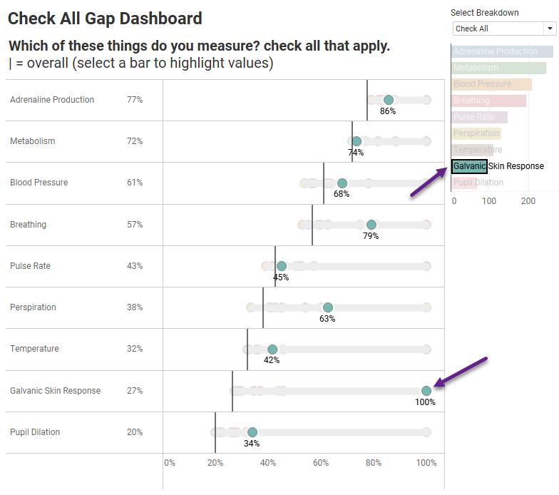
And here’s a check-all-that-apply question broken down by itself, using the same technique.
Those 100% dots make sense, as 100% of respondents who measure Galvanic Skin Response also measure… Galvanic Skin Response!
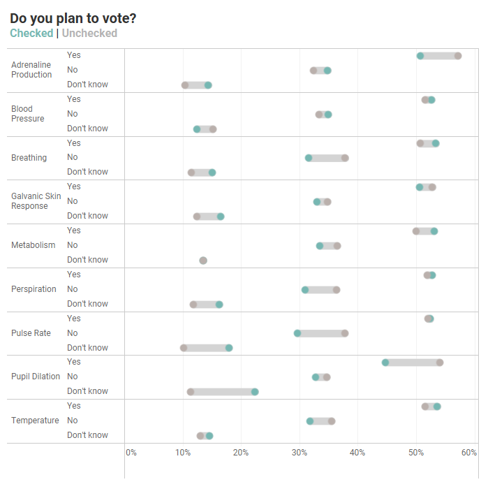
Showing the differences between those that checked something and those that did not
Here’s another question you may want to answer: are there any noteworthy differences between people who selected an item and those who did not?
Here’s a way to show this.
Let’s look under the hood.
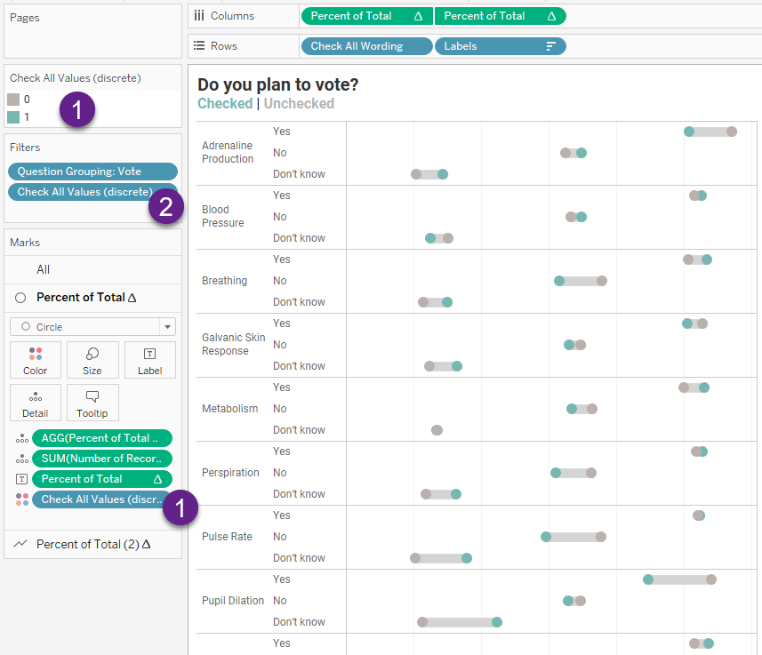
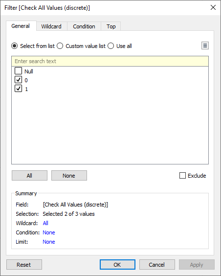
Check All Values (discrete) is just a copy of the [Check All Values] field but is defined as a discrete dimension rather than a continuous measure (1). It can have a value of 0, 1, or null.
We apply a filter (2) so that we won’t see responses from people who did not answer the question; that is, we remove the nulls.
The teal dots represent those who selected the item (a value of 1) and the gray dots are those that did not (a value of 0).
For a deeper exploration into the wonders of set controls and survey data with Tableau, see Set Controls and survey data – how to compare responses for this group vs that group vs overall.
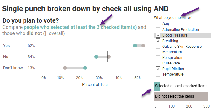
But what about the “And” approach?
Everything we’ve looked at so far show people who selected Blood Pressure OR Breathing OR Pupil Dilation?
But suppose we want to know about the folks who chose all three of those options; that is, people who selected Blood Pressure AND Breathing AND Pupil Dilation?
And do we want to see people who may have chosen more than those three things or ONLY those exact three things? Spoiler alert: I’m going to recommend you go with the AT LEAST approach as your response count on ONLY those things is likely to be very small.
Here’s the functionality we are seeking:
Let’s look under the good to see what’s going on.
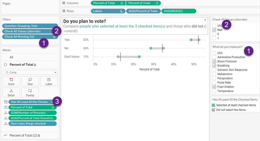
While (1) may look like a filter, this is a set control built from the field Check All Wording (Look for it along the right side as well as on the Filters shelf.)
As we are not interested in folks who did not respond at all to these questions, we eliminate Null responses (2).
The gap chart (aka, “connected dot plot”) is colored by the field [Has At Least All the Checked Items] (3). Teal shows responses from people who selected at least the items checked in the Set Control (1) and gray shows those who did not.
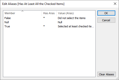
Note that this is a True-False field, and I aliased the responses so folks would not have to figure out what True and False mean:
What’s driving the gap chart?
Here’s how [Has At Least All the Checked Items] is defined.
[Resp # of Checked in Set] = [How many things checked]
[How many things checked] is defined like this.
{FIXED [RespID (Check All)]:
COUNT(IF [Check All Wording Set] THEN [Check All Wording] END)}
This translates as “at the respondent level, if something is IN the Check All Wording Set, it should be counted.
But it’s the other field that is doing the heavy lifting (and is a manifestation of Jonathan Drummey’s cleverness.). [Resp # of Checked in Set] is defined as follows.
{FIXED [RespID (Check All)] :
SUM(IF [Check All Wording Set] THEN [Check All Values] END)}
This translates as “for each respondent, look at what is in the Check All Wording Set and then add the value they put in. If the Set Control has three items selected, this will look at the values (0 or 1) for each of those three things. What we want are the folks who, when we add everything up, gives us a total of three.
Note that many, if not most, people choose more than three things. This makes sure we focus on people who at least selected the three things we care about.
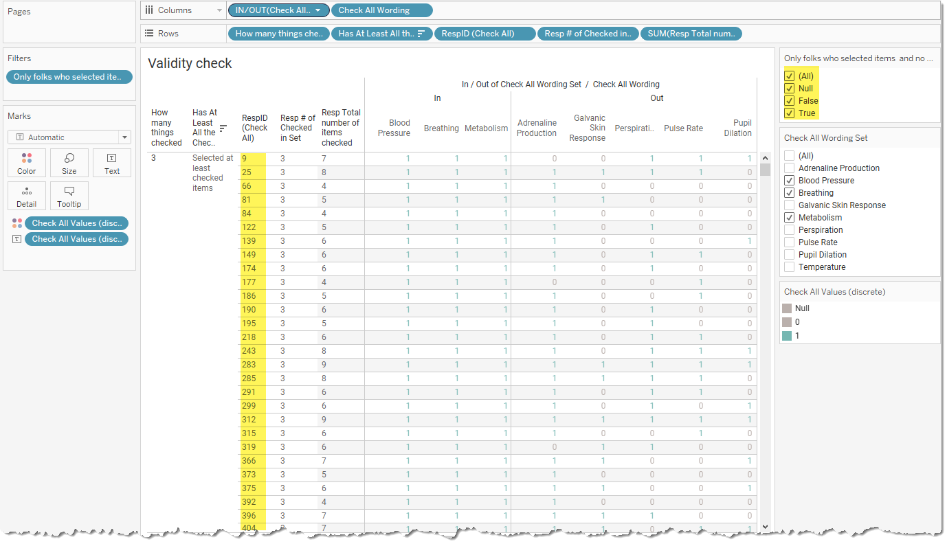
Validity Check, Please
When working through this with Jonathan, he built a cross-tab to look at how all the different fields behave and what results they yield. Here’s something similar that I put together that is in the downloadable dashboard (see end of post).
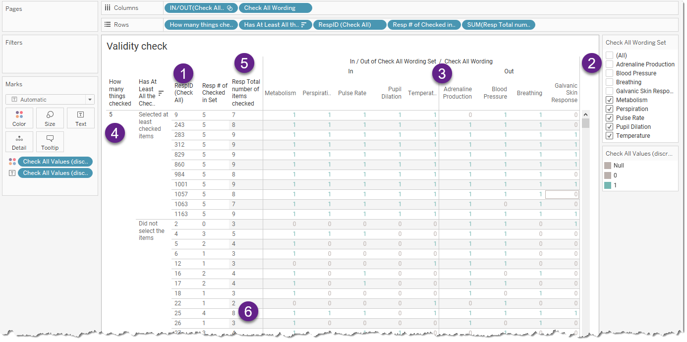
Here we show responses to the check-all-that-apply questions for every respondent (1). We’re particularly interested in the folks who selected the elements checked in the Set Control (2).
We separate the responses by those that are in the set and those that are not (3). There are 5 things that have been selected (4).
For the folks listed near the top, that is, the folks who selected the five items we care about, we can see that they all selected more than 5 things (5).
And a little further down, we see a respondent who selected 8 things, but only 4 of them are what we care about, so this respondent didn’t make the cut (6).
Why the “people who selected these things and ONLY these things” probably won’t work for you
I’ve added the following field as a filter to the validity worksheet.
[How many things checked] = [Resp Total number of items checked]
AND
[How many things checked] = [Resp # of Checked in Set]
Here’s what it looks like before I just show just the True values.
There are 82 respondents who selected at LEAST the three items checked. But if we only look at people who selected the three items (no more and no fewer) there is only ONE respondent who fits the bill!
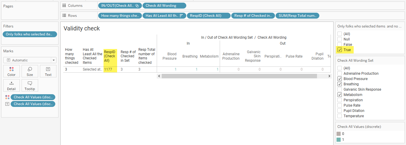
You can try experimenting with this but when you apply the “these items and these items only” logic your response count becomes very small.
Conclusion
I’m still skeptical of the value of this approach, especially with turning traditional single-punch demographic questions into multi-punch. That said, if you find a case where it’s been helpful, please let me know. In the meantime, here’s the dashboard for you to explore and download.