September 30, 2020
Overview

Tableau introduced Set Controls in 2020.2. Set Controls look like checkbox filters but instead of adding and removing data from a view they determine which elements are in a set and which are not. This feature can be very useful in visualizing survey data.
But why not just use filters?
Filters are great with survey data, but when you apply them it’s hard to recall what the dashboard looked like before you applied the filters. Which bars are bigger? Which bars are smaller?
I’ve written previously about a technique that allows you to compare a target audience with the entire population. In this blog post we’ll go further and use Tableau Set Controls able to show:
- How did a selected group respond to questions?
- How did those we didn’t select respond to the same questions?
- How did everyone respond to the questions?
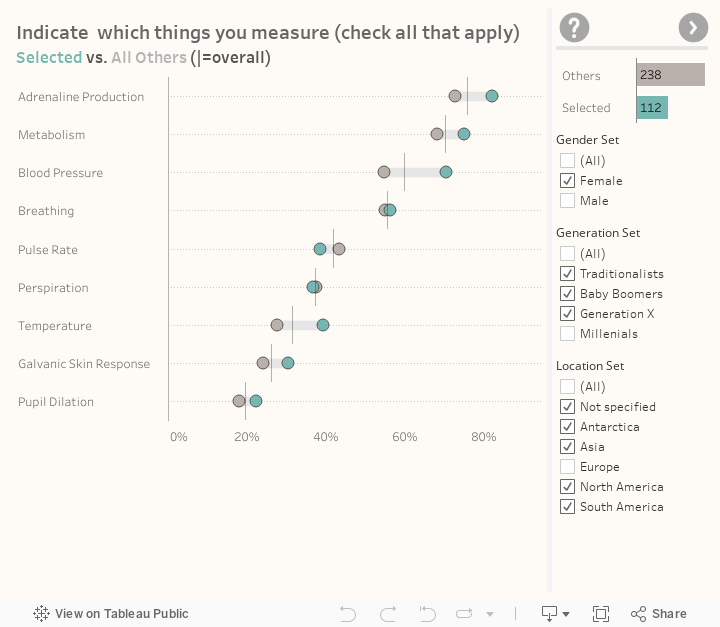
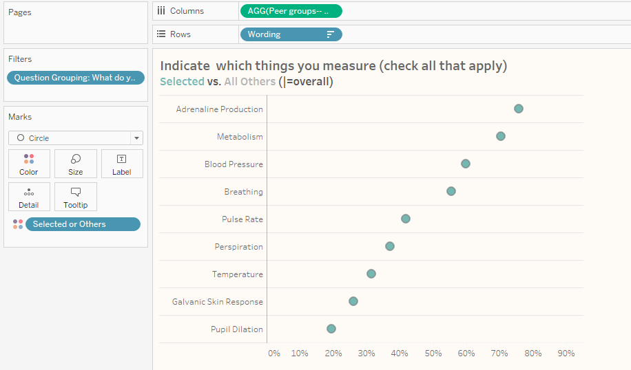
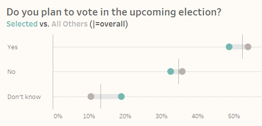
Here’s what it looks like.
Creating the Sets
The image above shows responses that are in our “master set” (green) vs responses that are outside the set (gray) vs. overall (the reference line). I’ll discuss this “master set” in a moment, but first we have to create a separate set for each of the demographics we want to cut the data by: Gender, Generation, and Location.
Creating these sets is easy, just right-click the field (in this case Gender) and select Create > Set.
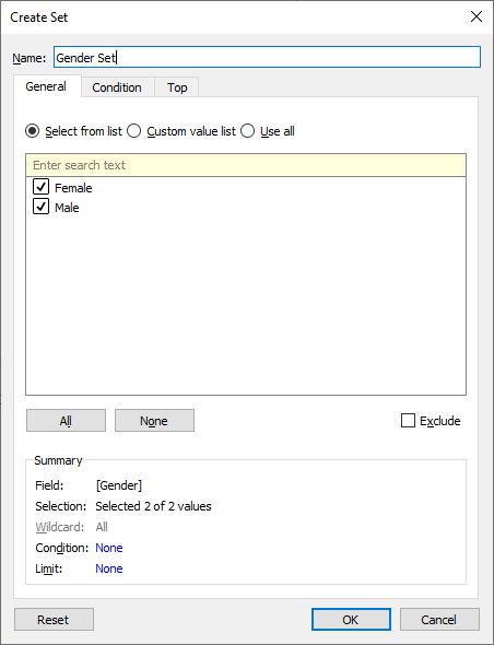
You’ll need to repeat this for all the demographic fields.
Creating a calculation that looks at all the sets
Here we have a calculated field called [Selected or Others] that look at all the demographics sets and determines what items have been selected and what have not.
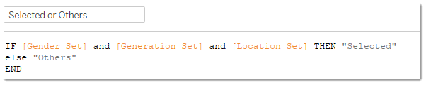
This translates as
If the survey response in question matches what we want for Gender, and for Generation, and for Location, then that row is “Selected”; otherwise that row is “Others.”
Let’s put this field on the Color marks card and see what happens.
Well, that’s not particularly useful. Why aren’t we seeing a difference?
Showing the set controls
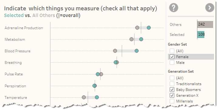
We see a single dot because all items from Gender, Generation, and Location have been selected. Let’s make it possible to turn on and off which things are in the set and which are not by showing Set Controls. We do this by right clicking the various sets and selecting Show Set. Here’s what happens when you do this, and when you de-select some of the check box items.
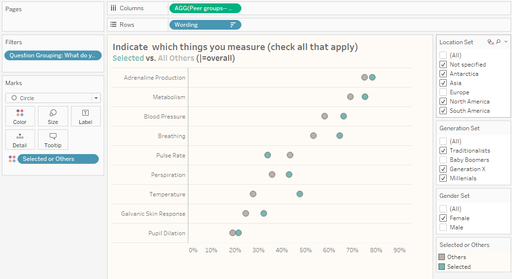
Notice the checkbox items along the right. They look like filters but behave differently as they turn on an off what is and what is not in each set.
Important: we MUST have something on level of detail that contains a reference to the sets we want to show. In this case we have [Selected vs Others] on Color. If we did not, we would not be able to show the set controls.
That’s better! The green dots represent everything that is selected and the gray dots everything that is not selected.
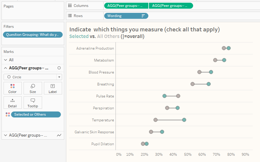
Connecting the dots
This chart will be easier to read if we fashion a connected dot plot (aka, a barbell chart). We can do this by duplicating the field on Columns, changing the mark type to line, and placing the field [Selected vs Others] on path. We then make this a dual axis chart and synchronize the axis.
(If you need more thorough instructions, see the blog post I mentioned earlier at https://www.datarevelations.com/resources/filtered_unfiltered/).
Adding the reference line showing all responses
We now have a chart showing the difference between those selected and those not selected. Using the same technique referenced in the previous blog post, we can add a reference line that shows the overall response, as shown below.
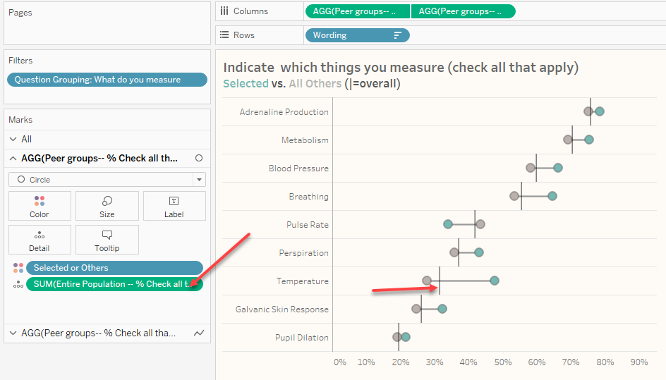
The reference lines come from the calculation [Entire Population — % Check all that apply] which has been added to the level of detail. This calculation is defined as follows.
{FIXED [Wording]: SUM([Value])/
SUM([Number of Records])}
This tells Tableau even though there may be filters, ignore them fix this to all the rows associated with the [Wording] field. For those of you wondering, you could also fix this to the [Question ID] field and you would get the same results.
What about single select questions?
The same technique works great for single-select questions and Likert questions as well (although you’d probably end up doing a percent top 2 boxes with the Likert stuff).
The embedded downloadable example at the end of this post contains dashboards that show how to implement this approach for both multi and single-select questions. But first…
Some bonus views
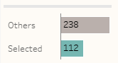
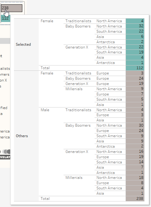
It’s useful to have a running total of how many respondents are in the set and how many are outside it. If either group only has a handful of respondents, then the responses from that group aren’t statistically meaningful. The bar chart towards the upper right of the dashboard presenting this running total.
Hovering over a bar will reveal a distribution of the selections.
Set Controls Survey Data Dashboard