I had a blast last month bantering with Andy Cotgreave about five data visualization abominations and determining which one was the biggest T.U.R.D (Truly Unfortunate Representation of Data).
I was inspired both by Andy and Enrico Bertini to show how the visualizations were misleading and how one could render an accurate and honest depiction of the data using AI. As readers of my newsletter know, my overarching advice about AI is that you must know what you are doing and know what good looks like lest you produce crappy stuff.
I thought I had done a pretty good job of this. If you were to look at my dialog with Anthropic’s Claude you will see me correcting the output many, many times and Claude telling me how smart I was… many, many times.
But… here’s a message I received from Jane Logan shortly after the event:
I just attended the TURD presentation – thanks for that! It was a super engaging. I really enjoyed it.
I just wanted to point out a small thing about that Biden White House chart which showed the increase of 14%. In the Claude “what they didn’t show you” graph, the distance between the 500 billion and the 600 billion looked bigger than the distance between 400 and 500 billion, 300 and 400 billion, etc. Was that a misdrawing of the axis or is it actually a different scale between the misleading and the actual?
Busted! She’s 100% correct. I didn’t review what AI produced and shared something that was flawed.
Here’s the original “turd.”
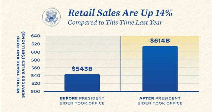
Original image published by Biden White house. The bar length is misleading but at least the title is accurate.
Here’s what I shared in the livestream. I’ve added the “whoops” callout showing the mistake.
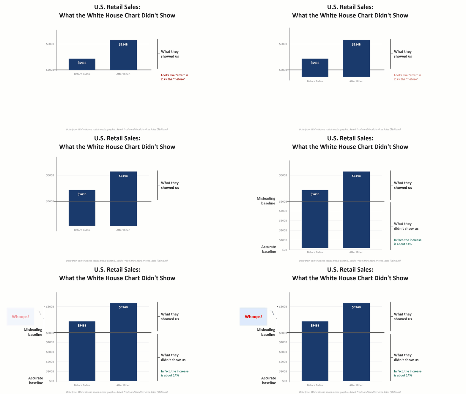
Flawed chart with unevenly-spaced Y-axis.
The y-axis should be equally spaced. I recently pointed out the flaw to my good friend Claude and asked for a corrected version, shown below.
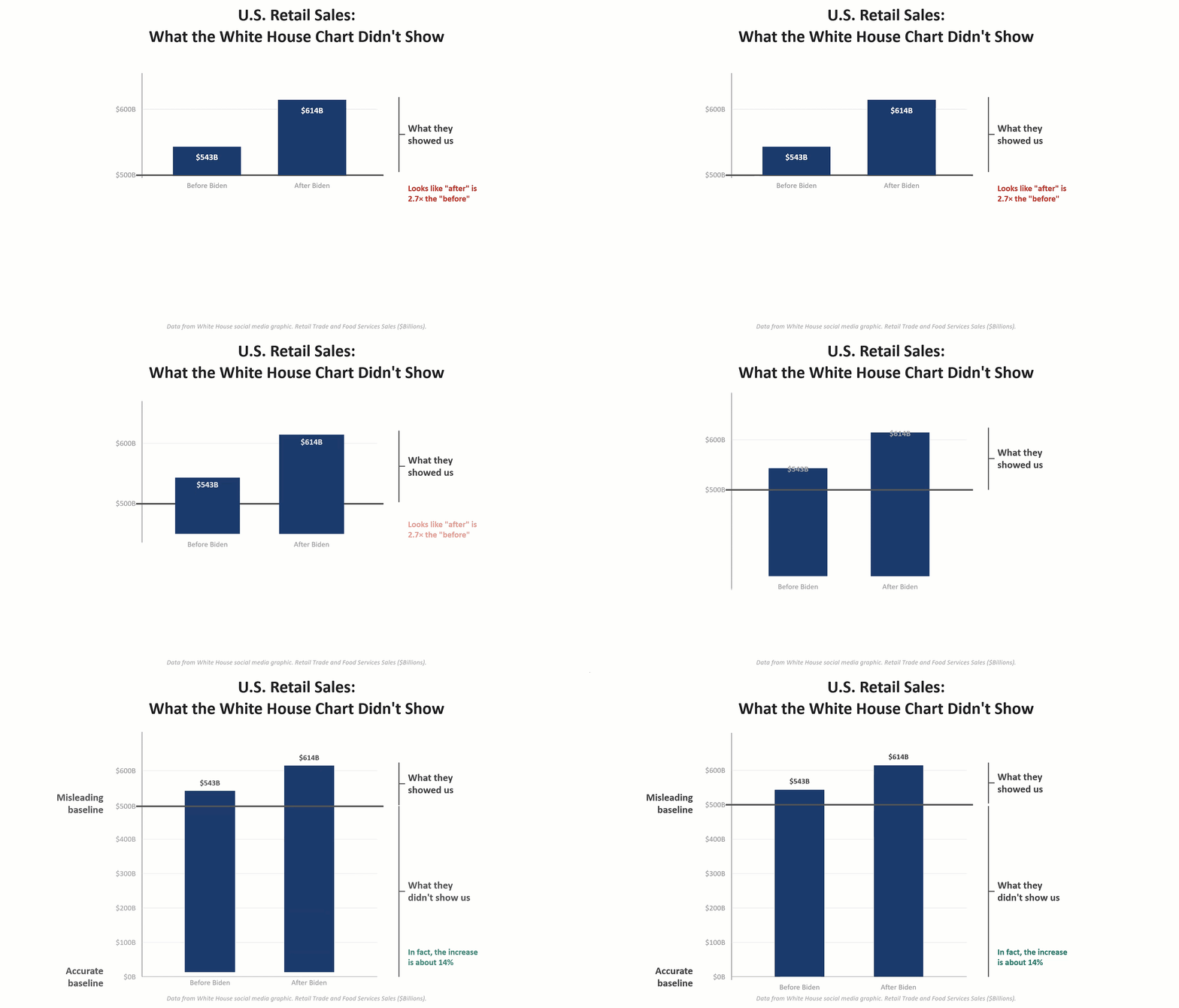
Improved chart with equally-spaced Y-axis.
Lesson learned.
You can watch the recording here.