A deep thanks to Ken Flerlage for helping me out with one of the tricky parts.
The connected dot plot (aka, gap chart, dumbbell chart, and barbell chart) has become my “go to” for showing the differences within demographic groups for virtually any survey data question type (Percent top two boxes, Check-all-that-apply, Median hours worked, etc.)
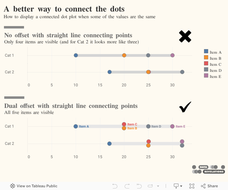
But what do you do when the values within different groups overlap or are the same?
In this blog post we’ll see how you can offset those values so they don’t occlude each other.
By the way, this technique works for any type of connected dot plot, not just those related to survey data.
Some examples in the wild
“How do organizations that are really good at this stuff handle situations like this?” That’s the question I ask when I’m tasked with visualizing data. I very much like how Pew Research Center handles gaps between different members within a demographic group.
Here’s an example that I featured in The Big Picture that shows the difference among Black, Hispanic, and White survey respondents to a survey Pew Research Center conducted in 2018.
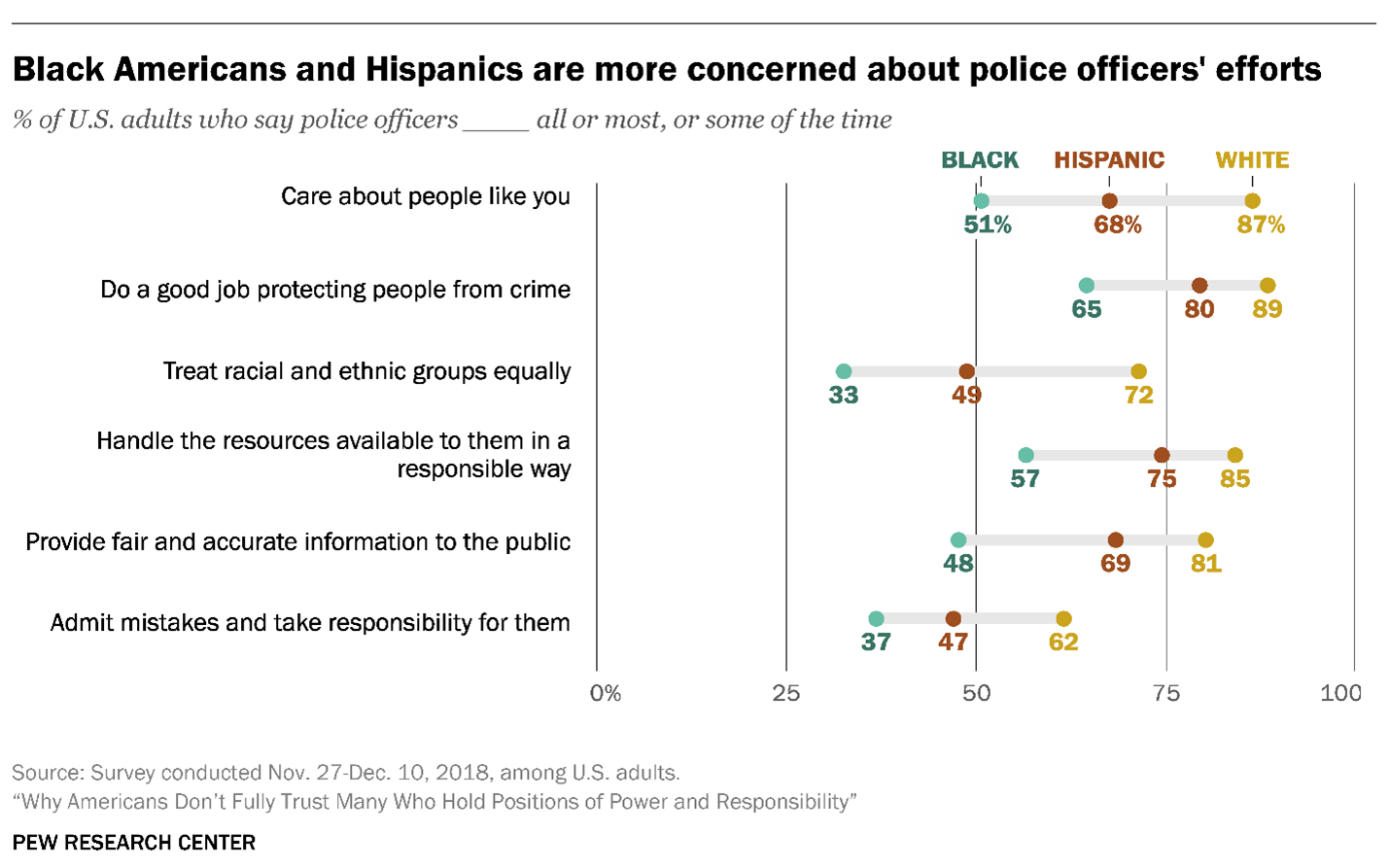
Figure 1 — A connected dot plot from Pew Research Center.
Here’s how I applied the same technique to visualize Likert scale data broken down by different demographics.
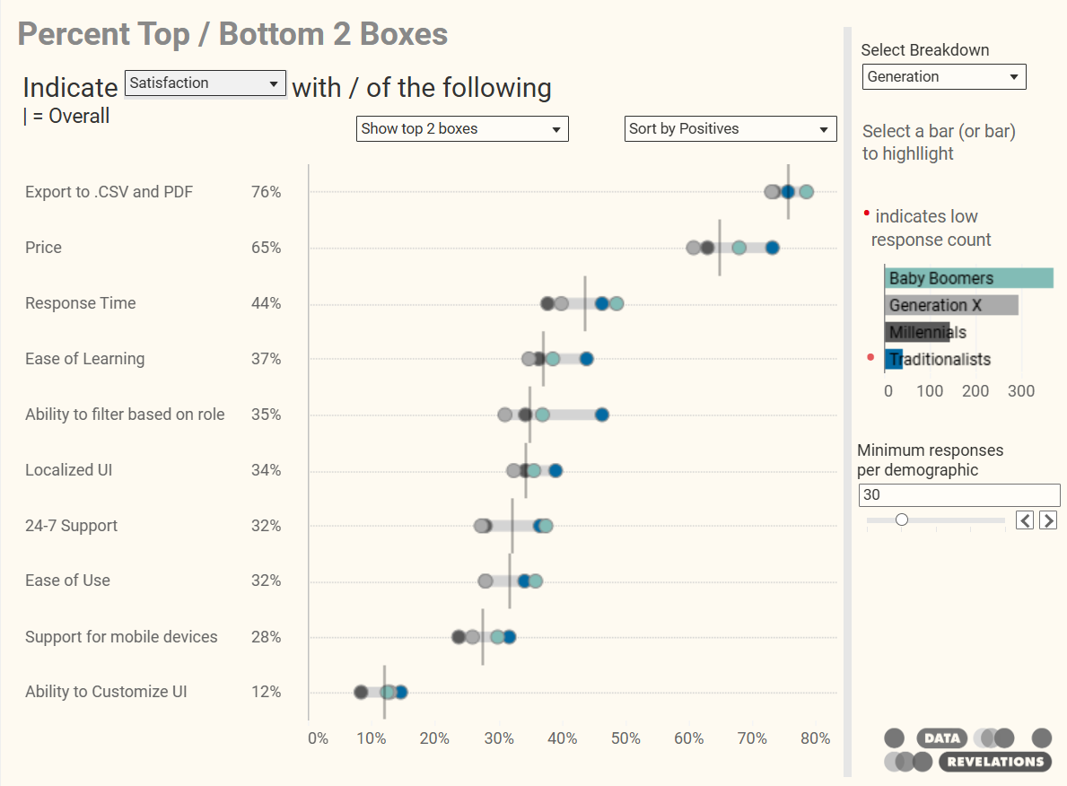
Figure 2 — A connected dot plot I created to handle multiple Likert-scale questions broken down into multiple generational segments.
Yes, but how do you handle identical values?
Look closely at the last row in the preceding graphic. Do you notice there are only three dots that are visible? The gray dot for “Generation X” is behind one of the other dots.
So… how do the pros address this problem?
Let’s look at another example from Pew Research where two values are identical.
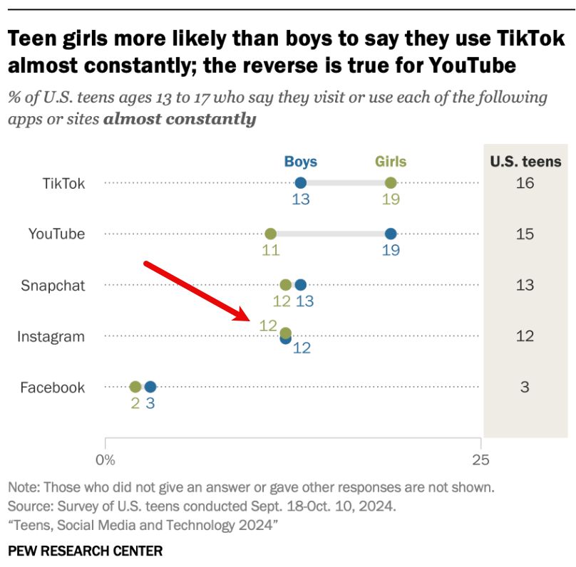
Figure 3 — Identical values are offset from each other so you can see both dots.
Ah, they offset the values from the dotted line.
How do you do something like this in Tableau?
Creating a connected dot plot with offset values in Tableau
Here’s a data set I put together to illustrate the challenges. Notice the identical values in Cat 1 and Cat 2 and the near identical values in Cat 2.
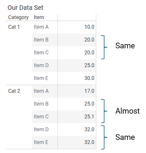
Figure 4 — The sample data.
Building a simple dot plot
Here’s a simple dot plot. We’ll hold off connecting the dots until we figure out how to do the offset.
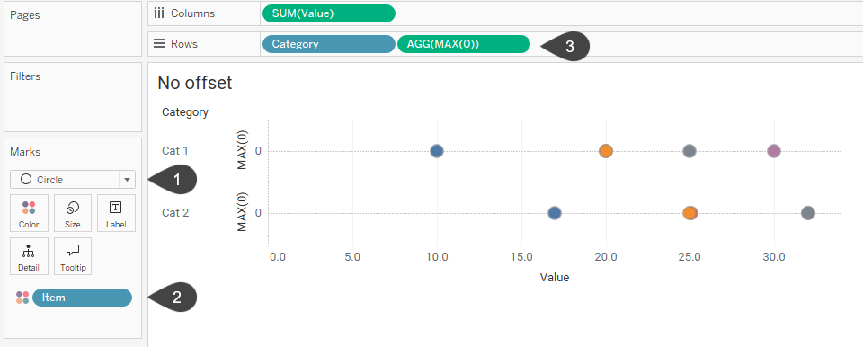
Figure 5 — A simple dot plot with dots that occlude other dots.
In the marks card we specify that we want to display circles (1) and that we want to have a different colored circle for each Item (2). The MAX(0) on Rows (3) is what allows us to display the dotted line. By default Tableau shows a dotted line for zero values for rows and columns.
Let’s see how to offset the dots so that we can see all five dots for both categories.
Creating a simple offset
Let’s deal with items that have equal values. Instead of placing MAX(0) on Rows we’ll fashion a calculated field called [Offset 1] that will move one of the items up a little higher on the Y-axis (1).
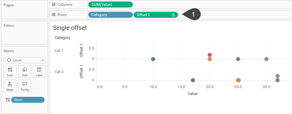
Figure 6 — A dot plot where any dot that would occlude another dot gets offset by .2 vertically.
The field [Offset 1] is defined as follows:
IF SUM([Value])-LOOKUP(SUM([Value]),-1)=0 then .2 else 0 END
This translates as
If the current dot is equal to the previous dot (meaning when you subtract them you get zero), place the current dot at .2; otherwise, place the current dot at 0. The “.2” is arbitrary, it just needs to be any value greater than 0.
Since we’re using a table calculation (LOOKUP) we’ll need to define the scope of that table calculation so that is does the comparison across [Item] and then starts over when it gets to a new [Category].
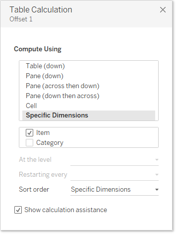
Figure 7 — Defining the scope of [Offset 1].
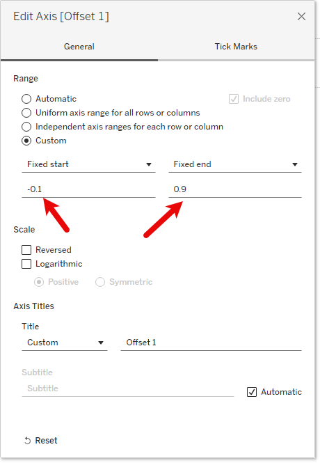
Figure 8 — Fixing the axis’ start and end values.
The fixed axis creates more headroom which in turn forces the .2 dot to be closer to the dotted zero line. If we hadn’t adjusted the axis the offset dots would look like this.
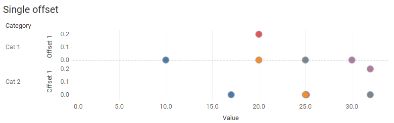
Figure 9 — Tableau’s automatic axis places the offset dot too high.
We’ve come up with a solution that addresses if there are a pair of dots that have the exact same value, but what about the two Items in Cat 2 that have values that are very close (25.0 and 25.1)?
Let’s see how we can address this as well as craft a symmetrical offset so we move one of the dots up and the other dot down.
Creating a symmetrical offset that handles close values
Here’s a more sophisticated approach to the Offset field.
IF ABS(SUM([Value])-LOOKUP(SUM([Value]),-1))<=.3  then .2

ELSEIF ABS(SUM([Value])-LOOKUP(SUM([Value]),1))<=.3 then -.2

ELSE 0

END
This translates as
If the current dot is within .3 of the previous dot, then move the dot to .2, else, if the current dot is within .3 of the next dot, then move the dot to -.2; otherwise, place the current dot at 0.
Note that we need to adjust the y-axis so that it now accommodates both the dots that have been placed higher and the dots that have been placed lower. Here’s what things look like with the new [Offset 2] field.
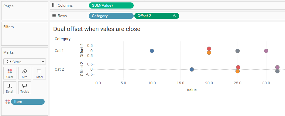
Figure 10 — Symmetrical offset that handles values that are close, in this case within .3.
Adding the connecting line
Let’s follow the standard approach to creating the connecting line. We’ll duplicate the SUM(Value) pill (1) and change the mark type for this second pill to be a line instead of a circle (2). Here’s what we get.
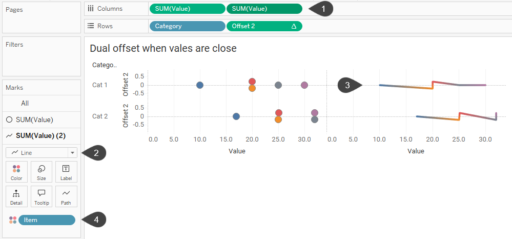
Figure 11 – Running into a speedbump, in this case a zig-zaggy line, in trying to construct the connected dot plot.
The line indeed connects the dots, but because the dots are offset we get a zig-zaggy line (3). We need a way to flatten the line, as it were (we’ll deal with it being multi-colored in a bit).
This is where I received some help from Ken Flerlage who came up with a clever way to change the level of detail for the line (4, above). Currently, there are five Items / dots. Suppose we came up with a new dimension, based on the dimension [Item] that had only two elements, with those elements being the minimum and maximum Items?
That’s what Ken fashioned with this calculated field called [High and Low Item]:
IF {FIXED [Category], [Item]: SUM([Value])} = {FIXED [Category]: MAX({FIXED [Category], [Item]: SUM([Value])})} OR

{FIXED [Category], [Item]: SUM([Value])} = {FIXED [Category]: MIN({FIXED [Category], [Item]: SUM([Value])})} THEN

[Item]

END
This translates as
If within each Category and Item, the sum of an Item is the same at the Maximum value within that Category and Item, or equal to the Minimum value within the same, then display that Item; otherwise, don’t display anything.
We need to use {Fixed} so that Tableau gives us a dimension that we can place on Color, Detail, or Path in the Marks card.
Let’s swap out Item with this new field and see what we get.
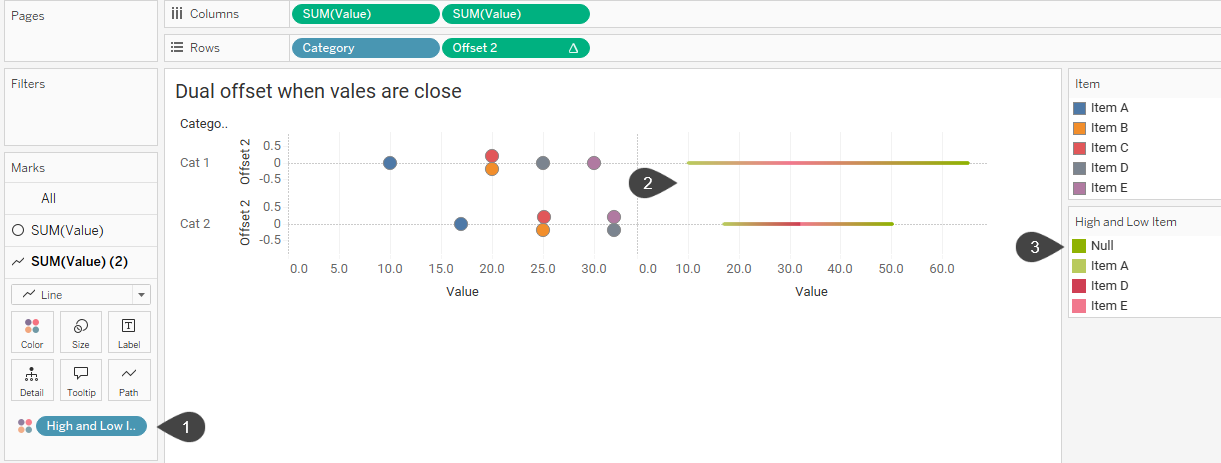
Figure 12 — Getting closer. The lines are straight but they are not the correct length as Tableau is adding together too many values.
The calculated field High and Low Item placed on color (1, above) produces straight lines, but the lines are too long (2) as Tableau is adding too many values together. We’re also getting some extra coloring because of the Null values (3).
If we right-click Null in the color legend and select Hide we’ll have a line that is the correct length.

Figure 13 — Very close. The lines are straight and they are the correct length, but we want them to be a light gray.
Now let’s move High and Low Item from Color to Path (you can also add it to Detail instead) and we have all the elements we need to create the connected dot plot.
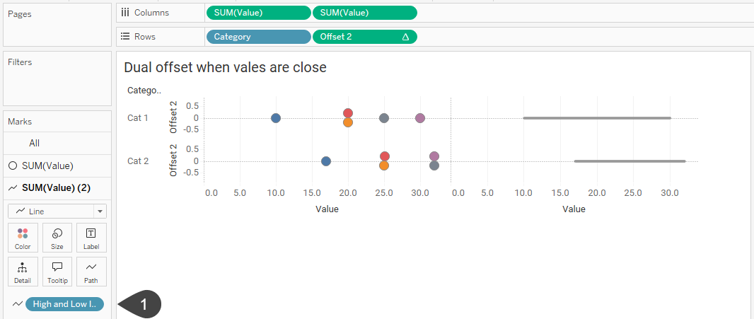
Figure 14 – [High and Low Item] is now on Path (1). The Null values are still hidden, and we no longer have a multi-colored line.
The hard part is done, we just need to
- Make this a dual axis chart by right-clicking the second SUM(Value) pill and selecting Dual Axis.
- Right-click in the top axis and select Synchronize Axis.
- Right-click the top axis and select Move marks to back (this just swaps the two green pills at the top).
- Increase the thickness of the line by selecting the pill associated with the line and increasing the size on the Marks card.
- Make the line color lighter.
- Hide the top axis by right-clicking and deselecting Show header.
- Hide the Offset 2 header by right-clicking on the Y-axis and deselecting Show header.
Here’s the result:
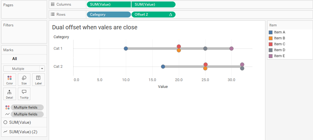
Figure 15 — A connected dot plot with offset values.
Bonus: how to ditch the legend
Whenever possible I do my best to avoid color and size legends. In the example below I’ve labeled each of the items in the first row so we don’t have to refer to a legend. You do this by placing [Item] on Label in the Marks card (for the Circle pill only) but do NOT turn on Show marks label. Instead, right-click each dot, select Mark Label and then Always show.
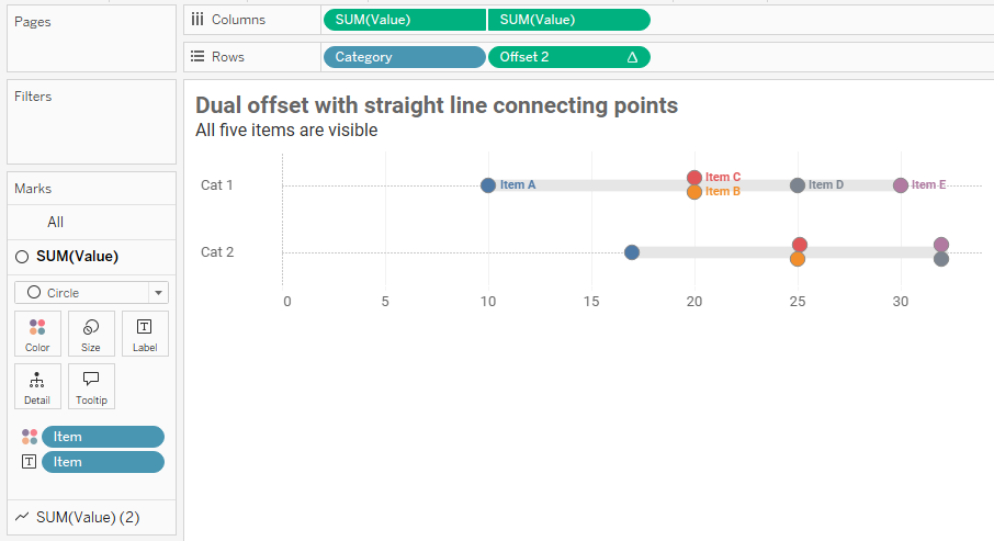
Figure 16 — A connected dot plot with direct labeling for the dots in the first row.
Conclusion
The connected dot plot remains my “go to” for showing gaps among different demographic groups for virtually any type of survey question. The technique discussed here addresses how you can offset elements when you have identical and near identical values.
Here’s the workbook that you can download.