Chart Chat Live — Round 26
A retrospective of some of our favorite visualizations and tools from 2021 and a discussion of the New York Times Covid "Spiral" chart that went viral. https://youtu.be/xchgcYNTs98

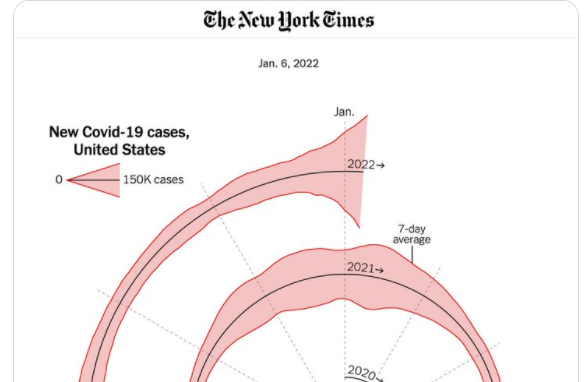
A retrospective of some of our favorite visualizations and tools from 2021 and a discussion of the New York Times Covid "Spiral" chart that went viral. https://youtu.be/xchgcYNTs98
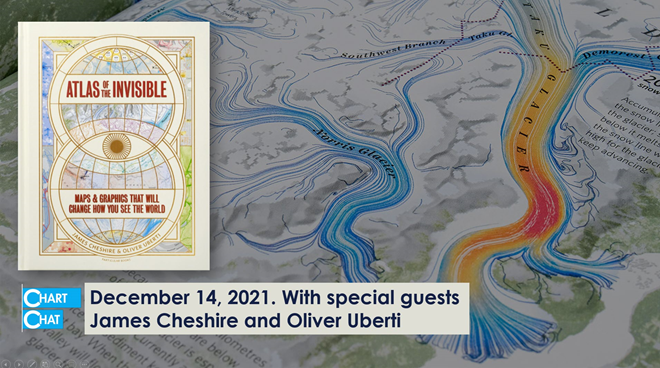
Our discussion with James Cheshire and Oliver Uberti. James and Oliver share how they developed some of the striking illustrations for Atlas of the Invisible. https://youtu.be/YwgqWaV5lZw

Our discussion with John Burn-Murdoch, Chief Data Reporter at The Financial Times. John takes us behind the scenes in the creation and evolution of some of the most influential charts of the pandemic. https://youtu.be/U0aHxx6lhz0

Our discussion with inventor, data visualization pioneer, and industry icon, Ben Shneiderman. https://youtu.be/nrLutRyr1L4

Ros Pearce, data journalist at The Economist, visits Chart Chat. It was a great discussion. https://youtu.be/JPfzinma9QU
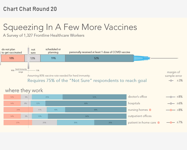
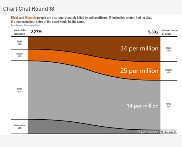
Revisit the political divide in the US, take a deep dive into a Washington Post visualization about vaccine intentions among healthcare workers, showcase some stellar social media data visualization projects, and review Robert Kosara's video on the famous Minard chart. https://youtu.be/kXn3aqGIOXk
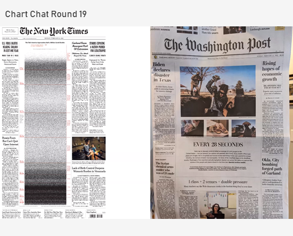
We discuss bar-in-bar charts, scaredy-cats and TURDs, great work from the New York Times, how to visualize 500,000 deaths, and the orange/blue debate. https://youtu.be/kco5U5wgDfY
In this Chart Chat we reflect on Sankey and proportion charts, unit charts, unemployment charts and presenting complex data. https://youtu.be/IIirXyOcbeQ
In this Chart Chat we reflect on a night of election vizzes, the lack of innovation and clarity (with the exception of the tie gauge, frownometer, and chipped cartogram) and whether we should access all visualizations based on precision (spoiler alert:NO!). https://youtu.be/xa2T-dIA-T0
In this Chart Chat we discuss election trackers and showing uncertainty. https://youtu.be/STk6n3JJGvE

