Some thoughts on Size, Color, Usability, and Engagement
I am consumed by doing what I can to make sure that my Tableau visualizations (both public and for clients) are, well, consumed.
While Tableau excels at helping people explore data and turn information into insights, it is still all too easy to create dashboards that neither please the eye nor enlighten the mind. In fact, too many Tableau Public visualizations I’ve seen are both ugly and confusing.
I have a lot of experience in this area having created many dashboards I thought were brilliant but left people flummoxed and uninspired. In this blog post I will share some of the things I’ve learned along the way to attract viewers and engage them in my stories.
Note: Andy Cotgreave recently addressed some of these same issues (see his blog post) and will explore how to create exemplary Tableau Public dashboards at the upcoming Tableau Customer Conference in Las Vegas in October.
Overview
There are many things one must take into account when designing good dashboards (colors, fonts, layout, etc.) but for this discussion I’m going to focus on the following elements.
- Size
- Color
- Usability
- Engagement
Size Matters
Actually, it’s the width that matters and in a moment we’ll see why you will tempt fate if you create a dashboard that is wider than 650 pixels.
But first, let’s look at just why you have to worry about this in the first place.
Every Tableau Public visualization has a Share button like the one shown below.
This button allows people that view your brilliant dashboards to not just create links to your work but to actually embed your work within their web sites, blogs, etc.
This is great but it means you don’t have control over how your work is displayed. For example, you may find that your dashboard that looks terrific with a width of 900 pixels looks horrible when crammed into a blog post.
Consider the case of the recent winner in Tableau’s Sports visualization contest. The dashboard looks great when seen as the author intended, but here’s how it looks in the Tableau blog post:
As Bill the Cat might say, “Ack!”
Whenever I publish interactive visualizations I hope that other bloggers pick up my viz feeds and embed my work in their blogs and web pages, but I’ve had enough of my work mangled at this point that I try very hard not to create dashboards that are wider than 650 pixels (As a general rule I shoot for a width of 625 pixels).
While you might think this is a tough constraint it turns out that being forced to work with a smaller canvas often results in dashboards that are easier for people to figure out how to use than larger dashboards. We’ll discuss this in the section on Usability below, but first let’s look at what color combinations to avoid at all costs.
Never Use Red and Green as Contrasting Colors
Once you visit this web site I guarantee you will never use red and green as contrasting / diverging colors.
This web site simulates color blindness. I’ll focus on red-green colorblindness as 7% of American men either cannot distinguish red from green or they see red and green differently from most people (Note that only 0.4% of women are so affected. See http://www.hhmi.org/senses/b130.html for more information.)
So, what’s the big deal? Here is a snippet of a red-green heat map from a popular Tableau Public visualization.
And here’s a simulation of what the image looks like to a person with red-green color blindness.
So, what should you do? I really like Tableau’s colorblind-friendly orange-blue diverging pallet. It looks good and is readable by virtually everyone.
You are now officially warned – anyone using red-green contrasting colors can expect a serious whupping from the viz police.
Usability
Here we’ll address the ease with which people both understand the story you are trying to tell as well as how easily people can figure out how to manipulate the filters, actions, and tabs in your dashboards.
Before you publish anything I strongly encourage you to find a friend or colleague who is not as enamored of your data / visualization as you are. Remember, at this point you have probably fallen in love with your data and attendant visualizations, so it important (albeit, sobering) to show your work to others to see if they “get” it.
If you are like me, you will probably go through the following three stages upon observing the reaction to your work.
Anger and Disgust – This may be accompanied by thoughts of “HOW CAN YOU NOT SEE HOW THIS WORKS? ARE YOU AN IDIOT? THIS IS SO SIMPLE AND CLEAR! ALL YOU HAVE TO DO IS THIS, THIS, AND THAT!”
Depression and Torpor – These are the feelings you may have once you realize that your friend / colleague is not in fact an idiot and that many people may not see the beauty and utility of your work. Get over it!
Assimilate and Improve – It turns out that you probably don’t have to ditch all your work as very often there are small, easy things you can do to help people “get” it. So, if folks don’t see that there are multiple tabs, filters, action controls, etc., there are things that you can do (besides yelling and gesticulating) to help them “get” your dashboard. Here are some of the things that I’ve tried that work.
Hover Help
Screen real estate is at a premium, especially if you adhere to my recommendation of keeping your dashboards narrow.
So, how can you display useful instructions without crowding your dashboard?
Create a tool tip that contains your help / instructions. Consider the screen below.
I think the UI for this is quite friendly but when I sent early cuts of this out to people to try, very few knew instinctively what to do, so I added a little help screen that appears when you hover over the dot.
It’s extremely simple to create this type of “Hover Help” tool tip.
1) Create a calculated field called “Instructions” and define this field as follows.
2) Place this field on the Rows shelf and change the chart type to Shape, as shown here.
3) Create a tool tip that contains your instructions.
4) Add this worksheet to your dashboard but hide the title so you just see the instructions and the circle.
Navigation – Dealing with Multiple Tabs
Many people not familiar with Tableau visualizations are going to miss the tabs at the top of your workbook.
You can help them discover your workbook’s other views either by pointing out the tabs with some on-screen instructions (or Hover Help) or by adding navigation elements to your dashboards.
Here’s an example from a workbook I prepared earlier this year.

Make it as easy as possible for people to figure out what they should do, and what they should do first
While the tabs at the top may get lost, my audience didn’t.
Here’s another example of embedding easily-discoverable navigation on a dashboard.
This technique uses the same calculated field approach we saw in Hover Help in that each navigation element is a separate worksheet in the workbook. The difference is that on the dashboard we define an action so that when a user clicks a mark a different tab in the workbook gets activated.
Note: This feature did not work with versions of Tableau Public prior to the July 2011 release.
Wording
The way something is worded in a filter or legend can either clarify or obfuscate. Consider the example below that shows an early cut of the filters I created for the Batting category in the Personal Baseball Entertainment Index.
Here we ask people to indicate the importance of certain offensive categories. If you like teams that score lots of runs you should move that slider to the right. If you don’t care that a team walks a lot you should move that slider to the left.
There was a lot of confusion regarding Strikeouts. Some people correctly gleaned that pushing the slider to the right meant that you wanted to find teams that didn’t strike out a lot. Others moved the slider to the left thinking that this meant find teams with few strikeouts.
This ambiguity was corrected simply by changing the wording on the filter.
Size and Complexity
I love intricate dashboards with multiple visualizations that have intelligently-defined actions so clicking on one chart affects results in another chart.
But folks not steeped in Tableau dashboard usage may be confused by all the different charts competing for attention. In addition, without prior instruction very few people will understand that clicking on one chart can impact results in another.
This is why I like the challenge of having a smaller canvas. If forces me to consider the less sophisticated audience and to craft dashboards that are simple and clear.
Engagement
Tableau is much more about telling the right story than assembling and displaying shiny objects, but you do in fact need to add some degree of visual bling to get people to stop and interact with your dashboards.
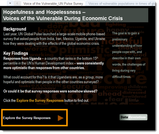
I’ve started adding a splash screen to both attract viewers and set the table for what will be found within the workbook. Here’s an example.
Likewise, I try to add fun visual elements within the meat of the workbook as well. Here we see two graphics that spice up the dashboard without being distracting.
One needs to be careful not to be too cutesy with this stuff. Here’s an early cut of the same visualization where I went overboard with the baseball motif.
This USA Today approach did nothing to help tell the story and in fact made it harder to distinguish between leaders and laggards.
Summary
Before publishing your next opus using Tableau Public please consider incorporating the following recommendations:
Size – Keep the dashboard width under 650 pixels.
Color – Do not use red-green for contrasting / diverging colors and check out your viz using a color-blind simulator (I use this one).
Usability – Have a friend (or friends) try your dashboard and observe them as they try to figure things out.
Engagement – Look at what you can do to draw viewers to your work without distracting people from the story you’re trying to tell.


