
Overview
I’m a big fan of Andy Kriebel’s and Andy Cotgreave’s Makeover Monday challenge. For those of you not familiar with this, each week Kriebel and Cotgreave find an existing visualization / data set and ask the data visualization community to come up with alternative ways to present the same data.
As Cotgreave points out in one of his blog posts “It’s about using a tool to debate data. It’s about improving people’s data literacy.”
With one major exception that I’ll discuss in a moment the challenge is meeting its goals as each week several dozen people participate and the submissions and accompanying discussions have been enormously valuable.
But there was one week where the community failed.
Worse than that, the community did some damage that will be difficult to repair.
Bad Data Make Bad Vizzes Make Bogus Conclusions
Week four of the Makeover Monday challenge used survey data from GOBankingRates that posed the question “how much money do you have saved in your savings account?” Here are some of the baseless conclusions from people that participated in the makeover:
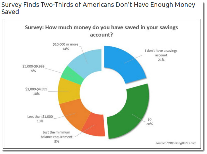
Figure 1 — From the source article that spawned the makeover. Yes, the exploding donut needs a makeover, but it’s the headline “Survey finds that two-thirds of Americans don’t have enough money saved” that presents the bigger problem.
- Americans Don’t Have Enough Money Saved (See link).
- 71% of Americans Have Less than $1,000 in Savings. Yikes! (See link).
- Americans Just Aren’t Saving Money (See link).
- Most Americans Have Miniscule Savings (See link).
- 80% of Americans Have Less than $5,000 in Savings! (See link).
- Americans Are Not Saving Enough Money! (See link).
- Americans Have Too Little Savings (See link).
So, what’s the problem?
It turns out the key finding from the original publication is not true — and thanks to the makeovers that spurious finding has been amplified dozens of times.
How did this happen?
Let’s dig into the data a little bit.
Is There a Relationship Between Age and Savings?
As I mentioned before I think the Monday Makeover Challenge is great and I’ve participated in a couple of them. I started to work on this one and took a stab at showing the relationship between age and savings, as shown here.
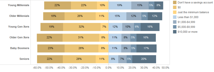
Figure 2 — Divergent stacked bar chart showing the percentage of people that have different savings amounts, sorted by age
This looked odd to me as I expected to see a correlation between age and savings; that is, I expected to see a lot more blue among Seniors and Baby Boomers.
I decided to make the demarcations less granular and just compare people with minimal savings and those with $1,000 or more in savings, as shown here.
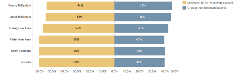
Figure 3 — Less granular divergent stacked bar chart
This result seemed way off, so either my supposition is wildly incorrect (i.e., as people get older they save more) or there was something wrong with the data.
Note: I try to remind people that Tableau isn’t just for reporting interesting findings. It’s a remarkably useful tool for finding flaws in the data.
It turns out that while there is indeed something wrong with the data, there was a much bigger problem:
Most people didn’t bother to look at the actual question the survey asked.
What the Survey Asked
The survey asked “How much money do you have saved in your savings account?” It did not ask “How much money do you have saved?”
The difference is titanic as the average American savings account yields but .06 percent interest! That’s infinitesimal — you might as well stick your money in a mattress!
Indeed, I am of the Baby Boomer generation and I have but $20 in my savings account — but (thankfully) more in my savings.
So, the vast majority of people that participated in the makeover didn’t bother to look at the actual question and came to — and published — a bogus conclusion.
Were there any other problems with the survey?
You betcha.
What’s Wrong with the Survey?
A visualization is only as good as its underlying data and the data in question has nothing to do with the savings habits of Americans; it only has to do with having a savings account.
But there are other shortcomings with the survey that should make us question whether the data is even useful for analyzing how much money Americans have sitting in a savings account.
Consider this excellent review of the same Makeover Monday challenge from Christophe Cariou. He points out the following shortcomings with the survey itself:
- In the article, we read: ‘The responses are representative of the U.S. internet population’. It is therefore not representative of the US population. See this report by Pew Research Center for age and online access.
- We also read ‘Demographic information was not available for all respondents, and analysis of responses by demographics is based solely on responses for which the targeted demographic information was available.’ Normally, if it was demographically representative, this would be clarified. This comment adds a doubt.
- The average savings amount in the article is the sum of the averages of the groups divided by 6. It is not weighted by the size of each group.
Note: Kudos to Bridget Cogley who also saw the problems with the conclusions when the makeovers first appeared in late January 2016.
Further note: In a subsequent makeover challenge blog post Cotgreave alerted participants to questionable data.
So, Where Exactly is the Harm?
So, dozens of people have created visualizations based on bad data and came up with bogus conclusions. Given the number of articles from allegedly reliable sources reporting shortcomings in savings, what’s the harm of sounding an alarm bell?
I suppose if you are an “ends justify the means” type of person then it’s fine to publish bogus findings as long as they change behavior in a positive way.
But I know many of the people in this community and they would be aghast at using data visualization this way.
I also fear that with collective missteps like this people will question the ability of makeover participants to relay accurate information.
So What Should We Do?
Andy Cotgreave and Andy Kriebel have earned their leadership positions in the data visualization community, so I hope they will make note of this makeover mishap and encourage people that published the bogus result to modify their headlines.
I also strongly encourage anyone working in data visualization to understand the data — warts and all — before rushing to publish. Andy Kriebel is providing the data set and we shouldn’t ask him to find all the flaws in it. Indeed, that’s part of our job.
Finally, I ask others in the community to be more diligent: only publish work that has been carefully vetted and do not tolerate unsubstantiated work from others.
While it’s true that nothing terrible will happen if more Americans open savings accounts, there may be other situations where publishing spurious conclusions will do some serious damage.


