
Data Viz and Star Trek
I chatted recently with Andy Cotgreave about the original Star Trek series and how impressed I was with Dr. McCoy’s sickbay monitor.
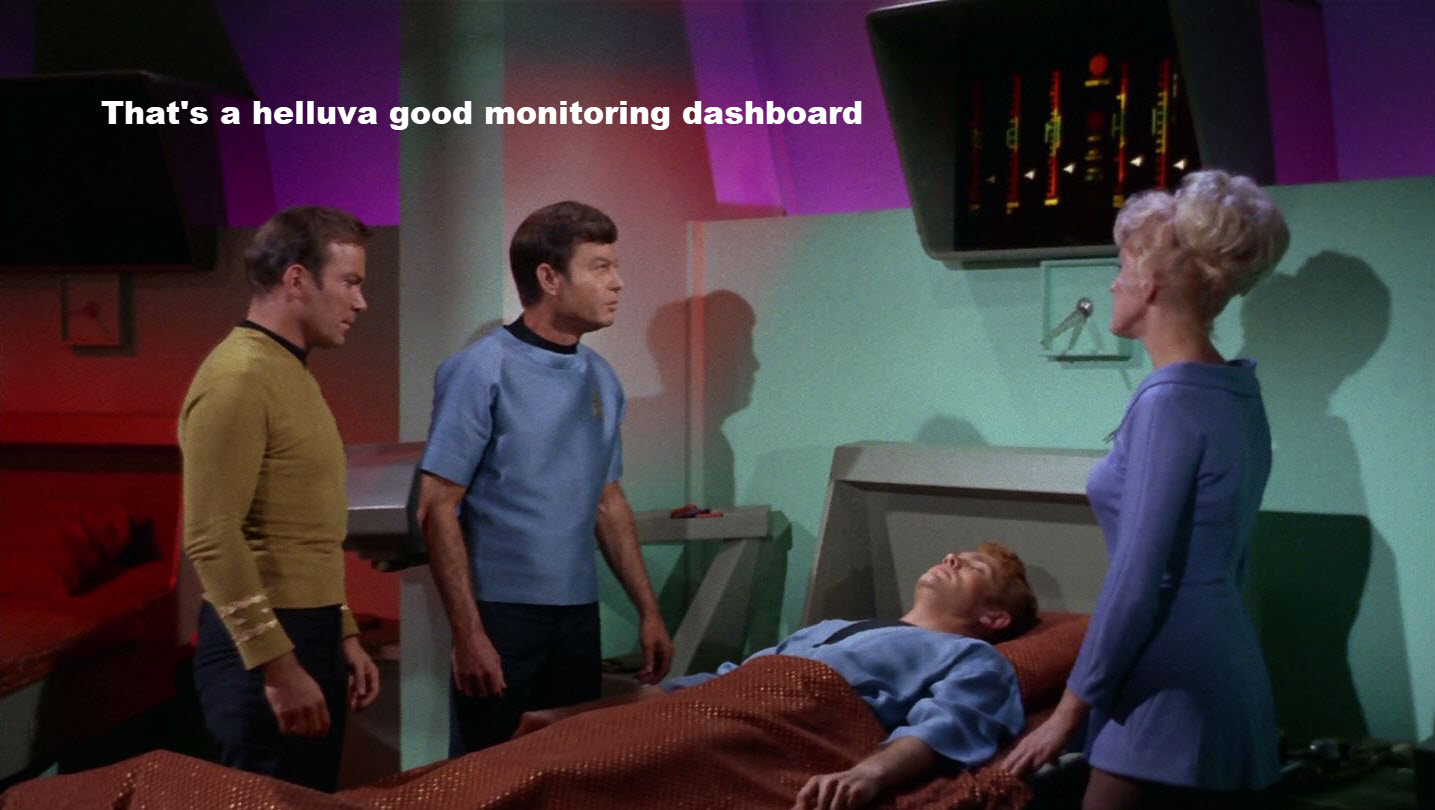
I think this is an AMAZING KPI monitoring dashboard and a lot of organizations could benefit from something like this. (Hey, Nick Desbarats… this is similar to your four-threshold approach, don’t you think?)
Doc Brown explains alternative timelines
Andy and I were now off to the races about data visualization in film and television. Andy mentioned RJ Andrews’ article from a few years ago, and in particular this clip from Back to The Future II where Doc Brown uses a hand-drawn illustration to explain the hard-to-grok notion of alternative timelines.
Death by PowerPoint
My friend Bill McHenry told me about this gem from the Fred Astaire film The Sky’s the Limit. Here actor Robert Benchley gives a mind-numbingly dull (and hilarious) PowerPoint presentation … almost 50 years before the invention of PowerPoint!
Help us find more great examples
I’m particularly keen on examples like Dr. McCoy’s sickbay monitor as the approach is something organizations could use, but we’d love to see other examples of where data visualization figures in the plot, helps explain a difficult concept, or is just entertaining.
You can submit your examples here.
Curious what we find? Follow us on Instagram at https://www.instagram.com/chartsonscreens/


